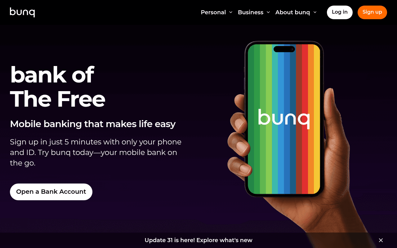
https://bunq.com
https://bunq.com
Screenshot of bunq.com
55of 100
C−

'bank of The Free' is a clever tagline but it front-loads brand poetry over concrete value — a first-time visitor doesn't immediately know what makes bunq worth switching to. The hero CTA button is a ghost outline on dark background, nearly invisible against the vibrant phone visual competing for attention. 57 images missing alt text on a financial product page is an accessibility and trust liability that regulators notice.

Your action plan

Ordered by conversion impact. Click any fix to see the before → after.

1
Replace ghost CTA button with high-contrast filled button
High ImpactQuick Win'Open a Bank Account' hero CTA button — white outline only
Currently
White outline ghost button on dark purple background
Recommended
Filled orange button matching nav Sign Up button — same color, same weight, impossible to miss
Ghost buttons consistently underperform filled buttons by 15-30% in A/B tests; the orange is already established as the brand action color in the nav — use it consistently

Copy rewrites

Ready to use

Drop-in replacements for your highest-leverage text. Each rewrite explains the conversion principle behind it.

Hero subheadline
Mobile banking that makes life easy
Free mobile banking with up to 2.01% savings interest — no branch visits, ever.
Specificity principle: replaces vague benefit with a concrete differentiator (interest rate) that competitors cannot easily match
Hero body copy
Sign up in just 5 minutes with only your phone and ID. Try bunq today—your mobile bank on the go.
Open your account in 5 minutes with just your phone and ID. Join 20 million people who already bank smarter.
Social proof injection: adds the 20M figure at the moment of consideration, reducing switching anxiety
Hero CTA button
Open a Bank Account
Start Free in 5 Minutes
Urgency plus benefit: communicates zero cost and low time commitment — both primary objections for neobank sign-up — in the button itself
Features section subheadline
Mobile banking that makes life easy
Everything your old bank does — faster, cheaper, and in one app.
Competitive framing: directly positions against legacy banks, the primary mental comparison the target audience is making
💡

The killer move

High Impact
Move the 2.01% savings rate into the hero headline

The single most differentiating, concrete, and emotionally resonant fact on the entire page — a best-in-class savings rate — is buried in a bullet point below the fold. Rewrite the hero subheadline to lead with it: this one change would likely outperform every other optimization on the page combined.

How visitors experience your page

Second-by-second walkthrough.

1 strong3 mixed1 weak
0-3 secondsMixed
0-3s First Impression: Dark purple hero, large 'bank of The Free' headline, colorful phone visual, ghost CTA button, nav with Log in and orange Sign up
Strong visual identity and bold headline create intrigue, but 'bank of The Free' requires interpretation — visitor is curious but not yet convinced of the specific value proposition
3-8 secondsMixed
3-8s Value Scan: Subheadline 'Mobile banking that makes life easy', body copy with 5-minute signup promise, ghost CTA button
5-minute signup is a strong friction reducer but the ghost button fails to visually demand action; visitor reads but may not click — the CTA is losing its job
8-15 secondsStrong
8-15s Feature Exploration: 'All you need from an online bank, in 1 app' section with 5 bullet benefits including 2.01% interest, crypto, pockets
Concrete feature list with a specific interest rate is compelling — this is where the real value proposition lives, but it's below the fold where many visitors never reach
15-30 secondsMixed
15-30s Trust Evaluation: 'Join 20 million worldwide' section, 3-step signup flow illustration, feature sections for cards, crypto, stocks
20M users is powerful social proof but buried mid-page with no testimonials, ratings, or regulatory badges visible — financial product visitors actively seek trust signals here
30+ secondsWeak
30s+ Decision: Cards, crypto, stocks feature sections, bottom notification bar about Update 31
No sticky CTA, no pricing comparison, no testimonials, no regulatory trust badge visible — visitor who scrolled this far is interested but lacks the final push to convert

Health check

8 dimensions, weighted by conversion impact.

First impression & hero
20%
6/10
Visually striking dark hero with bold typography, but ghost CTA and ambiguous tagline leave conversion points on the table
Copy & messaging
20%
6/10
5-minute signup and 2.01% interest are strong specifics, but they appear too late and the hero copy stays generic
Call-to-action
15%
4/10
Ghost button in hero is a critical failure — the only above-fold CTA is visually subordinate to a decorative phone image
Trust & social proof
15%
4/10
20M users exists but is buried mid-page; no testimonials, no app store ratings, no regulatory badges visible above fold
Visual design & layout
10%
8/10
Dark theme, colorful product visuals, and consistent brand identity are polished and premium — design quality is genuinely high
Page structure & flow
8%
6/10
Logical feature-by-feature scroll but best proof points (interest rate, user count) appear below fold where many visitors disengage
Technical & SEO signals
7%
7/10
Exceptional PageSpeed score of 95 with 958ms FCP is a genuine competitive advantage; 57 missing alt texts undermine accessibility
Differentiation & positioning
5%
5/10
'bank of The Free' is memorable but the page never explicitly states why bunq beats Revolut, N26, or Monzo — the comparison is implied, not made

Page speed

Based on real Chrome user data
95/100
Overall score
Combined performance rating
1.1 s
Largest paint
Time until the main content is visible
0.00
Layout shift
How much the page moves while loading
958 ms
First paint
Time until something first appears
74 ms
Responsiveness
How fast the page reacts to clicks

Want mobile analysis and fresh re-runs?

Buy roasts to unlock mobile analysis, re-analyze on demand, and more for bunq.com.

See roast packs →