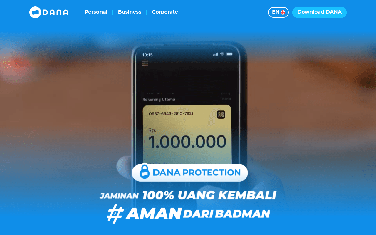
https://dana.id
https://dana.id
Screenshot of dana.id
45of 100
D

DANA leads with a security promise and bold hashtag campaign, but the full-page view reveals massive blank sections — entire scroll zones are empty blue and beige voids that suggest broken content rendering. The QR code download section is the only real conversion mechanism below the fold, yet it's buried under a hero that never explains what DANA actually does for a first-time visitor.

Your action plan

Ordered by conversion impact. Click any fix to see the before → after.

1
Fix broken below-fold content sections
High ImpactSome WorkLarge empty blue and beige blocks in full-page screenshot
Currently
Multiple full-viewport-height blank sections with no visible content
Recommended
Audit and repair CSS/JS rendering failures; ensure features, testimonials, and social proof sections load and display correctly
Blank sections destroy trust and signal a broken product — directly contradicting the security-focused DANA Protection messaging. Visitors who scroll past the hero see nothing and bounce.

Copy rewrites

Ready to use

Drop-in replacements for your highest-leverage text. Each rewrite explains the conversion principle behind it.

Hero campaign headline
JAMINAN 100% UANG KEMBALI #AMAN DARI BADMAN
100% Money-Back Guarantee. Your balance is always protected with DANA Protection.
Specificity and clarity — translates the campaign slogan into a concrete benefit statement that works for users unfamiliar with the hashtag campaign
Secondary hero headline
Let's transact with DANA #BukanDompetBiasa
More than a wallet — pay bills, transfer money, and shop online, all in one app.
Feature specificity over brand sloganeering; tells new users exactly what they can do, reducing cognitive load and increasing download intent
QR code section CTA
Download DANA now!
Scan to download free — join 50M+ Indonesians already using DANA
Social proof + zero-cost framing; anchoring the CTA to a user count leverages bandwagon effect and removes price friction
💡

The killer move

High Impact
Deploy a social proof counter strip immediately below the hero

Add a real-time or static trust bar showing '50M+ users, Rp X trillion transacted, 4.8-star rating, licensed by Bank Indonesia' — this single strip between hero and QR section would do more conversion work than any copy change, because fintech adoption is driven by herd behavior and regulatory trust, not campaign hashtags.

How visitors experience your page

Second-by-second walkthrough.

2 mixed3 weak
0-3 secondsMixed
0-3s first impression: Blue hero with phone mockup showing Rp 1.000.000 balance, DANA Protection badge, bold hashtag headline, Download DANA button in nav
Brand is immediately recognizable to existing users, but new visitors cannot determine what DANA does from the hero alone — the campaign hashtag assumes prior awareness
3-8 secondsMixed
3-8s orientation: Bottom of hero with #AMAN DARI BADMAN text, then Let's transact with DANA section with second phone mockup and QR code
Visitor gets a second phone mockup and a QR code — some clarity emerges, but no feature list or benefit hierarchy guides the eye; attention fragments
8-15 secondsWeak
8-15s exploration: QR code download block with Bank Indonesia and Kominfo regulatory logos — then blank beige section begins
Regulatory logos provide trust signal, but the page appears to end here visually; visitor assumes content is missing and confidence in the product drops
15-30 secondsWeak
15-30s scroll: Large empty blue section, then large empty beige section — no text, no images, no CTAs
Blank sections signal a broken page. A security-focused fintech with empty content zones creates cognitive dissonance — if the site is broken, is the app safe?
30+ secondsWeak
30s+ decision: Another blue section and a footer-area section, all apparently empty
Visitor who has scrolled this far has seen almost no supporting content — no features, no testimonials, no pricing, no use cases. Most will abandon without downloading

Health check

8 dimensions, weighted by conversion impact.

First impression & hero
20%
5/10
Strong brand color and security messaging, but zero value proposition for new users and campaign hashtag assumes existing brand familiarity
Copy & messaging
20%
4/10
Campaign slogans dominate over benefit-driven copy; bilingual inconsistency (Indonesian hero, English subhead) creates audience confusion
Call-to-action
15%
5/10
Download DANA nav button is visible and well-styled, but the primary QR conversion mechanism is buried and unsupported by social proof
Trust & social proof
15%
5/10
DANA Protection badge and Bank Indonesia regulatory logos are genuine trust signals, but no user counts, ratings, or testimonials are visible
Visual design & layout
10%
6/10
Hero is visually polished with strong blue brand identity and clean phone mockup, but full-page layout collapses into empty sections
Page structure & flow
8%
2/10
Catastrophic structural failure — majority of page below the QR section is blank, destroying any logical content progression toward conversion
Technical & SEO signals
7%
2/10
No meta title, no meta description, no H1 or H2 tags detected; multiple blank page sections suggest JavaScript rendering failures
Differentiation & positioning
5%
4/10
DANA Protection is a credible differentiator but is presented as a campaign rather than a clear competitive advantage over GoPay or OVO

Want mobile analysis and fresh re-runs?

Buy roasts to unlock mobile analysis, re-analyze on demand, and more for dana.id.

See roast packs →