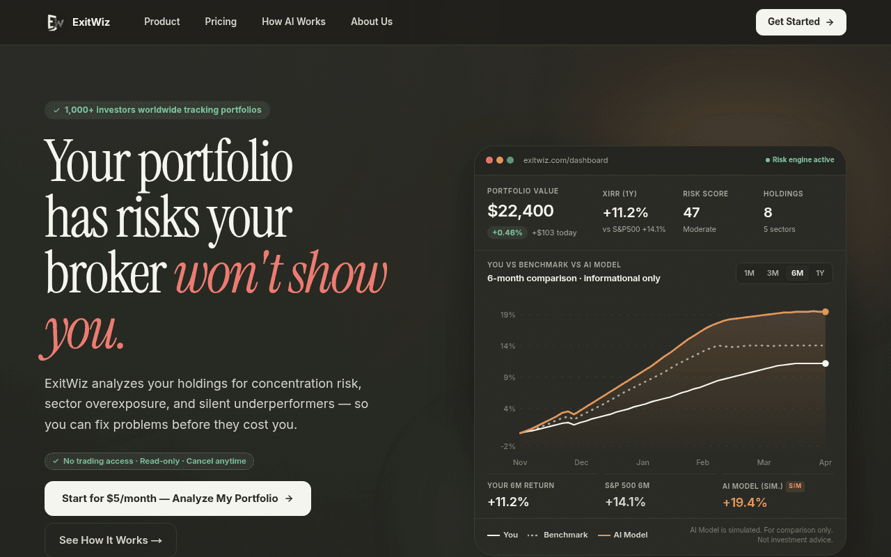
https://exitwiz.com
https://exitwiz.com
Screenshot of exitwiz.com
70of 100
B−

The hero headline is genuinely sharp and the $5 price point is a conversion gift — but the dashboard mockup showing the user underperforming S&P500 (+11.2% vs +14.1%) accidentally undermines the value prop. The TBT of 840ms means interactive elements are sluggish on load, which will hurt the 'Get Started' click-through on a page selling analytical precision.

Your action plan

Ordered by conversion impact. Click any fix to see the before → after.

1
Fix the benchmark numbers in the dashboard mockup
High ImpactQuick WinHero dashboard: Your 6M return +11.2% vs S&P 500 6M +14.1%
Currently
User shown underperforming S&P500 by 3.1 percentage points
Recommended
Show user beating S&P500 (e.g. +16.8% vs +14.1%) after using ExitWiz, or add a before/after framing label to contextualize the gap as the problem ExitWiz solves
Prospect-mirror effect: visitors subconsciously project themselves onto demo data. Showing underperformance as the default state without explicit before/after framing creates negative product association at the most critical first-impression moment.

Copy rewrites

Ready to use

Drop-in replacements for your highest-leverage text. Each rewrite explains the conversion principle behind it.

Hero subheadline / body copy
ExitWiz analyzes your holdings for concentration risk, sector overexposure, and silent underperformers — so you can fix problems before they cost you.
ExitWiz runs 12 AI agents on your portfolio every night — flagging concentration risk, sector overexposure, and silent underperformers before they cost you money.
Specificity principle: '12 AI agents every night' is concrete and differentiating vs the generic 'analyzes your holdings' phrasing. Adds urgency and proprietary process signal.
Primary CTA button
Start for $5/month — Analyze My Portfolio
Analyze My Portfolio Free for 7 Days — Then $5/month
Risk reversal: if a trial exists, lead with it. If not, the current copy is strong but adding a trial framing removes the last friction point for a $5 ask. Confirm trial availability before implementing.
Problem section headline
Your broker shows you prices. Nobody shows you the risk.
Your broker shows you prices. ExitWiz shows you what they won't.
Competitive positioning: replaces the passive 'nobody' with a direct brand claim, completing the hero headline's promise and reinforcing the antagonist-broker narrative established above the fold.
Final CTA section headline
Stop flying blind. Start knowing.
Join 1,000+ investors who spotted risks their brokers never flagged.
Social proof + specificity: replaces abstract metaphor with a concrete outcome claim anchored to the existing social proof number, making the final push feel earned rather than generic.
💡

The killer move

High Impact
Add a free portfolio risk score widget as the top-of-funnel hook

Let visitors paste their top 5 holdings and instantly receive a free Risk Score (mirroring the '47 Moderate' shown in the dashboard mockup) — no signup required. This transforms the value prop from abstract promise to lived experience in 60 seconds, and the natural next step becomes 'get the full analysis for $5/month' with zero cold-start friction.

How visitors experience your page

Second-by-second walkthrough.

2 strong3 mixed
0-3 secondsStrong
0-3s First Impression: Dark fintech aesthetic, bold headline 'Your portfolio has risks your broker won't show you', dashboard mockup, $5 CTA button, 1000+ investors badge
Headline is immediately provocative and relevant to the target audience. Dark premium aesthetic signals credibility. Visitor likely thinks 'this is for serious investors' and leans in.
3-8 secondsMixed
3-8s Value Scan: Subheadline with three specific risk types, 'No trading access · Read-only · Cancel anytime' trust strip, dual CTA buttons, dashboard numbers including the underperformance vs S&P500
Trust strip is excellent friction-reducer. But the dashboard showing user underperforming benchmark creates subconscious doubt — visitor may wonder if the product actually helps performance.
8-15 secondsStrong
8-15s Problem Validation: Problem section with four specific risk scenarios: concentration, underperformers, post-damage discovery, broker misalignment
Four-point problem articulation is well-executed. Each scenario is specific enough to trigger recognition. Visitor likely nods at 'that position down 22%' — emotional resonance drives scroll continuation.
15-30 secondsMixed
15-30s Feature Evaluation: Four-column feature grid: Risk Detection, Strength Signals, Daily Intelligence, Live News Feed. AI model comparison section. Stats bar: 1000+ portfolios, $100M+ holdings, 12 AI agents
Feature density is high but benefit framing is inconsistent — some bullets are outcomes, others are features. Visitor may feel informed but not yet convinced the daily briefing is worth $5/month.
30+ secondsMixed
30s+ Conversion Decision: Testimonials section, pricing table ($5 Core vs $12 Pro), final CTA 'Stop flying blind. Start knowing', Get Started button
Pricing is a genuine strength — $5 is impulse-buy territory. But absent real testimonials and with a generic closing headline, the final push lacks the emotional close needed to convert fence-sitters. Pro plan at $12 needs a stronger anchor.

Health check

8 dimensions, weighted by conversion impact.

First impression & hero
20%
8/10
Headline is sharp and emotionally targeted; dashboard mockup adds credibility but the underperformance numbers accidentally undercut the value narrative.
Copy & messaging
20%
7/10
Problem framing is specific and compelling; feature section copy drifts into feature-listing rather than outcome-selling, losing momentum mid-page.
Call-to-action
15%
6/10
Primary CTA copy is specific and price-anchored, but dual above-fold buttons split intent and the final CTA section lacks urgency or scarcity.
Trust & social proof
15%
5/10
1000+ investors badge and read-only disclaimer are solid; confirmed absence of real testimonials is a significant gap for a financial product asking for portfolio access.
Visual design & layout
10%
8/10
Dark premium aesthetic is well-executed and appropriate for the fintech audience; dashboard mockup is detailed and believable as a product preview.
Page structure & flow
8%
7/10
Problem-solution-features-pricing flow is logical; the AI model section between features and testimonials slightly disrupts momentum toward conversion.
Technical & SEO signals
7%
6/10
Perfect SEO and accessibility scores are excellent; 840ms TBT is a meaningful conversion liability on a CTA-heavy page, performance score of 63 needs attention.
Differentiation & positioning
5%
8/10
Broker-as-antagonist positioning is distinctive and emotionally resonant; 12-agent AI loop is a specific differentiator that most competitors cannot easily claim.

Page speed

Tested via Google Lighthouse
63/100
Overall score
Combined performance rating
1.3 s
Largest paint
Time until the main content is visible
0
Layout shift
How much the page moves while loading
0.3 s
First paint
Time until something first appears
1.5 s
Interactive
Time until the page is fully usable
Accessibility: 100SEO: 100Best Practices: 100

Want mobile analysis and fresh re-runs?

Buy roasts to unlock mobile analysis, re-analyze on demand, and more for exitwiz.com.

See roast packs →