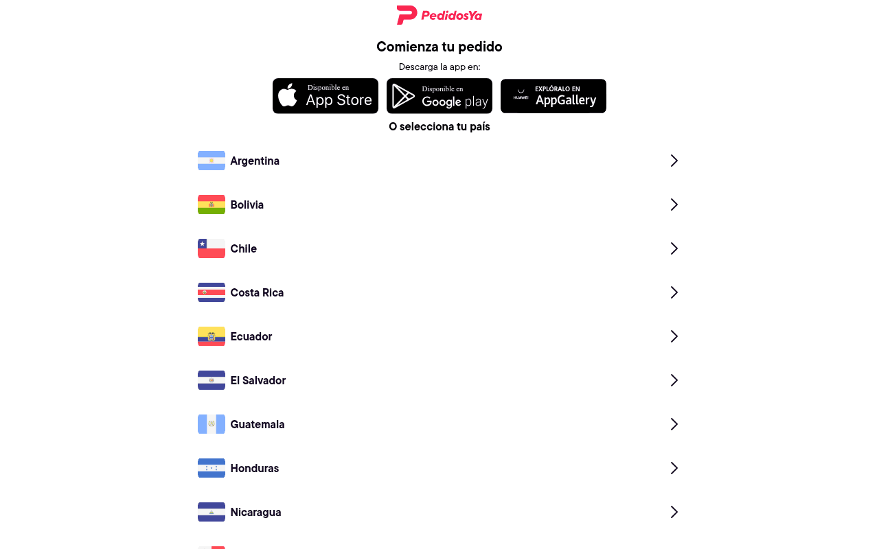
https://pedidosya.com
Screenshot of pedidosya.com
30of 100
F

PedidosYa's homepage is essentially a country-picker with a logo on top — zero value proposition, zero hero imagery, zero reason to care. A first-time visitor has no idea what makes PedidosYa worth downloading over Rappi or iFood. The massive whitespace in the full-page view suggests a rendering failure that leaves 60% of the page blank.

Your action plan

Ordered by conversion impact. Click any fix to see the before → after.

1
Add a hero section with value proposition above the country selector
High ImpactSome WorkArea above 'Comienza tu pedido' heading — currently empty whitespace
Currently
Logo + 'Comienza tu pedido' heading with no supporting context or imagery
Recommended
Insert a full-width hero with headline ('Comida, super y más — entregado en minutos'), a lifestyle image, and key differentiators (speed, restaurant count, coverage) before the country selector
First impressions form in 50ms; a blank page with only a country list communicates nothing about brand value, killing conversion for non-brand-aware visitors

Copy rewrites

Ready to use

Drop-in replacements for your highest-leverage text. Each rewrite explains the conversion principle behind it.

H1 heading
Comienza tu pedido
Todo lo que quieres, en tu puerta en minutos
Benefit-led headline replaces a generic imperative with a concrete outcome, addressing the visitor's core desire (speed + convenience)
Subtitle under H1
Descarga la app en:
Descarga gratis y recibe tu primer envío sin costo
Urgency and incentive — transforms a passive instruction into a value-loaded CTA that reduces download friction
H2 country selector
O selecciona tu país
Selecciona tu país y empieza a pedir ahora
Action orientation — adds momentum and urgency to what is currently a neutral navigation label
💡

The killer move

High Impact
Implement geo-IP auto-detection to skip the country selector entirely

Detect the visitor's country via IP on page load and redirect directly to the localized experience — eliminating the friction step entirely for the majority of users, and reserving the country selector only as a fallback for VPN or misdetected users.

How visitors experience your page

Second-by-second walkthrough.

1 mixed4 weak
0-3 secondsWeak
0-3s first impression: PedidosYa logo, 'Comienza tu pedido' heading, three app store buttons, and a list of Latin American countries with flags
Visitor gets zero emotional hook or value proposition — no imagery, no benefit statement, no reason to stay. Brand-aware users proceed; everyone else bounces immediately
3-8 secondsMixed
3-8s orientation: Country list from Argentina to Nicaragua visible in viewport, chevron arrows suggesting clickable rows
Returning users or those who know the brand will find their country and click through efficiently; new users still have no context for what they are selecting a country for
8-15 secondsWeak
8-15s consideration: Full country list (scrolling reveals Panama through Venezuela), footer copyright
No persuasion layer exists at this stage — no promotions, no featured restaurants, no urgency triggers. User either clicks a country or leaves; there is nothing to convert the undecided
15-30 secondsWeak
15-30s decision: App store download buttons remain the only conversion mechanism besides country selection
Users who have not yet acted have seen everything the page offers. Without a promotional hook or social proof, conversion probability drops sharply at this stage
30+ secondsWeak
30s+ re-evaluation: Same static page — no dynamic content, no chat, no personalization
Zero retention mechanisms. A user who scrolled the full page and did not convert has no reason to reconsider — no exit intent, no offer, no secondary CTA

Health check

8 dimensions, weighted by conversion impact.

First impression & hero
20%
2/10
No hero, no imagery, no value prop — just a logo and a country list on a mostly blank page
Copy & messaging
20%
3/10
'Comienza tu pedido' communicates action but zero benefit, differentiation, or emotional resonance
Call-to-action
15%
4/10
App store badges are present but lack incentive copy; country selector works functionally but is not conversion-optimized
Trust & social proof
15%
1/10
Absolutely no trust signals — no ratings, user counts, restaurant numbers, or testimonials anywhere on the page
Visual design & layout
10%
3/10
Clean but sterile; massive unexplained whitespace in full-page render suggests a layout failure that severely damages credibility
Page structure & flow
8%
4/10
Logical sequence (download app or select country) but no persuasion architecture between logo and action
Technical & SEO signals
7%
7/10
PageSpeed 97 performance score and 1.1s LCP are excellent; meta title and description are solid but the page content is too thin to support them
Differentiation & positioning
5%
2/10
Nothing on this page explains why PedidosYa beats Rappi, iFood, or any local competitor — pure utility, zero brand story

Page speed

Based on real Chrome user data
97/100
Overall score
Combined performance rating
1.1 s
Largest paint
Time until the main content is visible
0.00
Layout shift
How much the page moves while loading
845 ms
First paint
Time until something first appears
9 ms
Responsiveness
How fast the page reacts to clicks

Want mobile analysis and fresh re-runs?

Buy roasts to unlock mobile analysis, re-analyze on demand, and more for pedidosya.com.

See roast packs →