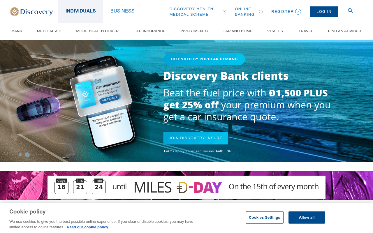
https://discovery.co.za
Screenshot of discovery.co.za
50of 100
D

Discovery is a powerhouse brand running a homepage that tries to sell everything to everyone simultaneously — the hero rotates between bank credit cards and car insurance while a countdown timer for 'Miles D-Day' competes for attention below. The product grid of 8 tiles with tiny overlaid text treats the homepage like a sitemap, not a conversion engine.

Your action plan

Ordered by conversion impact. Click any fix to see the before → after.

1
Consolidate hero to single high-intent offer with one CTA
High ImpactSome WorkHero carousel with 'Discovery Bank clients / Beat the fuel price with Đ1,500 PLUS get 25% off' slide
Currently
Rotating carousel with multiple offers and a single 'JOIN DISCOVERY INSURE' CTA buried mid-slide
Recommended
Replace carousel with a static hero focused on the single highest-converting product (likely bank account or medical aid). One headline, one sub-headline, one CTA button above fold.
Research by Nielsen Norman Group shows carousels reduce engagement — users ignore rotating banners at rates up to 89%. A single focused offer consistently outperforms multi-message carousels in financial services.

Copy rewrites

Ready to use

Drop-in replacements for your highest-leverage text. Each rewrite explains the conversion principle behind it.

Hero headline
Discovery Bank clients
Already with Discovery Bank? Here's your exclusive reward.
Specificity and relevance — the current label reads like a segment tag, not a headline. The rewrite creates intrigue and speaks directly to the audience.
Hero sub-headline
Beat the fuel price with Đ1,500 PLUS get 25% off your premium when you get a car insurance quote.
Get Đ1,500 in Discovery Miles plus 25% off your car insurance premium — just for getting a quote. No obligation.
Clarity and objection removal — restructuring leads with the reward, adds 'no obligation' to reduce friction, and removes ambiguity about what action triggers the benefit.
CTA button
JOIN DISCOVERY INSURE
Get My Quote and Đ1,500 Miles
Specificity and value reinforcement — the current CTA implies commitment (joining). The rewrite mirrors the offer, reduces perceived risk, and uses first-person ownership language.
Meta description
Discovery offers award-winning products - Medical Aid Administration, Car and Life Insurance, Bank Accounts and Investments, all with Vitality rewards.
Get medical aid, car insurance, banking and investments — all rewarding you through Vitality. Rated 4.55/5 by customers. Get a quote in 60 seconds.
Social proof and urgency — adds the customer rating and a time-to-value signal that increases click-through rate from search results.
💡

The killer move

High Impact
Build a Vitality-powered personalization layer on the homepage

Discovery's true moat is the Vitality behavioral rewards engine — no competitor offers it. A logged-in or cookie-identified visitor should see a homepage that surfaces their specific Vitality status, next reward milestone, and the one product most likely to increase their rewards, turning the homepage from a product catalog into a personalized financial dashboard that drives cross-sell through demonstrated value rather than promotional banners.

How visitors experience your page

Second-by-second walkthrough.

1 strong2 mixed2 weak
0-3 secondsMixed
0-3s First Impression: Discovery logo, dual nav (Individuals/Business), 10-item mega nav, hero carousel showing car insurance offer with Đ1,500 Miles headline, coastal road imagery
Brand recognition is immediate for existing customers, but new visitors face a navigation-heavy above-fold that signals complexity. The hero offer is specific but the carousel format undermines trust and attention.
3-8 secondsMixed
3-8s Offer Evaluation: Full hero copy: Đ1,500 PLUS 25% off car insurance, JOIN DISCOVERY INSURE button, Ts&Cs disclaimer, Miles D-Day countdown timer appearing below
The dual incentive (cash + discount) is compelling but the countdown timer for an unrelated Miles promotion immediately below creates competing urgency and dilutes focus on the primary CTA.
8-15 secondsStrong
8-15s Product Exploration: Get a quote in 60 seconds tab bar (Car Insurance, Medical Aid, Bank, Life Insurance, GAP Cover, Vitality), then 8 product image tiles
The quote tab bar is the page's most conversion-friendly element — it meets visitors with clear intent signals. However, the 8-tile grid below it creates decision paralysis by presenting all products simultaneously.
15-30 secondsWeak
15-30s Trust Assessment: 8 product tiles with overlaid text and starting prices, Feefo 4.55 rating widget, 3 customer review snippets
The Feefo rating is buried after extensive product browsing. Visitors who haven't yet committed to a product need social proof earlier. The review text is truncated and low-contrast, reducing its persuasive impact.
30+ secondsWeak
30s+ Decision or Exit: Remaining whitespace, extensive footer with 5 columns, social media icons, cookie banner still potentially visible
No re-engagement mechanism, no sticky CTA, no exit-intent offer. Visitors who scrolled this far without converting have no compelling reason to act — the page simply ends with a footer, losing high-intent prospects.

Health check

8 dimensions, weighted by conversion impact.

First impression & hero
20%
5/10
Carousel format wastes the hero's potential; the car insurance offer is specific but competes with a Miles countdown timer and a 10-item nav for attention above fold.
Copy & messaging
20%
6/10
The Đ1,500 + 25% off dual incentive is concrete and compelling, but most product tile copy is generic price-led and the hero headline 'Discovery Bank clients' is a label, not a hook.
Call-to-action
15%
5/10
JOIN DISCOVERY INSURE implies commitment rather than a low-friction first step; the quote tab bar is the strongest CTA element but sits below fold on most viewports.
Trust & social proof
15%
5/10
Feefo 4.55 rating exists but is placed too low to influence above-fold decisions; 16 of 18 images lack alt text, signaling accessibility and trust gaps.
Visual design & layout
10%
6/10
Clean brand identity and strong photography, but the 8-tile grid creates visual noise and the hero carousel with competing countdown timer fragments visual hierarchy.
Page structure & flow
8%
5/10
The page flows from promotion to product grid to reviews — logical but not conversion-optimized; no progressive commitment path guides visitors from awareness to quote.
Technical & SEO signals
7%
4/10
LCP 4.2s and CLS 0.14 both fail Core Web Vitals; 16 images missing alt text hurts accessibility and SEO; PageSpeed score of 70 is below competitive threshold for financial services.
Differentiation & positioning
5%
5/10
Vitality rewards ecosystem is Discovery's genuine differentiator but it appears as a nav item and tile rather than a central positioning statement woven through the hero narrative.

Page speed

Based on real Chrome user data
70/100
Overall score
Combined performance rating
4.2 s
Largest paint
Time until the main content is visible
0.14
Layout shift
How much the page moves while loading
2.6 s
First paint
Time until something first appears
156 ms
Responsiveness
How fast the page reacts to clicks

Want mobile analysis and fresh re-runs?

Buy roasts to unlock mobile analysis, re-analyze on demand, and more for discovery.co.za.

See roast packs →