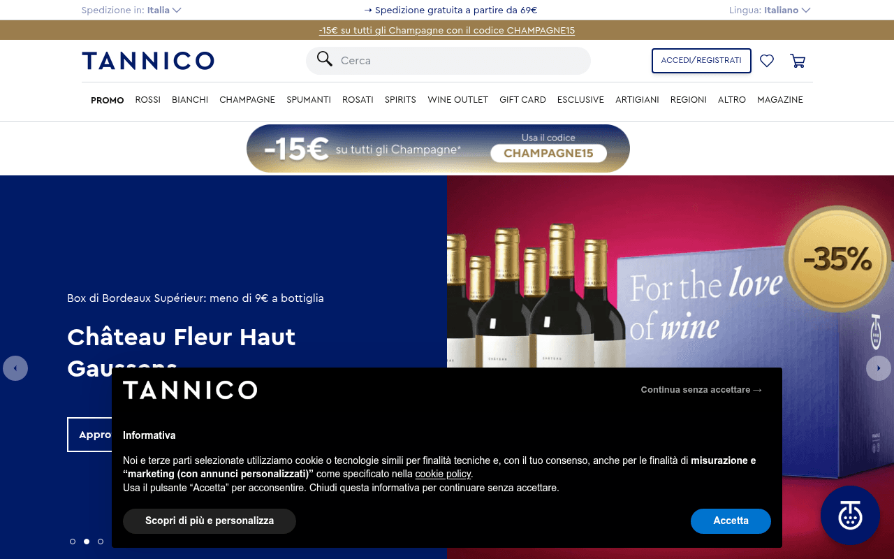
https://tannico.it
https://tannico.it
Screenshot of tannico.it
50of 100
D

Tannico has solid bones — fast load, clean nav, active promotions — but the hero carousel buries its best offer (the -35% Bordeaux box) under a cookie banner and a half-visible headline. The homepage has zero H1 tags and no testimonials, which is a missed trust opportunity for Italy's self-proclaimed top enoteca.

Your action plan

Ordered by conversion impact. Click any fix to see the before → after.

1
Add a visible H1 hero headline above the fold
High ImpactQuick WinHero carousel — currently shows product name 'Château Fleur Haut Gaussens' as implied heading with no H1 in DOM
Currently
No H1 exists on the page; hero text is partially obscured by cookie banner
Recommended
Add a persistent H1 such as 'La migliore enoteca online d'Italia — oltre 3.000 etichette' above the carousel CTA
Missing H1 hurts SEO and fails the 3-second clarity test — visitors cannot immediately confirm they are in the right place, increasing bounce rate

Copy rewrites

Ready to use

Drop-in replacements for your highest-leverage text. Each rewrite explains the conversion principle behind it.

Meta description
Tannico è l'enoteca online più scelta dagli italiani, acquista vino online in sicurezza. Offerte esclusive e spedizioni rapide.
Tannico: oltre 3.000 etichette selezionate, spedizione gratuita da 69€ e consegna in 24h. L'enoteca online preferita da 500.000 italiani.
Specificity — concrete numbers (3.000 etichette, 500.000 clienti, 24h) outperform vague superlatives in CTR by up to 36% (Moz)
Hero slide headline — Spring Sale
Spring Sale: 150+ occasioni fino al 26/04
Spring Sale: 150+ vini scontati fino al 35% — solo fino al 26 aprile
Urgency + specificity — adding the discount depth (35%) and spelling out the deadline increases perceived value and click intent
Hero slide subheadline — Bordeaux box
Box di Bordeaux Supérieur: meno di 9€ a bottiglia
6 Bordeaux Supérieur selezionati: meno di 9€ a bottiglia, -35% sul prezzo di listino
Anchoring — stating both the per-bottle price and the percentage discount activates loss aversion and makes the deal feel more concrete
Announcement bar
-15€ su tutti gli Champagne con il codice CHAMPAGNE15
Risparmia 15€ su ogni Champagne — usa il codice CHAMPAGNE15 al checkout
Framing — rewriting as a benefit ('risparmia') rather than a mechanic ('-15€') increases perceived generosity and action intent
💡

The killer move

High Impact
Launch a social-proof flywheel with a visible review count and a first-purchase guarantee

Add a persistent trust bar showing verified Trustpilot or Google rating with review count, and introduce a 'Soddisfatti o rimborsati' guarantee badge near every add-to-cart button — wine is a high-uncertainty category and a visible guarantee removes the single biggest objection for new visitors, typically lifting first-order conversion by 15-25%.

How visitors experience your page

Second-by-second walkthrough.

1 strong3 mixed1 weak
0-3 secondsMixed
0-3s first impression: Tannico logo, nav with 12 categories, free shipping bar, Champagne promo bar, large hero carousel partially obscured by cookie banner, -35% badge on wine box
Visitor recognizes this as a wine shop immediately — brand is clear. But the cookie banner covers the hero CTA and headline, creating friction before any value is communicated. First impression is cluttered rather than confident.
3-8 secondsMixed
3-8s orientation: Dismisses cookie banner, sees Bordeaux box offer at -35%, Spring Sale slide, Champagne -15€ promo repeated twice, navigation categories
Multiple competing promotions create decision paralysis. Visitor cannot identify a single primary offer. The duplicate Champagne banner wastes space that could show product cards and drive immediate browsing.
8-15 secondsStrong
8-15s value assessment: Scrolls past hero to 'Scopri la Lombardia da non perdere' section with Franciacorta product cards showing prices and discount badges
Product cards with clear pricing, discount percentages, and add-to-cart buttons are well-executed. Visitor starts evaluating specific products — this is where intent sharpens. Regional curation adds editorial credibility.
15-30 secondsWeak
15-30s trust evaluation: More product grids (Bollicine di Franciacorta), no visible reviews, no star ratings, no trust badges beyond payment icons in footer
No social proof anywhere on the page. For a first-time visitor considering a 50-100€ wine purchase, the absence of reviews or ratings is a significant trust gap that increases cart abandonment risk.
30+ secondsMixed
30s+ decision: Continued product browsing, footer with payment methods (Visa, PayPal, Klarna etc.), no visible loyalty program or subscription offer
Engaged visitors will likely search or browse categories — the site is functional. But without a trust anchor or a compelling reason to buy now vs. later, many will exit to compare. A first-order incentive or guarantee would close more sessions.

Health check

8 dimensions, weighted by conversion impact.

First impression & hero
20%
5/10
Hero carousel has strong visuals and relevant offers but is undermined by a cookie banner blocking the CTA, duplicate promo banners, and no H1 clarity statement
Copy & messaging
20%
5/10
Promotional copy is functional but relies on mechanics over benefits; no brand voice, no emotional hook, and superlatives without proof points
Call-to-action
15%
5/10
CTAs exist but are visually weak — small buttons, low contrast, and competing with too many simultaneous offers diluting click intent
Trust & social proof
15%
3/10
Zero testimonials, no star ratings, no review count on homepage — a critical gap for a self-described top Italian enoteca asking for 50-150€ purchases
Visual design & layout
10%
7/10
Clean navy and white palette, professional product photography, well-structured nav — visually credible but the duplicate promo banner wastes prime real estate
Page structure & flow
8%
6/10
Logical category-first structure with regional curation sections; product cards are well-formatted but the hero-to-product transition lacks a guiding narrative
Technical & SEO signals
7%
7/10
Excellent PageSpeed score of 93, fast FCP 1.3s and LCP 1.6s, but missing H1 tags and zero accessibility score reported are meaningful SEO and UX liabilities
Differentiation & positioning
5%
4/10
Claims to be Italy's top enoteca but provides no proof — no awards, no sommelier credentials, no unique selection story visible above the fold

Page speed

Based on real Chrome user data
93/100
Overall score
Combined performance rating
1.6 s
Largest paint
Time until the main content is visible
0.02
Layout shift
How much the page moves while loading
1.3 s
First paint
Time until something first appears
78 ms
Responsiveness
How fast the page reacts to clicks

Want mobile analysis and fresh re-runs?

Buy roasts to unlock mobile analysis, re-analyze on demand, and more for tannico.it.

See roast packs →