https://edu.chainguard.dev/chainguard/chainctl/chainctl-docs/chainctl/
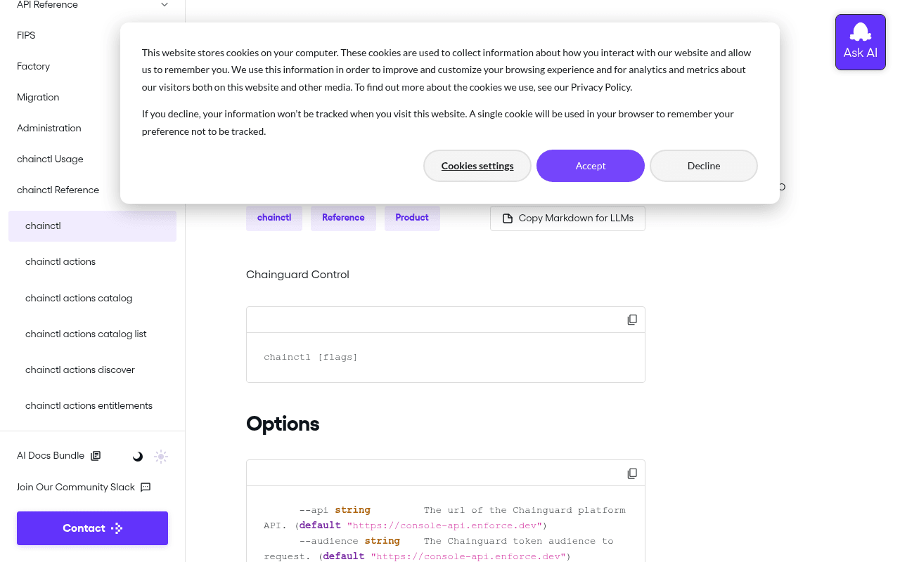
Screenshot of edu.chainguard.dev
55of 100
C−

This is a documentation page, not a landing page — and it knows it.

The 'chainctl [flags]' code block and dense left-nav sidebar serve developers well, but the page title is just 'chainctl' with zero context for anyone arriving cold. The 'Contact' CTA button at the bottom of a 200-item sidebar is doing the conversion heavy lifting, which is like putting a checkout button in the footnotes.

Your action plan

Ordered by conversion impact. Click any fix to see the before → after.

1
Add a one-line value proposition beneath the page H1
High ImpactQuick WinH1 'chainctl' heading with subtitle 'Chainguard Control'
Currently
chainctl — Chainguard Control (no further context)
Recommended
Add a single sentence: 'The CLI for managing Chainguard images, policies, and access controls — install in 60 seconds.' directly below the H1
First-time visitors arriving via search have zero context. The F-pattern reading model means the first 2 lines after H1 determine whether they stay. A single orienting sentence reduces bounce for non-expert visitors.

Copy rewrites

Ready to use

Drop-in replacements for your highest-leverage text. Each rewrite explains the conversion principle behind it.

Page H1 subtitle
Chainguard Control
Chainguard Control — CLI for managing images, policies, and access across your supply chain
Specificity: replaces a product name with a functional description that communicates value to first-time visitors
Contact button in sidebar
Contact
Talk to Sales
Clarity: 'Contact' is ambiguous (support? billing?). 'Talk to Sales' sets expectation and attracts higher-intent visitors while filtering out support requests
Copy Markdown for LLMs button
Copy Markdown for LLMs
Copy for AI/LLM Context
Audience language: 'LLMs' is jargon even for developers; 'AI/LLM Context' is more universally understood and signals the use case more clearly
Was this helpful section
Was this helpful?
Did this solve your problem? If not, ask our AI or join the community Slack.
Conversion path: transforms a dead-end feedback widget into a next-step funnel that captures dissatisfied users before they bounce
💡

The killer move

High Impact
Instrument doc pages as product-qualified lead signals

Users reading chainctl reference docs are 3-5x more likely to convert than blog readers. Add a lightweight 'Start using chainctl in your org' inline CTA after the Options section, and instrument time-on-page plus scroll depth to trigger a targeted Intercom or email sequence — turning your highest-intent documentation traffic into a measurable pipeline source.

How visitors experience your page

Second-by-second walkthrough.

2 strong2 mixed1 weak
0-3 secondsMixed
0-3s First Impression: Cookie banner obscuring content, left sidebar with many nav items, 'chainctl' H1, code block with 'chainctl [flags]'
Developer recognizes a docs page immediately — that's good. But the cookie banner blocks the content and the H1 gives no orientation for cold traffic. Experienced Chainguard users proceed; new evaluators may bounce.
3-8 secondsStrong
3-8s Orientation: Options section with --api and --audience flags, code syntax highlighting, breadcrumb tags (chainctl, Reference, Product)
Developers scan for the flags table — they find it immediately. The syntax highlighting and copy button are professional signals. This audience trusts well-formatted code docs. Confidence builds.
8-15 secondsStrong
8-15s Content Evaluation: Full options list with flag descriptions, SEE ALSO section with related chainctl commands as links
The SEE ALSO section is genuinely useful — cross-linking related commands reduces pogo-sticking. Users evaluating the CLI depth will find the breadth reassuring. No conversion opportunity is present here.
15-30 secondsMixed
15-30s Decision Point: Related Articles section, Was this helpful widget, last updated timestamp (2025-07-01)
User has consumed the page. The Was this helpful widget is a dead end — no next step offered. The recency of the timestamp (July 2025) builds trust. But there is no CTA to try the product, sign up, or go deeper.
30+ secondsWeak
30s+ Conversion Moment: Extremely long sidebar with hundreds of chainctl sub-commands, Contact button at very bottom of sidebar
Users who scroll the sidebar are highly engaged — they are evaluating the full CLI surface area. This is peak purchase intent. The only CTA is a buried Contact button. A self-serve signup or free trial link here would convert meaningfully.

Health check

8 dimensions, weighted by conversion impact.

First impression & hero
20%
5/10
Cookie banner blocks content at load; H1 'chainctl' with subtitle 'Chainguard Control' gives zero orientation to cold traffic despite strong code formatting below
Copy & messaging
20%
5/10
Technically accurate CLI documentation but zero value-proposition copy — reads as internal reference, not a page that could convert an evaluator
Call-to-action
15%
3/10
Single 'Contact' button buried at the bottom of a 200-item sidebar is the only conversion touchpoint on a high-intent documentation page
Trust & social proof
15%
6/10
Recent last-updated timestamp, professional code formatting, and schema markup signal credibility; no customer logos or testimonials visible in this doc context
Visual design & layout
10%
7/10
Clean two-column docs layout with good syntax highlighting and copy buttons; sidebar overload is the primary visual friction point
Page structure & flow
8%
6/10
Logical H1 > code block > Options > SEE ALSO > Related Articles flow works for documentation; no conversion funnel structure exists
Technical & SEO signals
7%
8/10
PageSpeed 93, FCP 545ms, LCP 590ms are excellent; canonical URL set, schema markup present, all images have alt text — technically strong
Differentiation & positioning
5%
4/10
Nothing on this page communicates why Chainguard's CLI is better than alternatives — it documents features without positioning them as competitive advantages

Page speed

Based on real Chrome user data
93/100
Overall score
Combined performance rating
590 ms
Largest paint
Time until the main content is visible
0.08
Layout shift
How much the page moves while loading
545 ms
First paint
Time until something first appears
45 ms
Responsiveness
How fast the page reacts to clicks

Want mobile analysis and fresh re-runs?

Buy roasts to unlock mobile analysis, re-analyze on demand, and more for edu.chainguard.dev.

See roast packs →