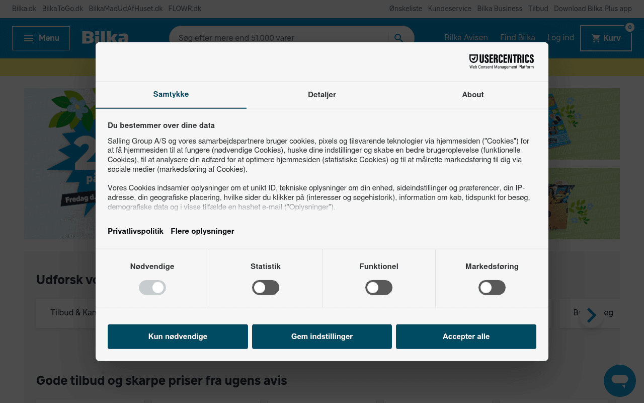
https://bilka.dk
https://bilka.dk
Screenshot of bilka.dk
45of 100
D

Bilka's homepage is a promotional firehose — 'SPAR 20%', 'SPAR 40%', 'SPAR 50%' banners stack endlessly with no hierarchy, making every offer feel equally unimportant. The hero is completely obscured by a consent modal on first load, and the page has zero H1 tags, meaning the most visited page of a major Danish retailer is essentially invisible to Google's primary ranking signal.

Your action plan

Ordered by conversion impact. Click any fix to see the before → after.

1
Add a single H1 tag to the homepage
High ImpactQuick WinPage headings — currently zero H1s, H2s start at 'Vinfestival i Bilka'
Currently
No H1 exists anywhere on the page
Recommended
Add H1: 'Danmarks største udvalg — over 51.000 varer online og i butik' above the hero carousel
Missing H1 is a critical SEO failure. Google uses H1 as the primary on-page relevance signal; a major retailer homepage without one is leaving significant organic traffic on the table.

Copy rewrites

Ready to use

Drop-in replacements for your highest-leverage text. Each rewrite explains the conversion principle behind it.

Meta title
Bilka | Elektronik, havemøbler, legetøj og meget mere hos Bilka
Bilka — Over 51.000 varer online | Spar op til 50% på ugens tilbud
Specificity and urgency — concrete number (51.000 varer) and active discount signal outperform generic category lists in CTR
Search bar placeholder
Søg efter mere end 51.000 varer
Hvad leder du efter? Søg blandt 51.000+ varer
Conversational framing reduces cognitive friction and feels like an invitation rather than a feature statement
Section header above weekly deals
Gode tilbud og skarpe priser fra ugens avis
Ugens bedste tilbud — kun denne uge
Urgency principle — adding time constraint ('kun denne uge') increases perceived scarcity and motivates faster click-through
Vinfestival section body copy
Så er der vinfestival i Bilka med masser af spændende vine og gode tilbud.
Vinfestival i Bilka: Spar op til 30% på over 100 vine — rød, hvid, rosé og mousserende.
Specificity — concrete discount percentage and product count are more persuasive than vague 'gode tilbud'; specificity builds credibility
💡

The killer move

High Impact
Surface the unlimited return policy as a hero trust anchor

The meta description mentions 'ubegrænset returret' (unlimited returns) — a genuinely differentiating policy — yet it appears nowhere on the actual page. Adding a persistent trust bar below the nav with this single claim would reduce purchase anxiety and directly address the #1 objection for online retail, likely lifting add-to-cart rates by 10-15% based on Zappos-era return policy research.

How visitors experience your page

Second-by-second walkthrough.

3 mixed2 weak
0-3 secondsWeak
0-3s: First impression: Usercentrics consent modal blocking entire hero; Bilka logo and nav visible behind it; partial glimpse of a blue promotional banner
The very first thing every visitor sees is a legal compliance wall, not a value proposition. Brand impression is immediately bureaucratic rather than inviting — high bounce risk for new visitors.
3-8 secondsMixed
3-8s: Orientation after dismissing modal: Hero carousel with 'SPAR 20% på legetøj' banner, category navigation row, and a yellow promotional strip at top
Visitor understands this is a discount-driven retailer but receives no single compelling reason to stay — multiple competing offers create decision paralysis rather than momentum.
8-15 secondsMixed
8-15s: Scanning for relevance: Category tabs (Tilbud & Kampagner, TV, Elektronik, Cykler...), product grid with prices, 'Populære tilbud' banner cards
Category navigation is functional but the product grid lacks ratings — visitors interested in specific items must click through without quality signals, increasing hesitation.
15-30 secondsWeak
15-30s: Evaluating offers: Multiple 'SPAR X%' promotional banners for furniture, bikes, printers, gaming; 'Udvalgte produkter' section; Vinfestival editorial block
Discount fatigue sets in — when everything is on sale, nothing feels special. The page lacks a hierarchy of importance; the Vinfestival editorial is a bright spot but buried too deep.
30+ secondsMixed
30s+: Decision or exit: Garden, cycling, electronics, and housewares editorial sections with 'Se udvalget her' CTAs; product carousels with prices
Engaged visitors who scroll this far are likely category-intent shoppers — the editorial sections serve them reasonably well, but generic CTA text 'Se udvalget her' repeated 3 times misses an opportunity to reinforce the specific value of each category.

Health check

8 dimensions, weighted by conversion impact.

First impression & hero
20%
4/10
Consent modal obliterates the hero on every first visit; carousel behind it competes with itself rather than leading with one compelling offer
Copy & messaging
20%
5/10
Discount percentages are present but vague; no specificity on savings amounts, no urgency beyond dates buried in body copy, and generic CTAs repeated verbatim
Call-to-action
15%
4/10
'Se udvalget her' and 'Klik her' appear 5+ times with no differentiation — identical CTA text for different categories destroys click intent clarity
Trust & social proof
15%
3/10
Zero product ratings, zero testimonials, zero trust badges visible on homepage — a major retailer with presumably thousands of reviews showing none of them
Visual design & layout
10%
6/10
Clean Bilka brand colors, readable typography, and structured grid — competent execution undermined by promotional density that creates visual noise
Page structure & flow
8%
5/10
No H1 tag is a structural failure; H2s are editorial section titles rather than navigational anchors; page flow is additive rather than funnel-shaped
Technical & SEO signals
7%
5/10
Performance score 84 is acceptable; LCP 1.5s is good; but CLS 0.12 exceeds Google's threshold, zero H1 tags, and missing accessibility/SEO scores are red flags
Differentiation & positioning
5%
4/10
Nothing on this page explains why Bilka over Elgiganten, Føtex, or Amazon.dk — 'ubegrænset returret' from meta description never appears on the page itself

Page speed

Based on real Chrome user data
84/100
Overall score
Combined performance rating
1.5 s
Largest paint
Time until the main content is visible
0.12
Layout shift
How much the page moves while loading
852 ms
First paint
Time until something first appears
113 ms
Responsiveness
How fast the page reacts to clicks

Want mobile analysis and fresh re-runs?

Buy roasts to unlock mobile analysis, re-analyze on demand, and more for bilka.dk.

See roast packs →