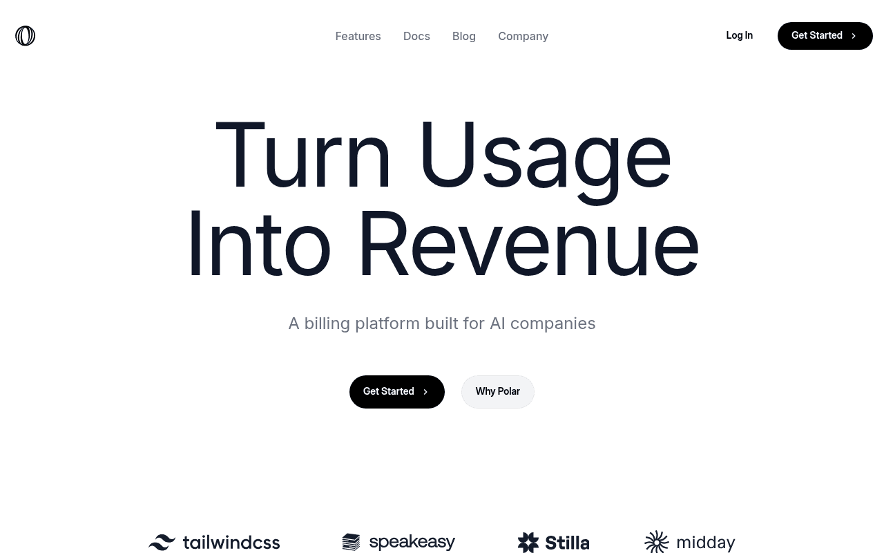
https://polar.sh
https://polar.sh
Screenshot of polar.sh
65of 100
C+

The headline 'Turn Usage Into Revenue' is punchy but the subhead 'A billing platform built for AI companies' does all the heavy lifting — and it's still vague. Four customer logos (Tailwind, Speakeasy, Stilla, Midday) are present but completely wasted without any quantified outcomes, and the page buries its most compelling differentiator — cheapest Merchant of Record on the market — below the fold where almost no one will see it.

Your action plan

Ordered by conversion impact. Click any fix to see the before → after.

1
Surface the MoR pricing differentiator above the fold
High ImpactQuick WinHero subhead: 'A billing platform built for AI companies'
Currently
A billing platform built for AI companies
Recommended
The only billing platform for AI companies with usage metering, feature flags, and the cheapest Merchant of Record on the market.
Unique selling propositions above the fold increase conversion by reducing the need to scroll. 'Cheapest MoR' is a concrete, defensible claim currently buried as an H2 — moving it up front immediately differentiates from Stripe, Lago, and Orb.

Copy rewrites

Ready to use

Drop-in replacements for your highest-leverage text. Each rewrite explains the conversion principle behind it.

Hero subhead
A billing platform built for AI companies
Usage metering, feature flags, and MoR compliance — built specifically for AI products billing on tokens, seats, or events.
Specificity principle: naming the exact use cases (tokens, seats, events) speaks directly to the ICP and filters out irrelevant traffic, increasing qualified conversion rate.
Why Polar secondary CTA
Why Polar
See How It Works
Action-oriented language outperforms brand-centric labels. 'Why Polar' sounds defensive; 'See How It Works' is curiosity-driven and moves visitors toward the product.
Section header for framework adapters
Integrate robust & secure payments in under a minute
Ship billing in under a minute — with Next.js, TypeScript, and 11 more adapters
Specificity and social proof: naming the actual frameworks (Next.js, TypeScript) resonates with the technical audience and the number 13 adapters signals breadth without requiring a click.
Meta description
Monetize your software with ease
Usage-based billing, feature flags, and global MoR compliance for AI companies. Integrate in minutes. Start free.
SEO + specificity: the current meta is 5 words and competes with nothing. Keyword-rich descriptions improve CTR from search by 5-10% and set accurate visitor expectations.
💡

The killer move

High Impact
Add a live pricing calculator in the hero or immediately below it

AI founders obsess over unit economics. A simple interactive calculator — 'Enter your monthly API calls and average tokens per call, see your billing revenue' — would make the value proposition visceral and personal, dramatically increasing time-on-page and qualified signup intent for exactly the ICP this page targets.

How visitors experience your page

Second-by-second walkthrough.

2 strong2 mixed1 weak
0-3 secondsMixed
0-3s First Impression: Large headline 'Turn Usage Into Revenue', subhead 'A billing platform built for AI companies', two CTAs, four customer logos partially visible
The headline is memorable but the subhead is generic. Visitor understands the category but not why Polar vs. Stripe Billing or Orb. They don't yet have a reason to stay.
3-8 secondsStrong
3-8s Value Scan: Three feature pillars (Payments/Usage/Billing, Customer Management, Global MoR), billing pipeline diagram with Checkout/Usage Events/Metering/Invoicing
Technical visitors immediately recognize the full billing stack. The pipeline visualization is effective for developers who think in systems. This section likely retains the ICP.
8-15 secondsStrong
8-15s Proof Seeking: Code snippet for LLM ingestion, live events dashboard mockup showing token counts and billing totals, user_123 billing breakdown
The code-first demo is exactly right for this audience. Seeing real token ingestion code with a live events panel answers 'does this actually work for my use case' — high intent visitors will engage deeply here.
15-30 secondsMixed
15-30s Objection Handling: Dark video section, framework adapters section with Next.js highlighted, Benefits Engine / feature flags section
The dark section breaks momentum without adding proof. Framework adapters are compelling but the visitor is now asking 'what does this cost and who else uses it' — neither question is answered at this scroll depth.
30+ secondsWeak
30s+ Decision Point: Testimonials section header 'Trusted by industry leaders', two text testimonials visible, likely a final CTA below
Testimonials appear too late and without attribution details (company size, ARR, use case). By this point, unconverted visitors are comparison-shopping. A pricing anchor or ROI calculator here would dramatically improve bottom-of-page conversion.

Health check

8 dimensions, weighted by conversion impact.

First impression & hero
20%
7/10
Strong headline and clean design but subhead is generic and the hero has no product visual — a missed opportunity to show the dashboard immediately.
Copy & messaging
20%
6/10
Technical copy is accurate and specific in feature sections but the top-level positioning lacks a defensible differentiator until deep scroll.
Call-to-action
15%
6/10
'Get Started' appears in nav and hero but lacks friction-reducing qualifiers; 'Why Polar' secondary CTA is brand-centric rather than benefit-driven.
Trust & social proof
15%
5/10
Four logos with zero metrics, testimonials buried at page bottom with no attribution details — significant gap for a payments platform where trust is the primary purchase barrier.
Visual design & layout
10%
8/10
Clean dark-navy and white palette, excellent typographic hierarchy, code snippets and UI mockups are well-integrated and credible for a developer audience.
Page structure & flow
8%
7/10
Logical progression from value prop to features to integrations to social proof, but the dark video section disrupts momentum without adding conversion value.
Technical & SEO signals
7%
8/10
PageSpeed 90, FCP 1.1s, LCP 2.5s, CLS 0.00 — excellent technical performance; meta description is severely underoptimized at 5 generic words.
Differentiation & positioning
5%
6/10
'Cheapest Merchant of Record on the market' is a powerful claim hidden as a mid-page H2 — the page's strongest differentiator is its least visible element.

Page speed

Based on real Chrome user data
90/100
Overall score
Combined performance rating
2.5 s
Largest paint
Time until the main content is visible
0.00
Layout shift
How much the page moves while loading
1.1 s
First paint
Time until something first appears
75 ms
Responsiveness
How fast the page reacts to clicks

Want mobile analysis and fresh re-runs?

Buy roasts to unlock mobile analysis, re-analyze on demand, and more for polar.sh.

See roast packs →