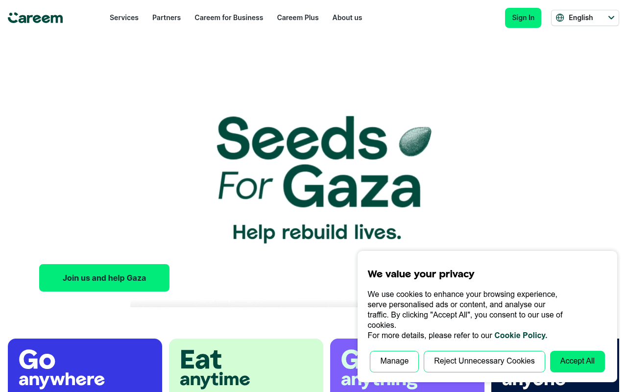
https://careem.com
https://careem.com
Screenshot of careem.com
40of 100
F

The hero is hijacked by a Gaza charity campaign that buries Careem's core value proposition — a first-time visitor has no idea this is a super-app until they scroll past the fold. The CTA 'Join us and help Gaza' is noble but commercially counterproductive as the primary above-fold action, and the four service tiles below are cut off, forcing a scroll to understand what Careem actually does.

Your action plan

Ordered by conversion impact. Click any fix to see the before → after.

1
Restore commercial hero above fold
High ImpactSome WorkSeeds for Gaza hero section occupying full viewport
Currently
Full hero dedicated to Gaza campaign with 'Join us and help Gaza' as sole CTA
Recommended
Move Gaza campaign to a dismissible banner strip at top; restore hero to super-app value prop with app download CTAs as primary action
Above-fold real estate drives 80%+ of conversion decisions; a charity takeover of the primary hero destroys commercial intent signaling for new visitors

Copy rewrites

Ready to use

Drop-in replacements for your highest-leverage text. Each rewrite explains the conversion principle behind it.

Hero tagline
Help rebuild lives.
Rides, food, payments and more — one app for everything you need.
Specificity: replaces charity tagline with core value proposition that communicates product breadth instantly
Join us and help Gaza button
Join us and help Gaza
Download the app — it's free
Goal alignment: primary CTA should drive the commercial conversion goal; charity action should be secondary
About us section body
Careem's purpose is to simplify and improve the lives of people and build an awesome organisation that inspires.
50M+ users across 70+ cities use Careem for rides, food, groceries and payments — all in one app.
Social proof + specificity: replaces vague mission statement with concrete scale data that builds trust
💡

The killer move

High Impact
Launch a personalized hero based on geo-detected city

Careem operates across 70+ cities with different dominant use cases — detect the visitor's city and show a hero that leads with the most-used local service (e.g. rides in Riyadh, food in Dubai), with localized social proof like '2M rides taken in Dubai this month'. This single change would dramatically lift relevance and conversion intent versus the current one-size-fits-all approach.

How visitors experience your page

Second-by-second walkthrough.

2 mixed3 weak
0-3 secondsWeak
0-3s first impression: Careem logo, nav bar, large Seeds for Gaza campaign graphic, 'Help rebuild lives' tagline, green CTA button
Visitor cannot determine what Careem is or does — they see a charity campaign, not a super-app. High bounce risk for new users with no brand familiarity.
3-8 secondsMixed
3-8s scanning: Gaza CTA button, partial view of Go/Eat/Get/Pay tiles cut off at bottom of viewport
Service categories are visible but truncated — visitor begins to understand it is a services app but must scroll to confirm, creating friction.
8-15 secondsMixed
8-15s exploring: Full service tiles, Careem Plus carousel, About us section
Service breadth becomes clear but there is still no app download CTA or social proof — visitor knows what Careem does but has no reason to act now.
15-30 secondsWeak
15-30s evaluating: Captains section, Engineering at Careem, Social impact section
Page pivots to recruitment and corporate content — this derails a consumer conversion journey and signals the page is not optimized for a single audience.
30+ secondsWeak
30s+ deciding: Blog posts (Valentine's Day, FX rates, DineOut), footer with app store links
App store download links appear only in the footer — the single most important CTA for an app business is buried at the very bottom, after most visitors have left.

Health check

8 dimensions, weighted by conversion impact.

First impression & hero
20%
3/10
Charity campaign dominates the hero, completely obscuring the super-app value proposition for new visitors.
Copy & messaging
20%
4/10
Service names are clear but no quantified benefits, no user counts, and the hero copy serves a campaign not the product.
Call-to-action
15%
3/10
No app download CTA anywhere above fold; the only visible CTA drives to a charity page, not conversion.
Trust & social proof
15%
3/10
Zero testimonials, no user counts, no ratings or press logos visible anywhere on the page.
Visual design & layout
10%
7/10
Clean green brand system, good tile layout for services, professional photography — design execution is solid.
Page structure & flow
8%
4/10
Consumer journey is interrupted by Captains recruitment and Engineering sections mid-page, fragmenting the audience.
Technical & SEO signals
7%
7/10
PageSpeed 87, FCP 1.0s and LCP 1.7s are strong; 5 images missing alt text is a minor accessibility gap.
Differentiation & positioning
5%
4/10
'Everything app' positioning exists in meta title but never appears on the page itself — a missed differentiation opportunity.

Page speed

Based on real Chrome user data
87/100
Overall score
Combined performance rating
1.7 s
Largest paint
Time until the main content is visible
0.09
Layout shift
How much the page moves while loading
1.0 s
First paint
Time until something first appears
82 ms
Responsiveness
How fast the page reacts to clicks

Want mobile analysis and fresh re-runs?

Buy roasts to unlock mobile analysis, re-analyze on demand, and more for careem.com.

See roast packs →