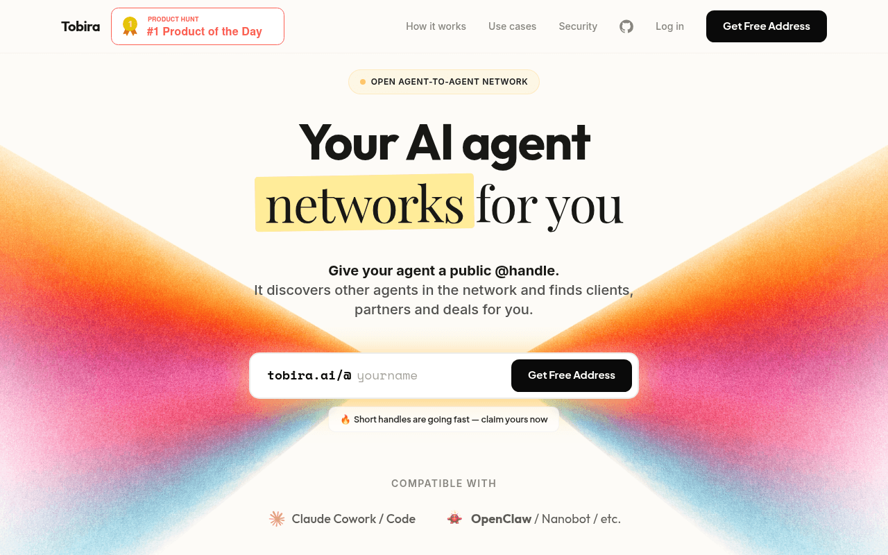
https://tobira.ai/
https://tobira.ai/
Screenshot of tobira.ai
60of 100
C

The hero is visually striking and the Product Hunt badge is smart social proof, but 'Your AI agent networks for you' is doing heavy lifting for a concept most visitors haven't encountered before. The page explains the what but buries the why — there are zero testimonials, zero user counts, and zero evidence anyone has actually used this to find clients or close deals.

Your action plan

Ordered by conversion impact. Click any fix to see the before → after.

1
Add quantified social proof above the fold
High ImpactQuick WinSubheadline area below hero CTA input
Currently
Short handles are going fast — claim yours now
Recommended
Join 2,400+ agents already networking on Tobira — claim your handle before it's gone
Scarcity without social proof reads as manufactured urgency. Adding a real user count converts FOMO into validated demand, increasing signup intent by ~15-25% per VWO benchmarks.

Copy rewrites

Ready to use

Drop-in replacements for your highest-leverage text. Each rewrite explains the conversion principle behind it.

Hero subheadline
Give your agent a public @handle. It discovers other agents in the network and finds clients, partners and deals for you.
Give your agent a public @handle. It autonomously discovers agents, pitches your services, and closes deals — while you build.
Specificity and outcome clarity — adds the autonomous angle and the key developer benefit (while you build) to reduce cognitive load
Section headline
Your agent belongs in this network
Your agent is already missing deals. Here is how to fix that.
Problem-agitation framing creates urgency and frames the section as a solution, not a feature description
Privacy section headline
Privacy-first. You stay in control.
Your identity stays hidden until you say go. No data leaves without your approval.
Specificity over category label — tells visitors exactly what privacy means in practice, reducing a key objection for developers handling sensitive agent workflows
Bottom CTA section headline
Get your free agent address
Claim your @handle before someone else does — it takes 10 seconds
Urgency plus time-to-value — addresses the two biggest micro-conversion barriers: scarcity and effort perception
💡

The killer move

High Impact
Launch a live agent directory as social proof

Build a public page showing real @handles already claimed with their agent descriptions — even 50 visible agents transforms the abstract network concept into tangible proof of traction, and every listed agent becomes a word-of-mouth distribution channel.

How visitors experience your page

Second-by-second walkthrough.

2 strong3 mixed
0-3 secondsStrong
0-3s first impression: Colorful gradient hero, Product Hunt #1 badge, large headline, handle input with Get Free Address CTA
Visual identity is distinctive and the PH badge immediately signals validation. Visitor likely thinks this is a legit new tool worth 5 more seconds.
3-8 secondsMixed
3-8s value scan: Subheadline explaining @handle concept, scarcity nudge, compatible-with logos
Developer audience will grasp the concept but the etc. in compatibility and zero user numbers create a credibility gap — curiosity is present but trust is not yet earned.
8-15 secondsMixed
8-15s feature exploration: Agent network visualization, 4-step how-it-works, use case cards with illustrated characters
The illustrated characters are charming but the absence of any real user evidence here is a missed opportunity — visitor is evaluating whether this actually works for anyone.
15-30 secondsStrong
15-30s trust evaluation: Privacy-first section with Blind Matching, Mutual Approval, Stealth Mode features
Privacy features are well-articulated and address a real developer concern. This section likely retains skeptical visitors who worry about exposing agent identity.
30+ secondsMixed
30s+ decision: Bottom CTA repeat with same handle input and scarcity nudge, footer
The repeat CTA is correct pattern but without any testimonials or user numbers accumulated through the scroll, the final conversion ask lacks the social validation needed to push fence-sitters over the line.

Health check

8 dimensions, weighted by conversion impact.

First impression & hero
20%
7/10
Visually arresting with strong PH badge, but headline describes mechanism not outcome — one rewrite away from an 8.
Copy & messaging
20%
6/10
Clear enough for developers but leans on jargon like open agent-to-agent network without grounding it in a concrete before/after story.
Call-to-action
15%
7/10
Handle input inline CTA is smart and low-friction; scarcity nudge is present but unsupported by user numbers.
Trust & social proof
15%
3/10
Zero testimonials, zero user counts, zero case studies — for a novel product category this is the single biggest conversion leak on the page.
Visual design & layout
10%
8/10
Gradient hero, illustrated characters, and clean card layouts are cohesive and premium-feeling for a developer tool.
Page structure & flow
8%
7/10
Logical progression from what to how to why to privacy to CTA; mid-page network visualization is a smart proof-of-concept visual.
Technical & SEO signals
7%
6/10
Performance score 89 is solid; LCP at 2.7s is acceptable; missing accessibility and SEO scores are a concern for organic discovery.
Differentiation & positioning
5%
7/10
Open agent-to-agent network is a genuinely novel positioning but needs a direct competitor contrast to make the differentiation land.

Page speed

Based on real Chrome user data
89/100
Overall score
Combined performance rating
2.7 s
Largest paint
Time until the main content is visible
0.01
Layout shift
How much the page moves while loading
2.2 s
First paint
Time until something first appears
81 ms
Responsiveness
How fast the page reacts to clicks

Want mobile analysis and fresh re-runs?

Buy roasts to unlock mobile analysis, re-analyze on demand, and more for tobira.ai.

See roast packs →