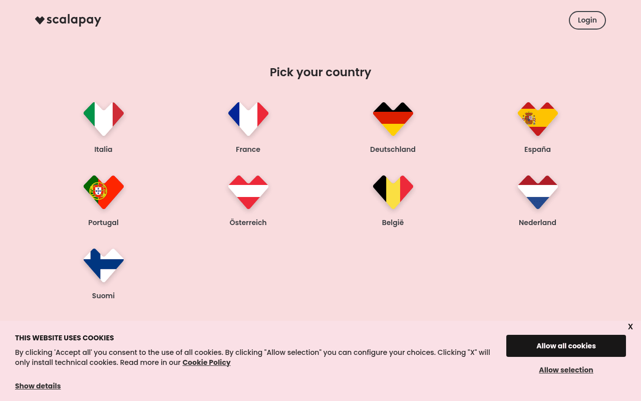
https://scalapay.com
Screenshot of scalapay.com
40of 100
F

The homepage greets visitors with a country-picker gate before showing any value proposition — a conversion-killing friction wall that buries the compelling 'If you love it, scalapay it' hero behind a mandatory detour. With 131 of 140 images missing alt text and an accessibility score of zero, Scalapay is leaving both users and search engines in the dark.

Your action plan

Ordered by conversion impact. Click any fix to see the before → after.

1
Eliminate country-picker as homepage entry point
High ImpactSome WorkFull-screen 'Pick your country' modal/page blocking hero content
Currently
Country selection is the first and only thing visitors see above the fold
Recommended
Auto-detect country via IP geolocation and redirect silently; show a small flag/country switcher in the nav for overrides
Every additional step before value delivery reduces conversion by ~20% per friction point (Fogg Behavior Model). Forcing a choice before showing any benefit is a classic conversion killer.

Copy rewrites

Ready to use

Drop-in replacements for your highest-leverage text. Each rewrite explains the conversion principle behind it.

Hero headline
If you love it, scalapay it
Buy now, pay in 3 interest-free instalments. No fees, ever.
Specificity — the current line is clever but opaque to new visitors; the rewrite states the core value proposition immediately, reducing cognitive load.
Hero subheadline
Shop in your favourite stores and pay in three convenient, interest-free instalments. Receive your order straight away.
Shop at 1,500+ stores today. Split any purchase into 3 equal payments — zero interest, zero fees. Your order ships immediately.
Social proof + specificity + urgency — adds merchant count as trust signal, reinforces zero-cost benefit twice, and confirms instant gratification.
Merchant value proposition stat
48% Increase in basket size
Merchants see 48% larger baskets and 11% more conversions — with zero fraud risk.
Consolidation + specificity — combining the three stats into one punchy sentence makes the merchant ROI case scannable and memorable.
Meta description
Receive your order now. Enjoy it and take your time to pay little by little.
Shop at 1,500+ stores and split your purchase into 3 interest-free instalments. No fees. Order ships immediately. Available across Europe.
SEO specificity — includes keyword-rich terms, quantified social proof, and geographic scope to improve click-through rate from search results.
💡

The killer move

High Impact
Replace country gate with a geo-targeted, dual-audience hero

Build a single hero that auto-detects country and simultaneously speaks to both consumers (shop now, pay later) and merchants (grow revenue 48%) via a tabbed or split-screen layout — eliminating the gate while doubling the addressable conversion surface in one viewport.

How visitors experience your page

Second-by-second walkthrough.

2 mixed3 weak
0-3 secondsWeak
0-3s First impression: Pink background, Scalapay logo, Login button, and a full grid of 9 country flag hearts with 'Pick your country' heading
Visitor has no idea what Scalapay does — they see a country selector with zero context. High probability of bounce from confused or impatient users who expected a product page.
3-8 secondsWeak
3-8s Orientation: Still only the country picker — no value proposition, no hero copy, no product explanation visible anywhere in the viewport
Visitor must make a decision (select country) before understanding the product. This reverses the natural persuasion sequence: value first, commitment second.
8-15 secondsMixed
8-15s Engagement: After selecting country: hero headline 'If you love it, scalapay it', product installment examples (Tiziana Fausti bag at 210 euros x3), and a second country picker
The installment calculator with real products is compelling and concrete — this is the strongest conversion asset on the page, but it arrives too late and after unnecessary friction.
15-30 secondsMixed
15-30s Consideration: How it works steps (online and in-store), merchant trust stat '1,500 merchants', customer testimonials in Italian and English mixed
The 3-step process is clear and reassuring, but testimonials are all identical Italian text ('Permette di realizzare desideri...') suggesting a carousel rendering issue — destroys credibility.
30+ secondsWeak
30s+ Decision: Merchant stats (48% basket increase, 11% conversion lift, 0% risk), footer with company address and nav links
Strong merchant ROI data appears only at the very bottom — merchants who could be converted are likely gone. No persistent CTA, no email capture, no urgency mechanism to close the loop.

Health check

8 dimensions, weighted by conversion impact.

First impression & hero
20%
2/10
A country-picker wall with zero value proposition is the worst possible first impression for a BNPL product competing against Klarna and Afterpay.
Copy & messaging
20%
5/10
The hero tagline is charming but vague; installment examples with real products are effective; testimonials are undermined by apparent rendering duplication.
Call-to-action
15%
3/10
Two generic 'DISCOVER' buttons and no primary conversion CTA above the fold; no sign-up prompt, no merchant onboarding CTA visible until deep scroll.
Trust & social proof
15%
5/10
1,500 merchant count and customer reviews exist but are buried; identical testimonial text across multiple names signals a broken carousel and actively erodes trust.
Visual design & layout
10%
6/10
Brand is cohesive with consistent pink palette and heart motif; flag heart icons are charming; but excessive whitespace in the full-page view wastes real estate.
Page structure & flow
8%
3/10
Country gate before hero content inverts the persuasion funnel; merchant value props appear at the bottom where decision-makers rarely reach.
Technical & SEO signals
7%
2/10
PageSpeed 80 is acceptable (LCP 2.4s), but accessibility score of 0, SEO score of 0, and 131 images without alt text represent critical technical debt.
Differentiation & positioning
5%
5/10
Interest-free and instant delivery are stated but not dramatized against competitors; European multi-market presence is a genuine differentiator that goes unexploited.

Page speed

Based on real Chrome user data
80/100
Overall score
Combined performance rating
2.4 s
Largest paint
Time until the main content is visible
0.08
Layout shift
How much the page moves while loading
1.5 s
First paint
Time until something first appears
128 ms
Responsiveness
How fast the page reacts to clicks

Want mobile analysis and fresh re-runs?

Buy roasts to unlock mobile analysis, re-analyze on demand, and more for scalapay.com.

See roast packs →