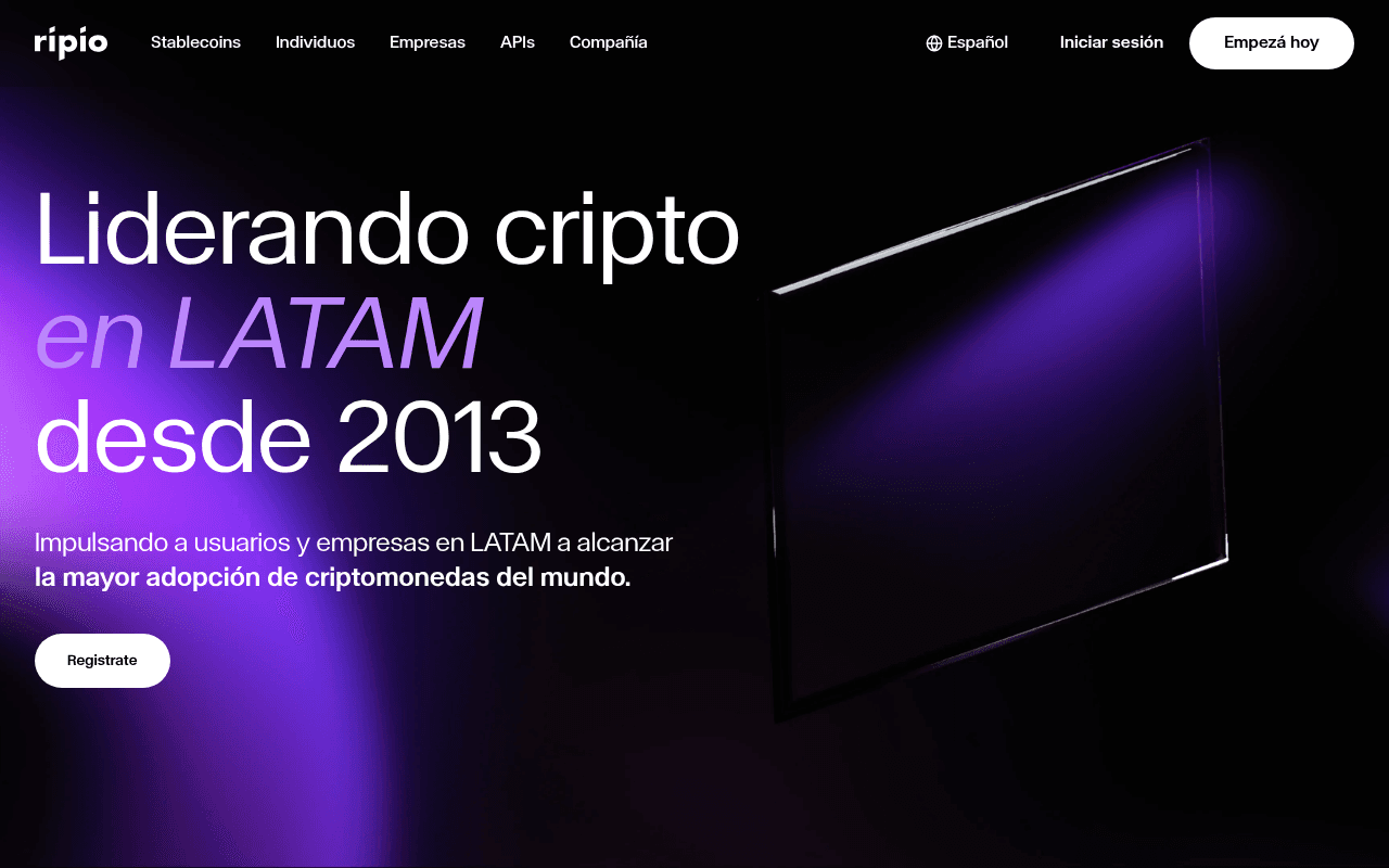
https://www.ripio.com
Screenshot of ripio.com
55of 100
C−

Ripio has genuine authority — 11 years, LATAM leadership, 49 partner logos — but the full-page screenshot reveals a catastrophic content void: the page is 90% black emptiness below the fold. The hero CTA 'Registrate' is a ghost button competing with a bolder 'Empezá hoy' in the nav, creating split-attention and diluted conversion intent.

Your action plan

Ordered by conversion impact. Click any fix to see the before → after.

1
Unify primary CTA styling and eliminate ghost button
High ImpactQuick WinHero 'Registrate' button (white outline) vs nav 'Empezá hoy' (solid white fill)
Currently
Ghost outline 'Registrate' in hero; solid filled 'Empezá hoy' in navbar — two competing CTAs with inverted visual hierarchy
Recommended
Make hero CTA solid filled with high-contrast color (purple or white fill) and use identical label 'Empezá hoy' to match nav — one message, one action
CTA button contrast directly impacts click-through; ghost buttons underperform solid buttons by 15-30% in A/B tests, especially on dark backgrounds

Copy rewrites

Ready to use

Drop-in replacements for your highest-leverage text. Each rewrite explains the conversion principle behind it.

Hero H1
Liderando cripto en LATAM desde 2013
La plataforma cripto más confiable de LATAM — desde 2013
Specificity and trust framing: 'más confiable' addresses crypto's #1 objection (security) while preserving the longevity proof point
Hero subheadline
Impulsando a usuarios y empresas en LATAM a alcanzar la mayor adopción de criptomonedas del mundo.
Compra, vende y gestiona cripto con la infraestructura que ya usan millones en LATAM.
Benefit specificity: replaces abstract mission language with concrete user actions and social proof signal ('millones')
Hero CTA button
Registrate
Empezá hoy — es gratis
Urgency plus friction reduction: matching nav CTA label creates consistency, and 'es gratis' directly removes the #1 signup barrier in fintech
💡

The killer move

High Impact
Make local stablecoins the hero narrative, not a nav item

Ripio's wARS, wBRL, wCOP, wMXN stablecoins are a genuinely rare product in LATAM — no major competitor offers this. Repositioning the hero around 'Tu peso en el mundo cripto' with a live yield calculator would convert both retail and B2B audiences simultaneously while creating a defensible category narrative that Binance and Coinbase cannot replicate.

How visitors experience your page

Second-by-second walkthrough.

3 mixed2 weak
0-3 secondsMixed
0-3s First Impression: Dark hero with large headline 'Liderando cripto en LATAM desde 2013', purple gradient, abstract 3D object, two CTA options
Visual design is premium and credible; however two competing CTAs (ghost Registrate vs solid Empezá hoy in nav) create micro-confusion about the intended action
3-8 secondsWeak
3-8s Value Assessment: Subheadline about crypto adoption, 'Registrate' ghost button, no metrics or social proof visible
Visitor cannot quantify Ripio's scale or trustworthiness — no user count, no volume, no regulatory mention — crypto-skeptical users likely hesitate here
8-15 secondsMixed
8-15s Exploration: Navigation reveals Stablecoins, Individuos, Empresas, APIs segments — page begins to scroll into near-black sections
Nav segmentation is smart for multi-audience targeting, but below-fold content invisibility means exploratory scrollers find nothing to anchor interest
15-30 secondsWeak
15-30s Consideration: Product sections for stablecoins, DeFi, Ripio App, Trade platform, Visa card — if animations load
Product breadth is impressive but presentation relies entirely on scroll animations; users on slower connections or with reduced-motion settings may see empty black sections
30+ secondsMixed
30s+ Decision: B2B section, vision statement, security credentials (SOC1/SOC2), 11 years experience, Ventures section
Strong trust signals exist deep in the page (SOC2, 11 years, liquidity leadership) but placement is too late — most conversion decisions are made in the first 15 seconds

Health check

8 dimensions, weighted by conversion impact.

First impression & hero
20%
6/10
Premium dark aesthetic with clear LATAM positioning, undermined by competing CTAs and zero quantified trust signals above fold
Copy & messaging
20%
5/10
Mission-oriented language dominates over benefit-driven copy; abstract adoption narrative fails to answer 'what do I get and why trust you'
Call-to-action
15%
4/10
Ghost button 'Registrate' in hero is visually subordinate to nav CTA; inconsistent labels and styling split conversion intent
Trust & social proof
15%
5/10
49 partner logos and SOC2 credentials exist but are buried; no user count or transaction volume visible in the critical above-fold zone
Visual design & layout
10%
7/10
Dark purple aesthetic is on-brand for crypto, typography is bold and confident, but full-page rendering reveals severe below-fold content gaps
Page structure & flow
8%
4/10
Full-page screenshot shows 90% black void suggesting animation-dependent content that fails to render statically — structural reliability concern
Technical & SEO signals
7%
8/10
Exceptional PageSpeed score of 95 with 1.0s LCP and 0.02 CLS; 36 images missing alt text is the only notable technical gap
Differentiation & positioning
5%
6/10
'Since 2013' and 'LATAM leader' are genuine differentiators but local stablecoin innovation (wARS, wBRL) — the real moat — is not hero-level messaging

Page speed

Based on real Chrome user data
95/100
Overall score
Combined performance rating
1.0 s
Largest paint
Time until the main content is visible
0.02
Layout shift
How much the page moves while loading
812 ms
First paint
Time until something first appears
49 ms
Responsiveness
How fast the page reacts to clicks

Want mobile analysis and fresh re-runs?

Buy roasts to unlock mobile analysis, re-analyze on demand, and more for ripio.com.

See roast packs →