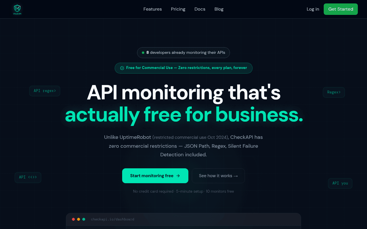
https://www.checkapi.io/
Screenshot of checkapi.io
65of 100
C+

The hero nails the positioning — 'actually free for business' is a sharp jab at UptimeRobot and the social proof badge showing '8 developers' actively undermines credibility rather than building it. The full-page scroll reveals a content-rich page that essentially disappears into a black void below the fold, with decorative floating API tags adding visual noise without communicating value.

Your action plan

Ordered by conversion impact. Click any fix to see the before → after.

1
Replace '8 developers' social proof with a meaningful metric
High ImpactQuick WinSocial proof badge: '8 developers already monitoring their APIs'
Currently
8 developers already monitoring their APIs
Recommended
Show monitors created count, uptime checks run, or remove until you have 500+ users — replace with a specific feature stat like '10,000+ API checks run daily'
Single-digit user counts trigger the opposite of social proof — they signal low adoption and raise trust concerns. Cialdini's social proof requires numbers that feel significant to the audience.

Copy rewrites

Ready to use

Drop-in replacements for your highest-leverage text. Each rewrite explains the conversion principle behind it.

Social proof badge
8 developers already monitoring their APIs
Built for developers who need real API monitoring — not just status codes
Replaces a damaging low-number social proof with a positioning statement that speaks directly to the audience's identity and pain point
Hero subheadline
Unlike UptimeRobot (restricted commercial use Oct 2024), CheckAPI has zero commercial restrictions — JSON Path, Regex, Silent Failure Detection included.
UptimeRobot restricted commercial use in Oct 2024. CheckAPI gives you JSON Path, Regex, and Silent Failure Detection — free, forever, no restrictions.
Specificity and urgency — leading with the competitor pain point as a statement rather than a parenthetical makes the contrast sharper and more scannable
Primary CTA button
Start monitoring free
Start monitoring free — 10 monitors included
Specificity principle: naming the exact free tier value (10 monitors) in the button reduces friction by pre-answering the 'what do I get' objection at the moment of decision
Meta description / page positioning line
Silent Failure Detection with Regex + JSON Path. Zero commercial restrictions on every plan. Unlike UptimeRobot, free forever.
The only API monitor that catches silent failures — 200 OK but broken data. Free forever for commercial use. No UptimeRobot restrictions.
Problem-first framing: leading with the specific pain (200 OK but broken) creates immediate recognition for the target audience before stating the solution
💡

The killer move

High Impact
Launch a public 'CheckAPI vs UptimeRobot' comparison landing page and capture branded search

The UptimeRobot restriction event created a high-intent search audience actively looking for alternatives — a dedicated /vs/uptimerobot page with the existing comparison table, optimized for 'UptimeRobot alternative' keywords, would capture that traffic at peak buying intent without cannibalizing the homepage positioning.

How visitors experience your page

Second-by-second walkthrough.

2 strong2 mixed1 weak
0-3 secondsMixed
0-3s First Impression: Dark hero, large headline 'API monitoring that's actually free for business', green CTA button, '8 developers' badge
Headline is clear and differentiated — developer audience immediately understands the UptimeRobot jab. But '8 developers' badge immediately signals this is a very early-stage product, triggering hesitation about reliability for production use.
3-8 secondsStrong
3-8s Value Scan: Subheadline with UptimeRobot comparison, two CTA buttons, micro-copy 'No credit card required · 5-minute setup · 10 monitors free', partial dashboard mockup
The micro-copy trio is excellent — it removes three common objections simultaneously. Dashboard mockup starting to appear builds product credibility. Visitor likely reads the UptimeRobot callout and feels validated if they came from that pain point.
8-15 secondsWeak
8-15s Feature Evaluation: Dashboard mockup with uptime stats, latency spike alert example, then scrolls into dark void before reaching comparison table
The page goes visually dark and sparse between the hero and the comparison table. Visitors lose momentum here — there is no visual anchor or compelling reason to keep scrolling, risking significant drop-off before reaching the strongest conversion argument.
15-30 secondsStrong
15-30s Comparison and Trust Check: UptimeRobot vs CheckAPI feature comparison table, Silent Failure Detection explanation, code examples
The comparison table is genuinely compelling for the target audience — specific, honest, and addresses real pain. Code examples showing regex patterns speak directly to developers. However, reaching this section requires surviving the dark void above it.
30+ secondsMixed
30s+ Decision Point: Features list, pricing section, how it works, final CTA — no testimonials anywhere on page
Complete absence of social proof throughout the entire page is the critical conversion gap. A developer ready to trust this tool with production monitoring has no third-party validation to reference — they are being asked to take a leap of faith based solely on the product's own claims.

Health check

8 dimensions, weighted by conversion impact.

First impression & hero
20%
7/10
Headline is sharp and competitor-aware, but '8 developers' badge actively damages credibility at the most critical moment
Copy & messaging
20%
7/10
UptimeRobot positioning is smart and specific; micro-copy under CTA is excellent; subheadline buries the lede with a parenthetical
Call-to-action
15%
7/10
Primary CTA is clear with good supporting micro-copy; secondary 'See how it works' provides a lower-commitment path — solid execution
Trust & social proof
15%
2/10
Zero testimonials, zero logos, and a user count of 8 — this is the single biggest conversion blocker on an otherwise well-positioned page
Visual design & layout
10%
6/10
Dark theme suits developer audience; floating API tags add noise without value; dashboard mockup is effective but page goes visually dead mid-scroll
Page structure & flow
8%
5/10
Strongest conversion argument (comparison table) is buried too deep; large dark gap between hero and content kills scroll momentum
Technical & SEO signals
7%
10/10
Perfect PageSpeed score of 100, LCP 0.7s, TBT 0ms — technically flawless, this is genuinely exceptional performance
Differentiation & positioning
5%
8/10
Naming UptimeRobot directly with a specific date is bold and effective — clear category positioning that resonates with the exact target audience

Page speed

Tested via Google Lighthouse
100/100
Overall score
Combined performance rating
0.7 s
Largest paint
Time until the main content is visible
0.029
Layout shift
How much the page moves while loading
0.2 s
First paint
Time until something first appears
0.7 s
Interactive
Time until the page is fully usable
Accessibility: 93SEO: 92Best Practices: 96

Want mobile analysis and fresh re-runs?

Buy roasts to unlock mobile analysis, re-analyze on demand, and more for checkapi.io.

See roast packs →