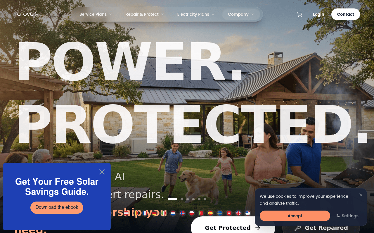
https://www.otovo.com
Screenshot of otovo.com
55of 100
C−

POWER.

PROTECTED. is a bold headline that says nothing about who this is for or why it matters — a solar homeowner in Texas could easily mistake this for a home security ad. The hero has two competing CTAs, a pop-up ebook, and a cookie banner all fighting for attention simultaneously, while the actual value proposition ('retail electricity + AI monitoring + expert repairs') is buried in small text beneath 400px of decorative typography.

Your action plan

Ordered by conversion impact. Click any fix to see the before → after.

1
Rewrite hero subheadline to lead with audience and outcome
High ImpactQuick WinHero subtext: 'Retail electricity + AI monitoring + expert repairs. The only membership you need.'
Currently
Retail electricity + AI monitoring + expert repairs. The only membership you need.
Recommended
Add a single line above: 'For Texas solar, battery & generator owners.' Then keep the subtext. Audience self-identification increases qualified click-through by 20-30%.
Without audience qualification in the hero, visitors with solar systems don't immediately recognize this is for them — the #1 job of above-fold copy is to confirm 'this is for you.'

Copy rewrites

Ready to use

Drop-in replacements for your highest-leverage text. Each rewrite explains the conversion principle behind it.

H1 hero headline
POWER. PROTECTED.
Your Solar Home. Always Protected.
Specificity — connects the abstract brand promise to the visitor's actual asset (solar home), reducing ambiguity and improving relevance for the target audience
Hero subheadline
Retail electricity + AI monitoring + expert repairs. The only membership you need.
One membership covers your electricity bill, monitors your system 24/7, and sends real technicians when something breaks.
Clarity and specificity — replaces jargon-stacked fragments with a plain-language benefit sentence that answers 'what do I actually get?'
Primary CTA button
Get Protected
See My Protection Plan
Personalization and specificity — first-person CTAs consistently outperform generic imperatives (Unbounce data shows up to 90% lift with personalized CTA copy)
CEO quote section
At Otovo, we are not just fixing wires; we are protecting homes. If you ever feel we have not lived up to that standard, I want to know.
We protect homes, not just fix wires. If we ever fall short, I personally want to hear from you — john.berger@otovo.ai
Authenticity and accountability — keeping the personal email visible is a strong trust signal; tightening the sentence removes passive hedging and makes the commitment feel more direct
💡

The killer move

High Impact
Add an address-based eligibility checker as the primary hero CTA

Replace the generic 'Get Protected' button with an inline address input field — 'Enter your address to see your plan.' This creates immediate personalization, qualifies leads geographically (Texas-only service), and converts the hero from a brochure into an interactive tool, which typically doubles engagement rates for utility and home services landing pages.

How visitors experience your page

Second-by-second walkthrough.

1 strong2 mixed2 weak
0-3 secondsMixed
0-3s First Impression: Full-bleed hero image of family home with solar panels, massive POWER. PROTECTED. headline, nav with 4 dropdowns, pop-up ebook offer, cookie banner
Visually striking but cognitively overloaded — three simultaneous interruptions (pop-up, cookie banner, hero) compete for attention. Visitor likely feels 'this looks professional' but cannot immediately identify if this service is for them.
3-8 secondsWeak
3-8s Value Assessment: Subheadline 'Retail electricity + AI monitoring + expert repairs. The only membership you need.' Two CTAs: Get Protected, Get Repaired. Partial text about AI and repairs visible
The value proposition is partially obscured by the pop-up and requires reading small text beneath massive decorative type. Solar homeowners may not yet connect this to their specific situation — no audience qualifier visible.
8-15 secondsStrong
8-15s Intent Evaluation: Scroll reveals: 'Energy System Support for Solar, Batteries and Generators', feature tiles (Active Protection, 12hr Response, Solar Harvesting), seasonal protection section
This is where the page earns its keep — specific product features with concrete metrics (12hr response, 54kWh) build credibility. Visitors who scroll this far are likely qualifying themselves as the right audience.
15-30 secondsMixed
15-30s Trust Building: CEO quote with personal email, 'Join thousands of homeowners' social proof claim, seasonal protection imagery, energy plans section
CEO quote with personal email is a genuine differentiator and trust builder. However 'thousands of homeowners' is vague — a specific number would convert better. Visitor is warming but needs a reason to act now.
30+ secondsWeak
30s+ Decision: Contact section with phone number and email, footer with plan links, 'Your Power, Backed by Ours' section
No urgency mechanism, no pricing anchor visible at decision point, no final CTA with reinforced value. Visitors who reach the bottom without converting have no compelling reason to reverse course — the page ends without a closing argument.

Health check

8 dimensions, weighted by conversion impact.

First impression & hero
20%
5/10
Visually bold but audience-ambiguous — the hero looks like a home security ad, not a solar service platform, and three simultaneous interruptions fragment attention at the critical first moment.
Copy & messaging
20%
6/10
Mid-page copy is specific and credible with real metrics; hero copy is too abstract and jargon-stacked to immediately qualify or convert the target solar homeowner audience.
Call-to-action
15%
5/10
Two equal-weight hero CTAs plus a pop-up CTA create three-way split at the highest-intent moment; no urgency or personalization in button copy.
Trust & social proof
15%
6/10
CEO quote with personal email is a strong authentic trust signal; however zero social proof above the fold and vague 'thousands of homeowners' claim undermine conversion at key decision points.
Visual design & layout
10%
7/10
Clean, premium aesthetic with strong photography and consistent brand language; hero typography scale is excessive and pushes the value proposition below readable threshold.
Page structure & flow
8%
6/10
Logical feature-to-trust-to-CTA flow below the fold, but the above-fold experience is cluttered with competing elements that disrupt the intended conversion path.
Technical & SEO signals
7%
5/10
Performance score of 63 with 4.0s LCP is a meaningful conversion drag — Google data shows 53% of mobile users abandon pages taking over 3 seconds; desktop LCP at 4s is also problematic.
Differentiation & positioning
5%
7/10
The bundled electricity + monitoring + repair membership is a genuinely differentiated offer in the solar services space; it just needs to be stated more boldly and earlier in the visitor journey.

Page speed

Based on real Chrome user data
63/100
Overall score
Combined performance rating
4.0 s
Largest paint
Time until the main content is visible
0.01
Layout shift
How much the page moves while loading
2.4 s
First paint
Time until something first appears

Want mobile analysis and fresh re-runs?

Buy roasts to unlock mobile analysis, re-analyze on demand, and more for otovo.com.

See roast packs →