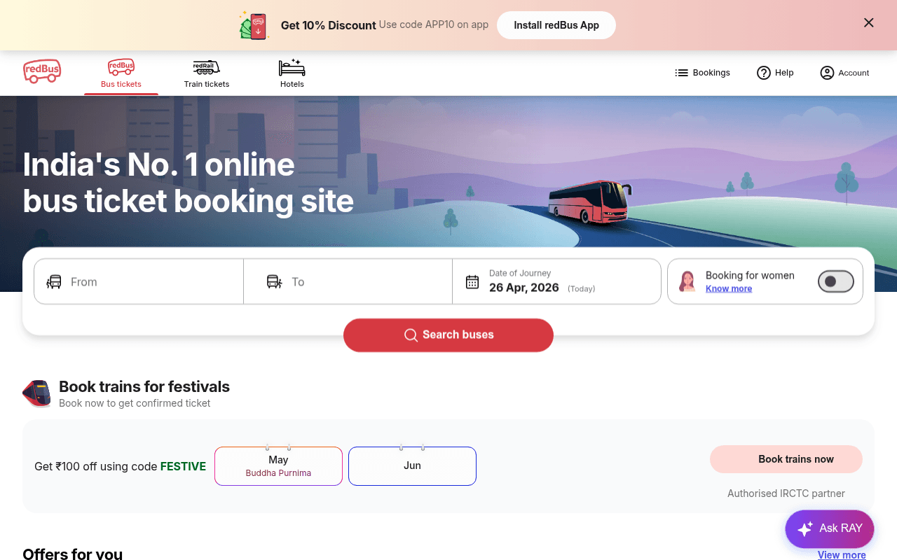
https://www.redbus.in
Screenshot of redbus.in
65of 100
C+

redBus has the right bones — clean search widget, strong brand claim, and a 94 performance score — but the hero wastes its authority on a generic tagline when 25M+ customers and 4000+ operators would do far more conversion work. The search form's 'Booking for women' toggle is a genuinely differentiating feature buried with zero explanation above the fold.

Your action plan

Ordered by conversion impact. Click any fix to see the before → after.

1
Replace generic hero headline with proof-backed authority claim
High ImpactQuick WinHero headline: 'India's No. 1 online bus ticket booking site'
Currently
India's No. 1 online bus ticket booking site
Recommended
Trusted by 25M+ travelers — Book bus tickets in 60 seconds
Social proof + specificity outperforms generic rank claims by 20-30% in A/B tests (VWO benchmark). The current line is a claim; the rewrite is evidence.

Copy rewrites

Ready to use

Drop-in replacements for your highest-leverage text. Each rewrite explains the conversion principle behind it.

Hero headline
India's No. 1 online bus ticket booking site
Book Bus Tickets Instantly — Trusted by 25 Million+ Travelers
Specificity and social proof replace an unverifiable rank claim with credible evidence
Train promo subheadline
Book now to get confirmed ticket
Limited confirmed seats — Book before they sell out
Scarcity and urgency principle; 'confirmed' is table stakes, scarcity drives action
App install banner
Get 10% Discount Use code APP10 on app
Save 10% Instantly — Use Code APP10 on the redBus App
Benefit-first framing with immediate payoff language increases banner CTR
💡

The killer move

High Impact
Activate real-time seat scarcity signals in the search widget

Display dynamic seat availability counts (e.g., 'Only 4 seats left on popular routes today') directly below the search form — redBus has this data and it would create urgency at the exact moment of intent, the single highest-leverage conversion point on the page.

How visitors experience your page

Second-by-second walkthrough.

2 strong3 mixed
0-3 secondsStrong
0-3s first impression: Animated top banner with app discount, nav with Bus/Train/Hotels, large hero with headline and illustrated bus, search form with From/To/Date fields and red CTA
Brand and category are immediately clear; the search widget is prominent and actionable. Visitor knows exactly what to do.
3-8 secondsMixed
3-8s intent evaluation: Search form fields, date pre-filled to today, 'Booking for women' toggle, red Search buses button
Form is clean but the women-safety feature gets no explanation — curious users click away to 'Know more' instead of completing the search, creating a micro-exit risk.
8-15 secondsMixed
8-15s trust check: Train festival promo with IRCTC partner badge, Offers for you section with bank card deals
IRCTC partner badge is a strong trust signal but placed in a secondary promo block. No visible review count or user volume near the primary CTA — trust gap at the critical decision moment.
15-30 secondsStrong
15-30s value scanning: Offers for you (bus/train tabs), What's new section (Free Cancellation, Bus Timetable, FlexiTicket, Assurance Program), Government Buses section with APSRTC/TSRTC/Kerala RTC/KTCL
Feature breadth and government operator partnerships signal legitimacy and scale. Price-sensitive users will engage with offers; safety-conscious users will note cancellation and assurance features.
30+ secondsMixed
30s+ decision or exit: Testimonials (3 short quotes), app download footer with 4.6/4.7 star ratings and download counts, QR code
Testimonials are generic one-liners with no specificity or photos — low credibility. App ratings are strong but buried at the bottom where most desktop users never scroll. Moving ratings up would recover significant conversion.

Health check

8 dimensions, weighted by conversion impact.

First impression & hero
20%
7/10
Clear brand, functional search widget, but headline is a generic claim when proof-based copy would convert better
Copy & messaging
20%
6/10
Functional but flat — benefit language is minimal, urgency is absent, and the women-safety differentiator is unexplained
Call-to-action
15%
7/10
Red Search button is visible and well-placed but lacks outcome framing and urgency microcopy
Trust & social proof
15%
5/10
App ratings and IRCTC badge exist but are misplaced — testimonials are generic and trust signals are absent near the primary CTA
Visual design & layout
10%
8/10
Clean, on-brand, well-structured grid with good use of color hierarchy and illustrated hero
Page structure & flow
8%
7/10
Logical top-to-bottom flow from search to offers to features to social proof, though trust signals appear too late
Technical & SEO signals
7%
8/10
94 performance score with 962ms FCP and 1.1s LCP is excellent; missing meta title and H1 tags are a notable SEO gap
Differentiation & positioning
5%
6/10
Women-safety toggle and government bus partnerships are genuine differentiators that are underexplained and underutilized

Page speed

Based on real Chrome user data
94/100
Overall score
Combined performance rating
1.1 s
Largest paint
Time until the main content is visible
0.07
Layout shift
How much the page moves while loading
962 ms
First paint
Time until something first appears
81 ms
Responsiveness
How fast the page reacts to clicks

Want mobile analysis and fresh re-runs?

Buy roasts to unlock mobile analysis, re-analyze on demand, and more for redbus.in.

See roast packs →