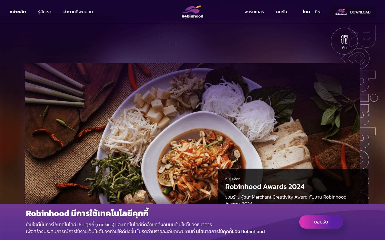
https://robinhood.in.th
Screenshot of robinhood.in.th
35of 100
F

The hero is a massive purple void — the full-page screenshot shows almost nothing but gradient blur for the top two-thirds of the page, with the actual food image and headline buried below the fold. A food delivery app that hides food is a conversion crime. The 'ดาวน์โหลด' CTA exists in the nav but the hero has no visible headline or download button above the fold at 1280px.

Your action plan

Ordered by conversion impact. Click any fix to see the before → after.

1
Surface headline and CTA above the fold
High ImpactSome WorkHero section — currently shows only dark purple gradient with no text or CTA visible at 1280x800
Currently
Full-width image with no overlaid headline or download button visible above fold
Recommended
Add a left-aligned hero headline ('กิน ทุกไลฟ์สไตล์ ครบ จบที่เดียว') with a high-contrast download CTA button (App Store + Google Play) positioned in the top 60% of the viewport
Nielsen's above-the-fold principle: users spend 57% of viewing time above the fold. Zero value proposition visible = zero conversion trigger.

Copy rewrites

Ready to use

Drop-in replacements for your highest-leverage text. Each rewrite explains the conversion principle behind it.

Hero tagline visible in page text
กิน ทุกไลฟ์สไตล์ ครบ จบที่เดียว
กิน ทุกไลฟ์สไตล์ ครบ จบที่เดียว — ไม่มีค่า GP ร้านได้เต็มๆ
Specificity + differentiation: calling out the zero-GP model immediately separates Robinhood from Grab/LINE MAN and gives both consumers and partners a reason to choose
Partner section headline
ขายดีแบบไม่เสียค่า GP
เพิ่มยอดขายโดยไม่เสียค่า GP — ร้านได้กำไรเต็มทุกออเดอร์
Loss aversion + specificity: framing GP savings as profit retention is more emotionally compelling than just 'no GP fee'
Rider section CTA
สมัครเข้าร่วมเป็นไรเดอร์ส่งอาหารกับ Robinhood Rider
รับเงินทุกวัน — สมัครเป็นไรเดอร์ Robinhood วันนี้
Urgency + benefit-first: leading with the daily payout benefit (already mentioned in body copy) as the CTA hook dramatically increases click intent
App download section
ดาวน์โหลดแอปฯ แอปพลิเคชัน ที่รู้ใจและตอบโจทย์ในทุกวัน
โหลด Robinhood ฟรี — สั่งอาหาร เรียกรถ ส่งของ ครบในแอปเดียว
Clarity + value stacking: listing specific services removes ambiguity and reinforces the super-app positioning that justifies the download
💡

The killer move

High Impact
Make zero-GP the hero, not a footnote

Robinhood's zero-GP model is the single most powerful differentiator in Thai food delivery — yet it appears in small body copy mid-page. Restructure the hero to lead with this: a split-screen showing restaurant owners keeping 100% margin vs. competitors taking 30-35% GP, with a live counter of baht saved by partner restaurants. This transforms the homepage from a generic app landing page into a movement that earns press coverage and word-of-mouth from the restaurant community.

How visitors experience your page

Second-by-second walkthrough.

2 mixed3 weak
0-3 secondsWeak
0-3s first impression: Dark purple nav, large blurred gradient hero with no visible headline or CTA, cookie banner covering bottom
Visitor cannot identify what this app does or why to care. No value proposition is visible. High bounce risk — the page looks like a loading error.
3-8 secondsMixed
3-8s orientation: Scrolls slightly to find food image with 'Robinhood Awards 2024' blog card and category icons (กิน เที่ยว เรียกรถ)
Category icons hint at super-app scope but the Awards blog card is not a conversion driver. Visitor understands it is a food/lifestyle app but still has no reason to download.
8-15 secondsMixed
8-15s evaluation: Services section with food ordering description, partner and rider sign-up blocks
The zero-GP partner proposition is genuinely differentiated but buried mid-page. Restaurant owners who scroll this far may engage; casual consumers likely already bounced.
15-30 secondsWeak
15-30s decision: Download section with app store badges and 'โหลดเลย' prompt
Download CTA appears very late with no reinforcing social proof (ratings, user count). Visitor has no emotional or rational anchor to commit to the download at this point.
30+ secondsWeak
30s+ deep engagement: Footer with nav links, social channels, legal links, and duplicate download button
Only the most motivated visitors reach here. No testimonials, no press logos, no app store ratings anywhere on the page — trust signals are completely absent throughout.

Health check

8 dimensions, weighted by conversion impact.

First impression & hero
20%
2/10
Hero is an empty purple gradient at 1280px — no headline, no CTA, no food visible above the fold; functionally invisible value proposition
Copy & messaging
20%
5/10
Zero-GP differentiator exists in body copy but is never used as a lead message; taglines are generic lifestyle phrases rather than benefit-driven hooks
Call-to-action
15%
3/10
Download CTA only appears in nav and deep in page; no above-fold CTA, no urgency, no app store rating to support the ask
Trust & social proof
15%
2/10
Zero testimonials, zero app ratings, zero partner counts, zero press mentions — a complete absence of social proof on a page asking for app downloads
Visual design & layout
10%
5/10
Brand colors are consistent and food photography is appetizing, but the hero layout wastes the entire viewport with decorative gradient instead of conversion content
Page structure & flow
8%
4/10
Blog card appears before services section, disrupting the logical consumer-to-download funnel; partner and rider sections compete for attention without clear hierarchy
Technical & SEO signals
7%
2/10
No H1, no H2, 24 of 28 images missing alt text — foundational SEO is broken; PageSpeed data unavailable but structural issues alone suppress organic visibility
Differentiation & positioning
5%
5/10
Zero-GP model is a genuine competitive differentiator but is treated as a mid-page feature rather than the brand's primary positioning statement

Want mobile analysis and fresh re-runs?

Buy roasts to unlock mobile analysis, re-analyze on demand, and more for robinhood.in.th.

See roast packs →