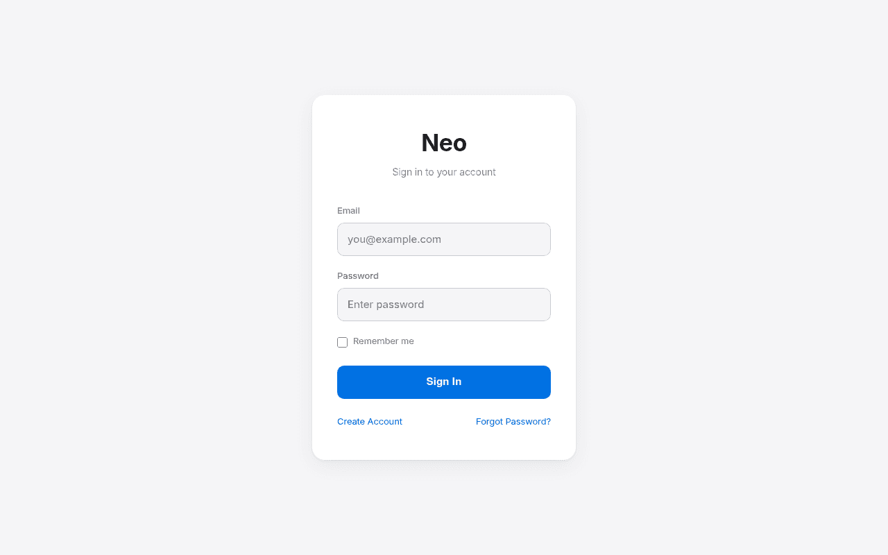
https://staging.nobleneo.com/remittance/add
Screenshot of staging.nobleneo.com
40of 100
F

A login card floating in a sea of grey with zero brand context — if a user lands here cold from an ad or email link, they have no idea what Neo does or why they should trust it with their money. The full-page screenshot reveals the card is vertically centered in a massive empty canvas, which is wasted real estate that could be reinforcing trust signals for a fintech handling international remittances.

Your action plan

Ordered by conversion impact. Click any fix to see the before → after.

1
Add trust signals below the Sign In button
High ImpactQuick WinWhite card — empty space below Remember me checkbox and above Sign In button
Currently
No security indicators, no SSL badge, no encryption mention
Recommended
Add a single line with a lock icon: 'Secured with 256-bit encryption' directly beneath the Sign In button
Fintech users are acutely security-conscious; Baymard research shows trust badges near CTAs reduce form abandonment by up to 42% in financial contexts

Copy rewrites

Ready to use

Drop-in replacements for your highest-leverage text. Each rewrite explains the conversion principle behind it.

H1 heading
Neo
NobleNeo — Send Money Globally
Specificity and brand clarity — a single word gives zero context to cold-traffic users arriving via email or ad
Subtitle text
Sign in to your account
Sign in to send your next transfer
Goal-oriented framing keeps the user focused on their job-to-be-done rather than a generic system instruction
Sign In button
Sign In
Sign In to My Account
Ownership language (my) marginally increases click-through by reinforcing personal relevance per CTA copy best practices
💡

The killer move

High Impact
Implement a split-screen trust architecture

Convert the login page to a 50/50 split: left panel shows a remittance-specific value prop with real transfer fee comparison data and a customer count stat; right panel contains the login form. This single change addresses trust, differentiation, and new-user conversion simultaneously — Wise and Remitly both use this pattern because it works for exactly this audience.

How visitors experience your page

Second-by-second walkthrough.

1 strong2 mixed2 weak
0-3 secondsMixed
0-3s first impression: Centered white card on grey background, bold Neo heading, two form fields, blue Sign In button
Clean and uncluttered but brand-anonymous — user cannot confirm they are on the right site or that it is legitimate without prior brand familiarity
3-8 secondsStrong
3-8s orientation: Email and password fields, Remember me checkbox, Sign In CTA
Form is immediately scannable and actionable; low cognitive load means returning users will proceed quickly
8-15 secondsWeak
8-15s hesitation check: No security badges, no brand logo beyond text, no social proof, no product context
First-time or cold-traffic users will hesitate — there is nothing to confirm this is a legitimate, regulated remittance platform before entering credentials
15-30 secondsMixed
15-30s decision: Create Account and Forgot Password links at bottom of card
Create Account is discoverable but competes visually with Forgot Password; new users may not self-identify as needing to create an account without a value proposition prompt
30+ secondsWeak
30s+ exploration: Nothing — no footer, no navigation, no additional content anywhere on the page
Users with any doubt have nowhere to go for reassurance — no help link, no contact, no terms — increasing abandonment probability for high-value remittance transactions

Health check

8 dimensions, weighted by conversion impact.

First impression & hero
20%
4/10
Functional but brand-naked — a fintech login page with no trust anchors or value context is a conversion liability
Copy & messaging
20%
3/10
Three lines of generic system copy do zero persuasive work for a money-transfer platform
Call-to-action
15%
6/10
Sign In button is visually prominent with good contrast but lacks supporting micro-copy to reduce hesitation
Trust & social proof
15%
2/10
Zero security indicators, no regulatory badges, no social proof — critically absent for a financial platform handling remittances
Visual design & layout
10%
5/10
Clean card design is undermined by the card floating off-center in a vast empty grey canvas
Page structure & flow
8%
5/10
Single-purpose form is appropriately minimal but wastes the full desktop canvas that could reinforce conversion
Technical & SEO signals
7%
9/10
Exceptional PageSpeed scores — 93 performance, 1.2s FCP, zero CLS — technical foundation is best-in-class
Differentiation & positioning
5%
2/10
Nothing on this page communicates what Neo does, why it is better, or why a user should trust it with their money

Page speed

Tested via Google Lighthouse
93/100
Overall score
Combined performance rating
1.2 s
Largest paint
Time until the main content is visible
0
Layout shift
How much the page moves while loading
1.2 s
First paint
Time until something first appears
1.4 s
Interactive
Time until the page is fully usable
Accessibility: 93SEO: 100Best Practices: 96

Want mobile analysis and fresh re-runs?

Buy roasts to unlock mobile analysis, re-analyze on demand, and more for staging.nobleneo.com.

See roast packs →