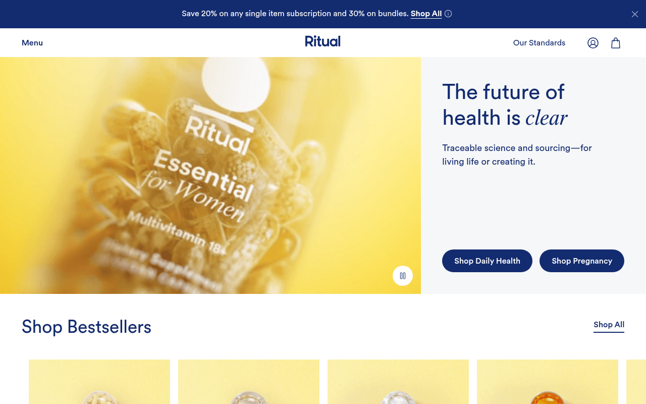
https://ritual.com
https://ritual.com
Screenshot of ritual.com
70of 100
B−

Ritual's hero is visually stunning but conversion-lazy — 'The future of health is clear' is a brand manifesto, not a reason to buy today. Two competing CTAs (Shop Daily Health vs Shop Pregnancy) split intent without guiding the visitor, and the massive empty whitespace between the subhead and buttons wastes 200px of premium real estate that could hold a trust signal or social proof hook.

Your action plan

Ordered by conversion impact. Click any fix to see the before → after.

1
Collapse hero whitespace and inject social proof above CTAs
High ImpactQuick WinHero right panel — 200px gap between subhead and CTA buttons
Currently
Empty white space between 'Traceable science and sourcing' and the two CTA buttons
Recommended
Insert a single trust bar line: '2.6 Billion Capsules Sold · Clinical Studies at UCLA & UMass' directly above the CTA buttons
Nielsen Norman research shows trust signals placed adjacent to CTAs increase click-through by 15-20%; this space is currently dead conversion real estate

Copy rewrites

Ready to use

Drop-in replacements for your highest-leverage text. Each rewrite explains the conversion principle behind it.

Hero headline
The future of health is clear
Supplements backed by science you can actually trace
Specificity — replaces abstract brand promise with a concrete, differentiated claim that answers 'why Ritual'
Hero subheadline
Traceable science and sourcing—for living life or creating it.
Every ingredient traced to its source. Clinical studies at leading universities. No guesswork.
Specificity and credibility — replaces poetic copy with verifiable proof points that reduce purchase anxiety
Announcement bar
Save 20% on any single item subscription and 30% on bundles. Shop All
New customers: Save 20% on subscriptions, 30% on bundles — your first order ships free. Shop Now
Urgency and loss aversion — adding 'first order' scarcity and free shipping removes friction and clarifies the offer is time-limited to new customers
Mid-page section header
Our radical idea: supplements should work.
Most supplements are unverified. Ours are clinically studied at UCLA and UMass.
Social proof and specificity — naming actual universities converts abstract credibility into verifiable authority, directly addressing supplement skepticism
💡

The killer move

High Impact
Add an interactive ingredient tracer in the hero panel

Ritual's core differentiator is traceability — build a single-line interactive element in the hero whitespace where visitors type an ingredient (e.g. Vitamin D3) and instantly see its source country and supplier. This transforms the abstract 'traceable' claim into a live product demo that no competitor can replicate and dramatically reduces purchase skepticism at the highest-traffic point on the page.

How visitors experience your page

Second-by-second walkthrough.

2 strong3 mixed
0-3 secondsMixed
0-3s First Impression: Full-bleed yellow product photo of Essential for Women bottle, headline 'The future of health is clear', two dark CTAs, announcement bar with 20% off
Visual identity is strong and premium; however the headline reads as brand manifesto rather than value proposition — visitor understands the aesthetic but not yet why to buy
3-8 secondsMixed
3-8s Orientation: Two competing CTAs (Shop Daily Health vs Shop Pregnancy), subhead about traceable science, large empty whitespace in hero panel
Visitor with clear intent (e.g. prenatal) can self-select, but undecided visitors get no guidance — the whitespace signals the page isn't fully optimized and may reduce confidence
8-15 secondsStrong
8-15s Evaluation: Shop Bestsellers grid with 4-5 products, trust badges (2.6B capsules sold, Clean Label Project, 100% traceable), pricing at $33-$54
Trust badges are well-chosen and specific; product grid gives tangible options — visitor starts evaluating whether price-to-value makes sense, but no subscription savings are visible on cards
15-30 secondsStrong
15-30s Consideration: Traceability section with map, Find Your Ritual category navigation, single testimonial, scientific leadership team with credentials
Credentialed scientists and traceability story are powerful differentiators for a skeptical health consumer — this section likely converts fence-sitters who need authority validation
30+ secondsMixed
30s+ Decision: For Skeptics section, community lifestyle imagery, category navigation footer, email signup, full site footer
The 'For Skeptics, By Skeptics' framing is clever positioning but appears too late — visitors who needed this reassurance may have already bounced; consider surfacing this message earlier in the flow

Health check

8 dimensions, weighted by conversion impact.

First impression & hero
20%
7/10
Visually premium and brand-coherent but headline is philosophical not persuasive, and 200px of dead whitespace wastes conversion real estate
Copy & messaging
20%
6/10
Traceability positioning is genuinely differentiated but execution leans poetic over specific — key proof points (UCLA studies, Clean Label) are buried below the fold
Call-to-action
15%
6/10
Two clear CTAs with good contrast but split intent without a decision aid, and no subscription savings are surfaced at point of CTA
Trust & social proof
15%
7/10
Strong trust badges, named scientists with credentials, and traceability map — but single testimonial is weak and placed too deep in the page
Visual design & layout
10%
8/10
Cohesive yellow-and-navy brand system, clean typography, and high-quality product photography — one of the stronger visual executions in supplement DTC
Page structure & flow
8%
6/10
Logical category-to-product-to-proof flow but 'For Skeptics' trust section appears too late and the hero whitespace disrupts momentum
Technical & SEO signals
7%
8/10
PageSpeed 90 with 1.2s FCP and 1.5s LCP is excellent for an image-heavy DTC page; 9 images missing alt text is a minor accessibility and SEO gap
Differentiation & positioning
5%
8/10
Traceability-first positioning with clinical study investment and named scientists is genuinely rare in supplements — the 'For Skeptics' framing is smart but underutilized above the fold

Page speed

Based on real Chrome user data
90/100
Overall score
Combined performance rating
1.5 s
Largest paint
Time until the main content is visible
0.01
Layout shift
How much the page moves while loading
1.2 s
First paint
Time until something first appears
111 ms
Responsiveness
How fast the page reacts to clicks

Want mobile analysis and fresh re-runs?

Buy roasts to unlock mobile analysis, re-analyze on demand, and more for ritual.com.

See roast packs →