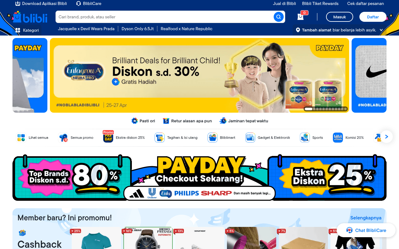
https://blibli.com
https://blibli.com
Screenshot of blibli.com
55of 100
C−

Blibli's homepage is a discount warehouse explosion — three competing PAYDAY banners, an 80% off strip, and a 25% extra discount block all scream simultaneously above the fold, creating visual noise that dilutes every individual offer. The trust signals (Pasti Ori, Retur, Jaminan) are tiny icon rows buried between banners, doing almost no heavy lifting where they matter most. The page converts on volume, not strategy.

Your action plan

Ordered by conversion impact. Click any fix to see the before → after.

1
Consolidate competing hero promotions into one dominant message
High ImpactSome WorkHero carousel + PAYDAY banner strip below fold showing 80% and 25% simultaneously
Currently
Three separate PAYDAY promotional zones visible within first scroll competing for attention
Recommended
Unify PAYDAY campaign into one hero banner with a single CTA: primary discount headline, countdown timer, and one action button — relegate secondary offers to category tiles
Hick's Law: more choices reduce decision speed. Multiple competing banners increase cognitive load and suppress click-through on any individual offer by 20-30% per Nielsen research

Copy rewrites

Ready to use

Drop-in replacements for your highest-leverage text. Each rewrite explains the conversion principle behind it.

Meta title
Blibli: Belanja Online ✔ Pasti ORI, Aman, Nyaman & Terpercaya!
Blibli: Belanja Online Pasti Original — Gratis Ongkir, Retur Mudah, 15 Hari Garansi
Specificity principle: replacing vague adjectives (Aman, Nyaman) with concrete guarantees (Gratis Ongkir, 15 Hari Garansi) increases CTR from search results
Hero banner headline
Brilliant Deals for Brilliant Child!
Hemat s.d. 30% untuk Si Kecil — Plus Gratis Hadiah Eksklusif
Localization + specificity: Indonesian-language headline with concrete saving amount outperforms English tagline for local audience trust and relevance
Trust strip below hero
Pasti ori Retur alasan apa pun Jaminan tepat waktu
100% Produk Original atau Uang Kembali — Retur Gratis Kapan Saja — Pengiriman Tepat Waktu Dijamin
Consequence-driven copy: stating the outcome of the guarantee (uang kembali, gratis) is more persuasive than the feature label alone — addresses purchase anxiety directly
New member section headline
Member baru? Ini promomu!
Belanja Pertama? Langsung Hemat Rp25.000 — Daftar Gratis Sekarang
Urgency + specificity: leading with the concrete saving amount and a direct action verb converts browsers into registrants faster than a question-based headline
💡

The killer move

High Impact
Launch a persistent above-fold trust bar that quantifies Blibli's guarantee in rupiah terms

Replace the generic Pasti Ori icon strip with a sticky sub-header showing a real number: '14 Juta+ Produk Original — Retur Gratis dalam 15 Hari — Jika Tidak Ori, Kami Ganti 2x Lipat.' Quantified guarantees with a penalty clause (2x refund) are the single highest-converting trust mechanism in Indonesian e-commerce and directly counter the primary objection that prevents first-time buyers from choosing Blibli over competitors.

How visitors experience your page

Second-by-second walkthrough.

1 strong3 mixed1 weak
0-3 secondsMixed
0-3s First Impression: Blibli logo, search bar, Masuk/Daftar buttons, PAYDAY hero banner with Enfagrow 30% discount, and partial side banners
Visitor recognizes a major e-commerce site and a promotional event, but the competing visual elements (left PAYDAY panel, center Enfagrow, right Nike partial) create split attention — no single message dominates
3-8 secondsMixed
3-8s Orientation: Trust strip (Pasti ori, Retur, Jaminan), category navigation row with Ekstra diskon 25% badge, and top of PAYDAY promotional strip
Visitor scans for their category or a compelling deal entry point. Trust signals are noticed but feel small. The Promo badge on Ekstra diskon 25% draws attention but competes with too many equal-weight options
8-15 secondsStrong
8-15s Deal Evaluation: PAYDAY strip with Top Brands 80% off, brand logos (Adidas, Unilever, Philips, Sharp), Member baru cashback section, Flash Sale section
Deal-motivated visitors engage here — recognized brand logos with large discount percentages create credibility and pull. Flash Sale with prices visible accelerates product-level consideration
15-30 secondsMixed
15-30s Category Exploration: Lagi disuka di Blibli product grid, Penawaran spesial, Special deals hari ini, Exclusive brand deals banners
Page becomes repetitive — multiple sections with similar product card layouts and PAYDAY branding blur together. Visitors without a specific intent may experience decision fatigue and bounce
30+ secondsWeak
30s+ Commitment or Exit: Endless product grid across categories, footer with SEO text about Blibli, help links, payment methods
No re-engagement hook or exit-intent mechanism. SEO footer text is invisible to real users. Visitors who haven't converted by this point have no compelling reason to register or purchase — the page relies entirely on deal volume rather than a closing argument

Health check

8 dimensions, weighted by conversion impact.

First impression & hero
20%
6/10
Strong brand recognition and active campaign energy, but three competing PAYDAY zones above fold dilute the primary message and split visitor attention
Copy & messaging
20%
5/10
Discount percentages do the heavy lifting; trust and value proposition copy is vague, short, and mostly in Indonesian without specificity or consequence-driven language
Call-to-action
15%
5/10
Masuk and Daftar buttons exist in header but no prominent CTA tied to the hero offer; new member value prop has no direct registration button at point of mention
Trust & social proof
15%
6/10
Pasti Ori guarantee and brand logos provide baseline trust, but no ratings, review counts, or transaction volume data visible above fold to reinforce credibility
Visual design & layout
10%
6/10
Consistent brand colors and professional banner production, but the page is visually dense with competing focal points and insufficient whitespace between sections
Page structure & flow
8%
5/10
Logical e-commerce hierarchy (hero, categories, deals, products) but repetitive section patterns and no progressive narrative — feels like a catalog dump rather than a guided journey
Technical & SEO signals
7%
7/10
Strong performance score of 84, excellent LCP at 1.3s and minimal CLS at 0.01; 18 images missing alt text is the primary technical gap worth addressing
Differentiation & positioning
5%
5/10
Pasti Ori and return policy are genuine differentiators but presented as small icons rather than a bold positioning statement that separates Blibli from Tokopedia or Shopee

Page speed

Based on real Chrome user data
84/100
Overall score
Combined performance rating
1.3 s
Largest paint
Time until the main content is visible
0.01
Layout shift
How much the page moves while loading
1.1 s
First paint
Time until something first appears
231 ms
Responsiveness
How fast the page reacts to clicks

Want mobile analysis and fresh re-runs?

Buy roasts to unlock mobile analysis, re-analyze on demand, and more for blibli.com.

See roast packs →