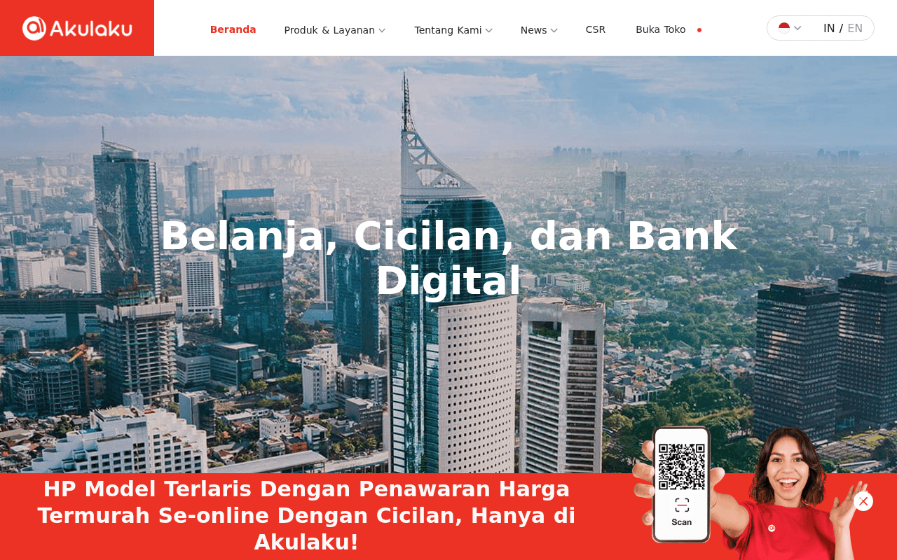
https://akulaku.com
https://akulaku.com
Screenshot of akulaku.com
50of 100
D

The hero headline 'Belanja, Cicilan, dan Bank Digital' is a category label, not a value proposition — it tells visitors what Akulaku is, not why they should care. The stat counters show '0Juta+' in the page text (likely a JS animation not captured), which is a trust-killer if it ever fails to load. Zero CTAs above the fold on a fintech homepage is a conversion crime.

Your action plan

Ordered by conversion impact. Click any fix to see the before → after.

1
Add a primary CTA button in the hero section
High ImpactQuick WinHero section — currently has headline and city skyline background only
Currently
No CTA button visible above the fold; nearest action is 'Buka Toko' in nav
Recommended
Add two CTA buttons below the headline: 'Download Aplikasi' (primary, red) and 'Buka Toko Gratis' (secondary, outlined white)
Nielsen's above-fold principle: visitors who don't see a clear next action within 5 seconds have 50%+ higher bounce rates. A fintech homepage with no hero CTA is leaving the highest-intent traffic with nowhere to go.

Copy rewrites

Ready to use

Drop-in replacements for your highest-leverage text. Each rewrite explains the conversion principle behind it.

H1 Hero Headline
Belanja, Cicilan, dan Bank Digital
Belanja Sekarang, Bayar Nanti — Cicilan Fleksibel untuk Semua Kebutuhan
Benefit-led framing: shifts from category description to customer outcome, triggering desire rather than mere recognition
H2 Subheadline
Menjadi Perusahaan Fintech Terunggul & Terpercaya
Dipercaya 32 Juta+ Pengguna di Asia Tenggara — Belanja, Cicilan, dan Perbankan Digital dalam Satu Aplikasi
Specificity and social proof: replaces an aspirational internal goal with a concrete user-count proof point that builds immediate credibility
Merchant section headline
Mereka Membuka Toko di Akulaku
Bergabung dengan 90.000+ Merchant — Buka Toko Gratis, Raih 33 Juta Pelanggan
Social proof plus specificity: leads with the merchant count and the customer reach benefit, making the value exchange explicit and compelling
PayLater section headline
Semua menggunakan Akulaku PayLater
Tingkatkan Penjualan hingga 40% dengan Akulaku PayLater
Outcome specificity: the 40% transaction increase stat is buried in body copy — surfacing it in the headline immediately communicates ROI to merchant decision-makers
💡

The killer move

High Impact
Implement audience-segmented hero with dynamic CTA routing

Replace the single generic hero with a split-path hero that asks 'Saya adalah: Pembeli / Merchant / Mitra Bisnis' — routing each segment to a tailored landing experience. This single change addresses the core problem: one page trying to convert three fundamentally different audiences with one message, which statistically converts none of them optimally.

How visitors experience your page

Second-by-second walkthrough.

1 strong3 mixed1 weak
0-3 secondsMixed
0-3s First Impression: Full-width Jakarta skyline hero, Akulaku logo, nav with Produk & Layanan, and headline 'Belanja, Cicilan, dan Bank Digital' — no CTA button visible
Visitor understands this is a fintech company but has no immediate action to take. The beautiful hero image creates a professional impression, but the absence of a CTA means high-intent visitors have no conversion path in the critical first seconds.
3-8 secondsStrong
3-8s Value Assessment: Scrolls to stats row showing 8Juta+ monthly users, 32Juta+ registered, 295Juta+ transactions, plus 90K sellers and 95% satisfaction claims
The social proof density here is excellent — multiple credibility signals in quick succession. If the JS counters animate correctly, this section does heavy trust-building work. Risk: if counters show 0, this becomes the page's biggest liability.
8-15 secondsMixed
8-15s Product Discovery: Ekosistem Keuangan section with three product cards: Aplikasi Akulaku, Solusi Pembayaran, Solusi Bank Digital — dark image overlays with white text
Visitor gets a sense of product breadth but the dark overlay cards lack descriptive copy. A consumer visitor cannot tell what differentiates these products or which one applies to them, creating decision paralysis rather than guiding them toward a specific action.
15-30 secondsMixed
15-30s Merchant Consideration: Inovasi Teknologi section with 5 tech features, then Merchant section with brand logos (Xiaomi, Samsung, Oppo, etc.) and 'Buka Toko Sekarang' CTA
The technology section reads as corporate brochure content — relevant to B2B partners but confusing for consumer visitors. The merchant section with recognizable brand logos is the page's strongest trust signal, but it appears too far down for most visitors to reach.
30+ secondsWeak
30s+ Conversion Decision: PayLater section with partner logos (Shopee, Tokopedia, JD.id, etc.), three benefit stats, then footer with app store badges and contact information
By this point, visitors who haven't converted are likely lost. The PayLater section has strong merchant-facing data (30%, 22%, 40% improvements) but no consumer CTA. App store badges appearing only in the footer means the primary conversion goal is buried at the very bottom of a long page.

Health check

8 dimensions, weighted by conversion impact.

First impression & hero
20%
4/10
Visually polished skyline hero but zero CTA above the fold and a generic category headline waste the highest-intent moment on the page
Copy & messaging
20%
4/10
Stats are strong but buried; headlines describe the company rather than articulating customer benefits; PayLater ROI data is undersurfaced
Call-to-action
15%
3/10
No primary CTA in the hero; 'Buka Toko Sekarang' appears mid-page for merchants only; app download path is footer-only — multiple audience segments are underserved
Trust & social proof
15%
7/10
295M+ transactions, 32M+ users, 90K merchants, recognizable brand logos, and 95% satisfaction create a strong credibility stack — undermined only by JS-dependent counters
Visual design & layout
10%
6/10
Clean, professional brand execution with consistent red-and-white palette; dark overlay cards in the ecosystem section sacrifice readability for aesthetics
Page structure & flow
8%
5/10
Page tries to serve consumers, merchants, and B2B partners simultaneously without clear audience segmentation, creating a diluted journey for all three
Technical & SEO signals
7%
7/10
PageSpeed 87 with 1.4s FCP and 2.5s LCP is solid; all 13 images missing alt text is an accessibility and SEO gap; canonical tag is correctly set
Differentiation & positioning
5%
4/10
Operating across shopping, BNPL, and digital banking is genuinely differentiated but the page never articulates why this ecosystem approach benefits the user over single-purpose competitors

Page speed

Based on real Chrome user data
87/100
Overall score
Combined performance rating
2.5 s
Largest paint
Time until the main content is visible
0.00
Layout shift
How much the page moves while loading
1.4 s
First paint
Time until something first appears
86 ms
Responsiveness
How fast the page reacts to clicks

Want mobile analysis and fresh re-runs?

Buy roasts to unlock mobile analysis, re-analyze on demand, and more for akulaku.com.

See roast packs →