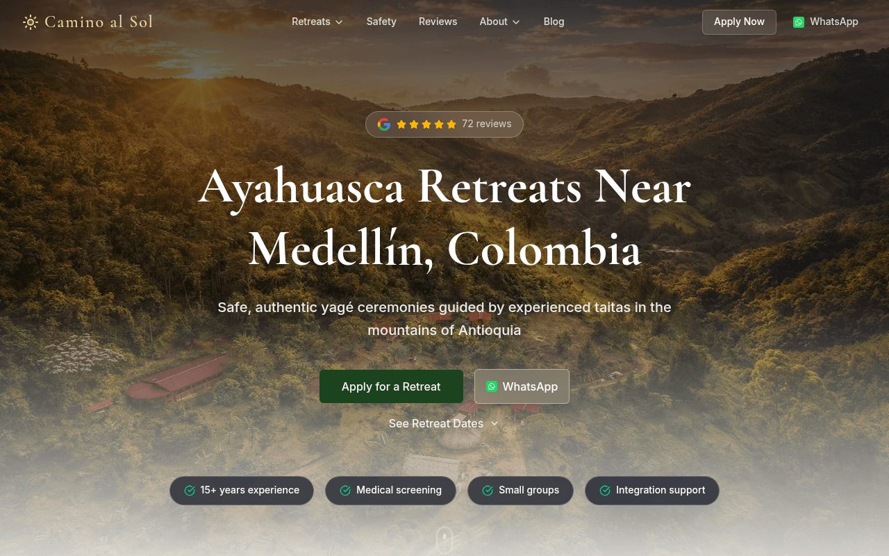
https://yaogara-v4.vercel.app/
Screenshot of yaogara-v4.vercel.app
70of 100
B−

The hero is genuinely stunning — aerial mountain photography, Google 5-star badge, and four trust chips land exactly right for a high-anxiety purchase. But the full-page view reveals a content-heavy single column that buries pricing and availability, and the duplicate feature cards ('Authentic Tradition' appears twice verbatim) suggest a carousel rendering issue that erodes the polished first impression.

Your action plan

Ordered by conversion impact. Click any fix to see the before → after.

1
Surface pricing or date range above the fold
High ImpactQuick WinSee Retreat Dates dropdown below CTAs
Currently
Collapsed accordion link with no price signal
Recommended
Add inline text beneath CTAs: 'Next retreat: [Month] · From $XXX · 8 spots remaining' to anchor expectations and create urgency
High-consideration purchases ($500-$3000+) require price anchoring early; hiding cost increases bounce from price-sensitive visitors who self-qualify out before applying

Copy rewrites

Ready to use

Drop-in replacements for your highest-leverage text. Each rewrite explains the conversion principle behind it.

Hero subheadline
Safe, authentic yagé ceremonies guided by experienced taitas in the mountains of Antioquia
Traditional yagé ceremonies led by Siona taitas — medically screened, small groups, 15+ years guiding guests from around the world.
Specificity and social proof — naming the tradition (Siona) and adding implied volume ('guests from around the world') increases credibility over generic safety claims
Why Guests Choose section intro
A safe, grounded space to experience traditional yagé with guidance, structure, and care — just outside Medellín.
Most retreats offer ceremony. Camino al Sol offers ceremony, medical screening, integration support, and 15 years of doing this responsibly — 45 minutes from Medellín.
Differentiation and contrast — positioning against the generic category ('most retreats') makes the value proposition concrete and memorable
Apply for a Retreat CTA button
Apply for a Retreat
Apply for a Retreat — Free, No Commitment
Friction reduction — for a high-consideration purchase, clarifying the application is free and non-binding removes the perceived risk of clicking and increases CTR
Video section label
The goal is not spectacle. This short preview helps guests understand the atmosphere of Yaogara before they travel: quiet, real, and designed for depth rather than distraction.
See Yaogara before you arrive — the land, the ceremony space, and the quiet that makes the work possible.
Sensory specificity over meta-commentary — visitors respond to place-based imagery language, not descriptions of what a video is trying to accomplish
💡

The killer move

High Impact
Add a medical screening explainer as a conversion asset, not just a trust chip

The audience's #1 objection is safety — not cost. Build a dedicated inline section or modal that shows exactly what the medical screening covers (contraindications, intake form, response time), turning the screening process itself into the primary trust differentiator and pre-qualifying applicants who would otherwise drop off mid-funnel.

How visitors experience your page

Second-by-second walkthrough.

2 strong3 mixed
0-3 secondsStrong
0-3s First Impression: Full-bleed aerial mountain photo, Google 5-star badge with 72 reviews, large serif headline, two CTAs, four trust chips
Immediate category clarity and trust establishment — the Google badge above the headline is an unusually smart placement that pre-empts skepticism before the value prop lands
3-8 secondsMixed
3-8s Value Assessment: Subheadline with taitas/Antioquia, Apply and WhatsApp CTAs, See Retreat Dates link, four feature chips
Visitor wants to know cost and next available date — neither is visible, creating friction for the most common qualifying question; WhatsApp as secondary CTA is smart for international audiences
8-15 secondsMixed
8-15s Credibility Check: Why Guests Choose section with four feature cards (duplicated), Find Your Path retreat options
Duplicate cards create a jarring credibility dip right when the visitor is deciding whether to trust the brand — the content itself is good but the rendering bug undermines it
15-30 secondsStrong
15-30s Deeper Evaluation: Video section with play button, three icon-based differentiators, How the Process Works numbered steps
The process section directly addresses the anxiety of first-timers — showing a clear 3-step path from Apply to Screening reduces perceived complexity and moves visitors toward action
30+ secondsMixed
30s+ Conversion Decision: Stories of Transformation testimonials section (below fold)
Testimonials arriving this late in the page are underutilized — for a high-trust purchase, social proof should appear within the first two scrolls, not as a final reassurance section

Health check

8 dimensions, weighted by conversion impact.

First impression & hero
20%
8/10
Aerial photography, pre-headline Google badge, and four trust chips create an unusually strong above-fold trust stack for a sensitive category
Copy & messaging
20%
6/10
Clear and honest but lacks specificity on outcomes, pricing signals, and facilitator identity — the video caption copy is actively counterproductive
Call-to-action
15%
7/10
Two-CTA hero (Apply + WhatsApp) is smart for international audiences but missing friction-reducers like 'free' or 'no commitment' on the primary button
Trust & social proof
15%
7/10
Google badge placement is excellent; testimonials are buried too deep and facilitators are anonymous — named guides with photos would significantly lift trust
Visual design & layout
10%
8/10
Warm earth tones, serif typography, and the mountain backdrop are tonally perfect for the audience — duplicate card bug is the only meaningful visual flaw
Page structure & flow
8%
6/10
Hero to features to retreats to video to process is logical but pricing and availability are absent from the entire visible flow, creating a critical information gap
Technical & SEO signals
7%
10/10
PageSpeed 99 performance, 0.9s LCP, zero CLS, 92 SEO score — technically exceptional, among the best scores possible for a content-rich page
Differentiation & positioning
5%
6/10
Siona tradition and 15+ years are genuine differentiators but are mentioned once and not amplified — the brand story behind the taitas is the real moat and it is underused

Page speed

Tested via Google Lighthouse
99/100
Overall score
Combined performance rating
0.9 s
Largest paint
Time until the main content is visible
0
Layout shift
How much the page moves while loading
0.3 s
First paint
Time until something first appears
0.9 s
Interactive
Time until the page is fully usable
Accessibility: 94SEO: 92Best Practices: 100

Want mobile analysis and fresh re-runs?

Buy roasts to unlock mobile analysis, re-analyze on demand, and more for yaogara-v4.vercel.app.

See roast packs →