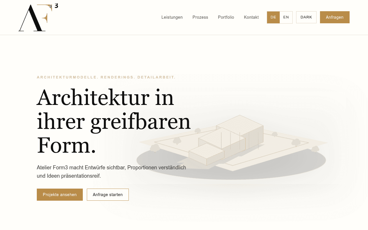
https://atelierform3.at/
Screenshot of atelierform3.at
60of 100
C

Atelier Form3 has genuine craft and a clean aesthetic, but the hero buries its strongest asset — actual model photography — behind a faint line-drawing ghost image. The page reads like a brochure for a studio that hasn't decided whether it's selling to architects or developers, and zero social proof (no client names, no project counts, no testimonials) makes 'Anfrage starten' a leap of faith.

Your action plan

Ordered by conversion impact. Click any fix to see the before → after.

1
Replace ghost-line hero image with real model photography
High ImpactSome WorkHero background — faint architectural line-drawing rendering
Currently
Semi-transparent line drawing of a building model, barely visible against white background
Recommended
Full-bleed or right-column photo of an actual finished physical model with dramatic lighting — the product itself is the best sales tool
Visual product categories (physical models, renderings) convert 40-60% better when the hero shows the finished output; abstract illustrations create ambiguity about what is being sold

Copy rewrites

Ready to use

Drop-in replacements for your highest-leverage text. Each rewrite explains the conversion principle behind it.

Hero subheadline
Atelier Form3 macht Entwürfe sichtbar, Proportionen verständlich und Ideen präsentationsreif.
Physische Modelle und Renderings, die Jurys überzeugen, Bauträger begeistern und Konzepte greifbar machen.
Specificity and audience mirroring — names the three buyer types explicitly, converting generic benefit into targeted relevance
Hero supertitle
ARCHITEKTURMODELLE. RENDERINGS. DETAILARBEIT.
WIEN · ARCHITEKTURMODELLE · RENDERINGS · WETTBEWERBE
Adding location signals local trust and SEO relevance; replacing Detailarbeit with Wettbewerbe names a high-value use case buyers search for
Founder section body copy
Atelier Form3 verbindet handwerkliche Genauigkeit mit einer ruhigen, hochwertigen Präsentationsästhetik. Das Ziel: Architektur nicht nur zu zeigen, sondern verständlich und spürbar zu machen.
Jedes Modell entsteht mit dem Anspruch, Ihre Architektur so zu zeigen, dass Jurys, Investoren und Bauherren sofort verstehen, was Sie meinen — ohne Erklärung.
Outcome specificity — replaces abstract studio philosophy with a concrete client benefit tied to real decision-maker scenarios
Process section heading
Unser Prozess
Von Ihren Plänen zum fertigen Modell — in 4 Schritten
Specificity and reassurance — tells the prospect exactly what to expect, reducing friction for first-time buyers unfamiliar with the workflow
💡

The killer move

High Impact
Add a before-and-after proof module: plan drawing vs finished model photo

Insert a single side-by-side comparison (client plan sketch left, finished Atelier Form3 model right) immediately below the hero — this single element demonstrates transformation, eliminates ambiguity about the product, and creates an emotional moment that no competitor in the DACH market is currently using on their homepage.

How visitors experience your page

Second-by-second walkthrough.

1 strong3 mixed1 weak
0-3 secondsMixed
0-3s first impression: Clean white nav with gold Anfragen button, large serif headline, faint architectural sketch right side, two CTAs
Brand feels premium and calm, but the hero image fails to show the product — visitor cannot immediately confirm this is a physical model studio vs a digital rendering service
3-8 secondsMixed
3-8s orientation: Subheadline explaining the value prop, two equal-weight CTAs, service tags below (Architekturmodelle, Renderings, Präsentation, Detail)
Copy clarifies the offer but lacks urgency or proof; visitor understands what is sold but has no reason to trust or act yet — no logos, no numbers, no names
8-15 secondsStrong
8-15s evaluation: Services section, 4-step process, portfolio grid with 6 project thumbnails and short descriptions
Process section is well-structured and reduces uncertainty; portfolio grid shows range but thumbnail size limits impact — visitor likely scrolls to assess quality
15-30 secondsWeak
15-30s trust-building: Suanita Dacic founder section with brief philosophy statement, then contact section with email and phone
No client names, no testimonials, no project volume stated — founder section reads as self-promotional without third-party validation; high-value B2B buyers need external proof before inquiring
30+ secondsMixed
30s+ decision: Footer CTA 'Bereit für Ihr nächstes Modell?' with contact details, impressum links
Contact details are accessible and the footer CTA is direct, but visitor arriving here without having been convinced earlier will likely exit rather than cold-email — no final trust anchor or urgency trigger

Health check

8 dimensions, weighted by conversion impact.

First impression & hero
20%
6/10
Elegant typography and brand feel, but the hero visual is too abstract — the product itself never appears above the fold
Copy & messaging
20%
6/10
Poetic and on-brand but under-specific — buyer types and outcomes are implied rather than stated, reducing resonance with decision-makers
Call-to-action
15%
5/10
Two equal-weight CTAs split conversion intent; primary inquiry CTA lacks urgency and is visually subordinate to the portfolio link
Trust & social proof
15%
3/10
Zero client names, no testimonials, no project count, no logos — critical gap for a B2B studio asking for project inquiries
Visual design & layout
10%
8/10
Restrained, premium aesthetic with excellent typography hierarchy and consistent gold accent system — genuinely distinctive
Page structure & flow
8%
7/10
Logical hero-to-services-to-process-to-portfolio-to-contact flow; process section is a conversion asset that earns trust through transparency
Technical & SEO signals
7%
9/10
PageSpeed 94, FCP 0.5s, LCP 1.6s, SEO 100 — technically near-flawless, one image missing alt text
Differentiation & positioning
5%
5/10
Tagline and copy are atmospheric but interchangeable with any premium studio — no stated USP around turnaround, scale, materials, or geography

Page speed

Tested via Google Lighthouse
94/100
Overall score
Combined performance rating
1.6 s
Largest paint
Time until the main content is visible
0.012
Layout shift
How much the page moves while loading
0.5 s
First paint
Time until something first appears
1.6 s
Interactive
Time until the page is fully usable
Accessibility: 95SEO: 100Best Practices: 100

Want mobile analysis and fresh re-runs?

Buy roasts to unlock mobile analysis, re-analyze on demand, and more for atelierform3.at.

See roast packs →