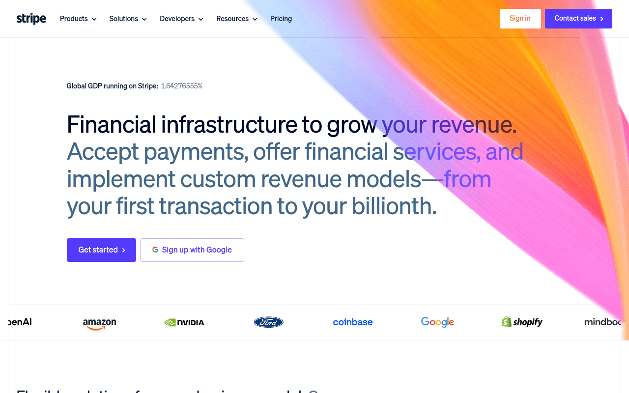
https://stripe.com
https://stripe.com
Screenshot of stripe.com
75of 100
B

Stripe's hero is visually stunning but strategically soft — the animated GDP ticker shows '1.64276555%' with no context, wasting prime real estate on a vanity metric that confuses more than it converts. The dual-CTA setup is clean, but 'Get started' competes with 'Contact sales' without segmenting the audience, leaving enterprise buyers and indie devs to self-sort with zero guidance. The logo carousel is world-class social proof buried below a fold that already had room for it.

Your action plan

Ordered by conversion impact. Click any fix to see the before → after.

1
Anchor the GDP stat with context
Medium ImpactQuick Win'Global GDP running on Stripe: 1.64276555%' above hero headline
Currently
Raw percentage with no explanation or emotional hook
Recommended
Add a parenthetical: 'Global GDP running on Stripe: 1.64% — over $1.9T processed in 2025' linking the two data points
Isolated statistics without anchoring context fail the 'so what' test — visitors skip numbers they cannot interpret in under 2 seconds (Nielsen Norman Group)

Copy rewrites

Ready to use

Drop-in replacements for your highest-leverage text. Each rewrite explains the conversion principle behind it.

Hero headline
Financial infrastructure to grow your revenue.
The payment infrastructure behind Amazon, Google, and Shopify.
Social proof and specificity — leading with recognizable customers converts faster than abstract category claims
Hero subheadline
Accept payments, offer financial services, and implement custom revenue models—from your first transaction to your billionth.
Accept payments, launch financial products, and build custom billing — all on one platform that scales from day one to enterprise.
Specificity and benefit framing — 'day one to enterprise' directly addresses the scale anxiety of both startup and enterprise audiences
Flexible solutions section header
Flexible solutions for every business model.
One platform. Every revenue model.
Brevity and positioning — shorter, bolder phrasing increases scannability and reinforces platform breadth without sounding generic
💡

The killer move

High Impact
Add a real-time revenue counter to the hero

Replace the static GDP percentage with a live-updating counter showing dollars processed on Stripe in the last 60 seconds — this transforms an abstract stat into visceral, undeniable proof of scale that no competitor can replicate and creates an immediate 'wow' moment that drives word-of-mouth sharing.

How visitors experience your page

Second-by-second walkthrough.

3 strong2 mixed
0-3 secondsStrong
0-3s first impression: Stripe logo, nav with Products/Solutions/Developers, colorful gradient hero, large headline, two CTAs
Brand recognition does heavy lifting — returning visitors orient instantly, but new visitors may not immediately grasp what Stripe does beyond 'financial infrastructure'
3-8 secondsMixed
3-8s value scan: Full hero headline, GDP stat, Get Started + Sign up with Google CTAs, partial logo strip
Visitor reads the headline and looks for proof — the GDP percentage is cryptic without context, and logos are just barely visible, creating a missed trust moment right when it matters most
8-15 secondsStrong
8-15s product exploration: Flexible solutions grid: payments, billing, agentic commerce, card issuing, stablecoins, embedded payments
Product breadth is impressive and well-illustrated with UI mockups — developer and product audiences will engage here, but enterprise buyers may feel overwhelmed without a clear starting point
15-30 secondsStrong
15-30s credibility check: Stripe Sessions conference banner, backbone stats (135+ currencies, $1.9T volume, 99.999% uptime, 200M+ subscriptions)
The stats section is genuinely compelling — $1.9T and 99.999% uptime are enterprise-grade proof points that should appear much earlier in the page flow
30+ secondsMixed
30s+ decision phase: Enterprise case studies (Hertz, URBN, Instacart, Le Monde), professional services CTA, Stripe-certified partners
Enterprise social proof is strong but arrives very late — visitors with high intent may have already bounced or navigated away before reaching Hertz and Fortune 100 claims

Health check

8 dimensions, weighted by conversion impact.

First impression & hero
20%
8/10
Visually exceptional with strong brand equity, but the GDP stat is unexplained and logo proof arrives a beat too late
Copy & messaging
20%
7/10
Headline is clear and ambitious but leans abstract — subheadline lists features rather than outcomes for distinct personas
Call-to-action
15%
6/10
Dual self-serve CTAs are clean but fail to segment enterprise vs developer audiences, leaving high-value leads without a clear path
Trust & social proof
15%
8/10
Fortune 100 stat, $1.9T volume, and A-list logos are world-class — sequencing buries the best proof below the fold
Visual design & layout
10%
9/10
Gradient hero, product UI mockups, and dark stats section create a polished, premium visual hierarchy throughout
Page structure & flow
8%
7/10
Logical product-to-proof-to-enterprise flow, but conference banner mid-page interrupts momentum at a critical trust-building moment
Technical & SEO signals
7%
8/10
PageSpeed 95 with 896ms FCP and 958ms LCP is excellent — 30 missing alt texts are the only meaningful technical gap
Differentiation & positioning
5%
7/10
Scale claims are strong but 'financial infrastructure' is category language competitors also use — no unique mechanism articulated

Page speed

Based on real Chrome user data
95/100
Overall score
Combined performance rating
958 ms
Largest paint
Time until the main content is visible
0.00
Layout shift
How much the page moves while loading
896 ms
First paint
Time until something first appears
83 ms
Responsiveness
How fast the page reacts to clicks

Want mobile analysis and fresh re-runs?

Buy roasts to unlock mobile analysis, re-analyze on demand, and more for stripe.com.

See roast packs →