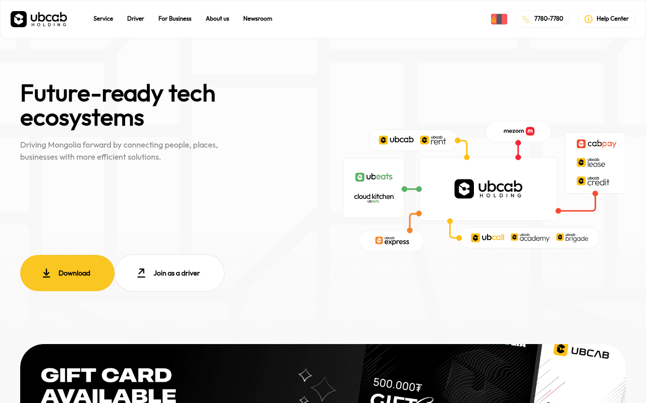
https://ubcab.mn
https://ubcab.mn
Screenshot of ubcab.mn
45of 100
D

The hero headline 'Future-ready tech ecosystems' reads like a VC pitch deck, not a consumer app — nobody opens a taxi app thinking 'I need a tech ecosystem.' The ecosystem diagram is visually interesting but communicates nothing actionable to a rider or driver, and 74K+ drivers and 1.4M+ users are buried below the fold where almost no one will see them.

Your action plan

Ordered by conversion impact. Click any fix to see the before → after.

1
Rewrite hero headline to be consumer-benefit-led
High ImpactQuick WinH1 hero headline 'Future-ready tech ecosystems'
Currently
Future-ready tech ecosystems
Recommended
Mongolia's Fastest Ride, Food & Delivery App — All in One
Benefit-led headlines outperform abstract brand positioning by 2-3x on CTR (Nielsen Norman). Visitors decide in 3 seconds; 'tech ecosystems' tells them nothing about what to do next.

Copy rewrites

Ready to use

Drop-in replacements for your highest-leverage text. Each rewrite explains the conversion principle behind it.

Hero headline
Future-ready tech ecosystems
Mongolia's #1 Ride, Food & Delivery App
Specificity and category ownership — tells the visitor exactly what the product does and asserts market leadership
Hero subheadline
Driving Mongolia forward by connecting people, places, businesses with more efficient solutions.
Book a ride, order food, or send a package — all from one app. Trusted by 1.4M+ users across 16 provinces.
Specificity + social proof: replaces vague corporate language with concrete use cases and embeds the key trust stat above the fold
Stats section label
All in one seamless payment solution: the most recommended service in Mongolia
Mongolia's most trusted super-app — by the numbers
Clarity and social proof framing: the current label buries the lead by focusing on payments when the stats prove overall market dominance
💡

The killer move

High Impact
Add a localized social proof strip with app store ratings

Insert App Store and Google Play ratings (e.g., 4.8★ from 50K reviews) directly beneath the hero CTA buttons — this single element has been shown to lift app download CTR by 15-25% because it converts abstract trust into a familiar, scannable signal that Mongolian consumers already associate with quality apps.

How visitors experience your page

Second-by-second walkthrough.

1 strong2 mixed2 weak
0-3 secondsWeak
0-3s First impression: Large abstract headline 'Future-ready tech ecosystems', ecosystem logo diagram, two CTAs, clean white layout
Visitor cannot immediately identify what UBCab does for them. Abstract B2B-sounding headline creates confusion for a consumer app audience — high bounce risk.
3-8 secondsMixed
3-8s Value scan: Subheadline about connecting people and businesses, Download and Join as a driver buttons, ecosystem diagram with sub-brand logos
Visitor starts to understand it is a multi-service app but must work to decode it. No price, no speed promise, no social proof yet — motivation to click is low.
8-15 secondsMixed
8-15s Engagement: Gift card banner (500,000₮), stats row with 16 provinces / 74K+ drivers / 1.4M+ users, Why UBCAB section with 4 benefit icons
Stats are compelling but arrive too late. Gift card promotion is visually loud and may distract from app download goal. Benefit icons lack supporting copy.
15-30 secondsStrong
15-30s Consideration: Service cards: Ride, Food Delivery, Online Payment, Express Delivery, Rent — each with See more links
Service breadth is now clear and well-presented. Visitor understands the super-app value. However, no testimonials or ratings reinforce trust at this decision stage.
30+ secondsWeak
30s+ Decision: Footer with address, phone 7780-7780, email, service links — no sticky CTA, no app store badges visible in footer
Page ends without a conversion anchor. No sticky download button, no app store badges in footer, no final CTA section — visitors who scroll fully have no prompt to act.

Health check

8 dimensions, weighted by conversion impact.

First impression & hero
20%
4/10
Abstract B2B headline and ecosystem diagram fail to communicate consumer value within the critical 3-second window.
Copy & messaging
20%
4/10
Corporate language dominates; key proof points like 1.4M users are buried; benefit copy is generic and repeated across service cards.
Call-to-action
15%
5/10
Two CTAs exist above fold but compete equally; no sticky CTA, no app store badges, no end-of-page conversion anchor.
Trust & social proof
15%
4/10
Strong stats (1.4M users, 74K drivers) exist but are placed below fold; zero testimonials, ratings, or press mentions visible.
Visual design & layout
10%
7/10
Clean, modern aesthetic with good brand color use; service cards are well-differentiated; ecosystem diagram is visually polished.
Page structure & flow
8%
5/10
Gift card banner interrupts the logical hero-to-proof-to-services flow; page ends without a closing CTA section.
Technical & SEO signals
7%
6/10
Excellent PageSpeed score of 96 with 1.0s FCP; severely undermined by 45 of 47 images missing alt text and no H2 headings.
Differentiation & positioning
5%
5/10
Super-app breadth is a genuine differentiator but is never stated as such; 'tech ecosystems' positioning is invisible to the target consumer.

Page speed

Based on real Chrome user data
96/100
Overall score
Combined performance rating
1.4 s
Largest paint
Time until the main content is visible
0.05
Layout shift
How much the page moves while loading
1.0 s
First paint
Time until something first appears
42 ms
Responsiveness
How fast the page reacts to clicks

Want mobile analysis and fresh re-runs?

Buy roasts to unlock mobile analysis, re-analyze on demand, and more for ubcab.mn.

See roast packs →