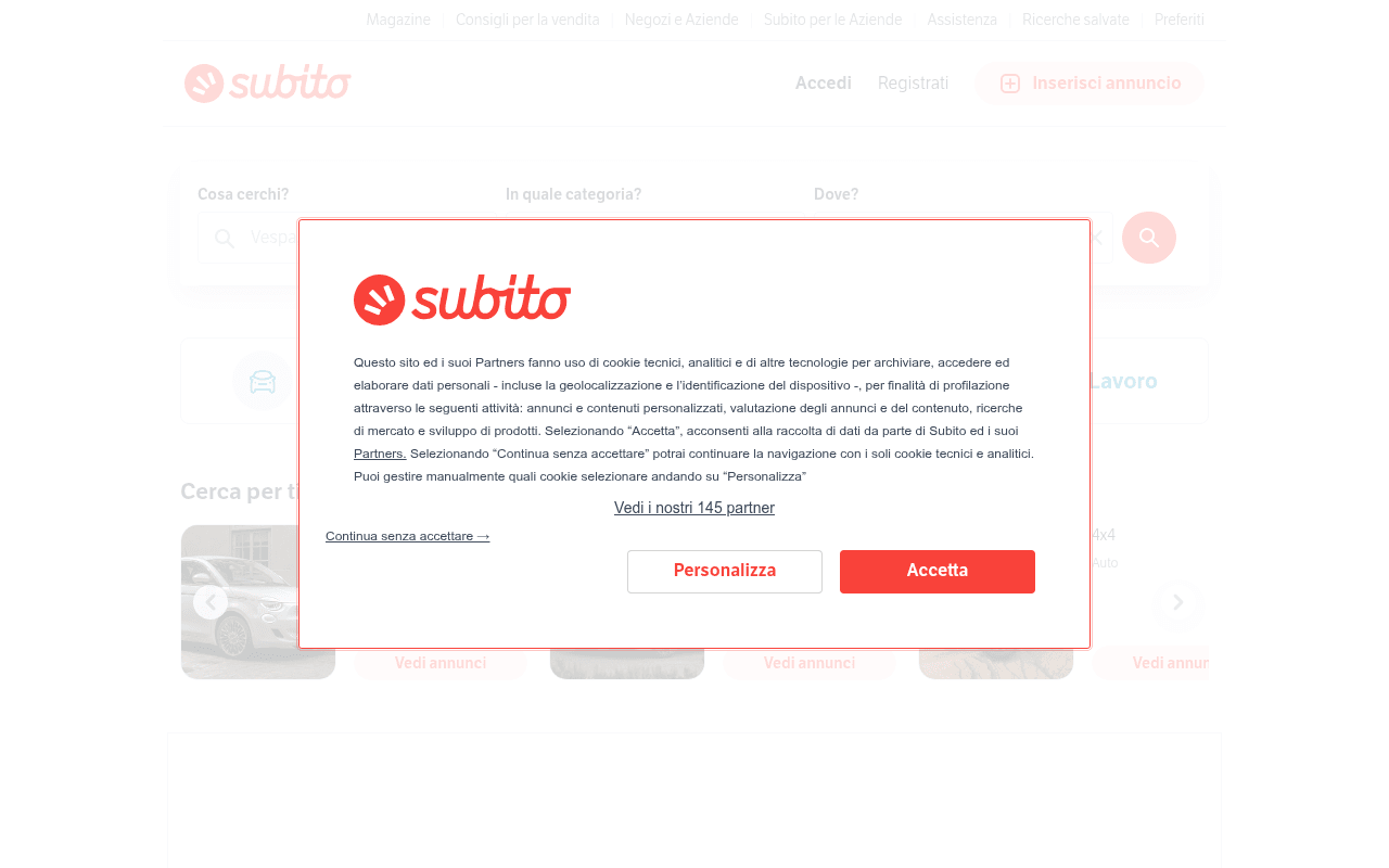
https://subito.it
https://subito.it
Screenshot of subito.it
45of 100
D

Subito.it is a well-known Italian marketplace that leans entirely on brand recognition — the homepage offers a clean search bar but zero value proposition copy, no headline explaining why to use Subito over competitors, and the cookie banner obliterates the above-fold experience before a single category is clicked. The 'Inserisci annuncio' CTA is the only conversion driver visible, yet it competes with nothing because there's nothing else to read.

Your action plan

Ordered by conversion impact. Click any fix to see the before → after.

1
Add a hero headline above the search bar
High ImpactQuick WinEmpty whitespace above the three-field search bar (Cosa cerchi / In quale categoria / Dove)
Currently
No headline or subheadline — search bar floats in a void
Recommended
Add H1: 'Compra e vendi in tutta Italia — milioni di annunci ti aspettano' directly above the search inputs
Marketplaces with a clear value proposition headline above the search bar show 15-20% higher engagement; users need context before committing to a search query

Copy rewrites

Ready to use

Drop-in replacements for your highest-leverage text. Each rewrite explains the conversion principle behind it.

Search placeholder text
Vespa
Cosa stai cercando? Es. iPhone, divano, auto...
Specificity and example-driven placeholders reduce cognitive load and prompt action faster than a single brand example
Nav CTA button
Inserisci annuncio
Pubblica gratis
Urgency + benefit framing; 'gratis' removes the primary objection (cost) at the moment of first consideration
Category navigation labels (implied)
Motori · Market · Immobili · Lavoro
Auto e Moto · Compra e Vendi · Casa e Affitti · Trova Lavoro
Descriptive labels outperform single-word labels by clarifying intent and reducing clicks-to-comprehension for new users
💡

The killer move

High Impact
Launch a dual-CTA hero with real-time listing counter

Replace the blank hero space with a split message: left side for buyers ('Trova quello che cerchi tra X annunci attivi oggi') with the search bar, right side for sellers ('Pubblica il tuo annuncio gratis in 2 minuti') with a prominent button — this single change addresses both sides of the marketplace funnel simultaneously and gives first-time visitors an immediate reason to act.

How visitors experience your page

Second-by-second walkthrough.

1 strong2 mixed2 weak
0-3 secondsWeak
0-3s first glance: Cookie consent modal covering most of the page, Subito logo, nav bar with Accedi/Registrati/Inserisci annuncio
The very first experience is a legal interruption, not a value proposition. Visitors form a negative first impression before seeing a single product or reason to stay.
3-8 secondsMixed
3-8s orientation: After dismissing modal: three-field search bar, four category icons (Motori, Market, Immobili, Lavoro), car type browsing strip
Search bar is functional and familiar but lacks context. Users who know Subito proceed; new users have no reason to trust or prefer it over Google search.
8-15 secondsStrong
8-15s exploration: Horizontal carousel of car categories with 'Vedi annunci' CTAs, personalized listing grid below
Product density is good — listings with images and prices create marketplace credibility. Returning users feel at home; new users start to understand the value.
15-30 secondsMixed
15-30s consideration: 'In evidenza per te' personalized grid, mixed categories (bikes, clothing, electronics), Scopri TuttoSubito banner
Personalization is a strength but the mixed-category grid feels chaotic without clear section headers. The 'Scopri TuttoSubito' upsell competes with organic browsing.
30+ secondsWeak
30s+ decision: App download CTAs, massive SEO footer with hundreds of city/category links, no re-engagement CTA for sellers
The page ends with an SEO link dump that signals 'we're done with you.' No email capture, no seller conversion prompt, no urgency mechanism to return. Missed retention opportunity.

Health check

8 dimensions, weighted by conversion impact.

First impression & hero
20%
4/10
Cookie modal + empty hero space + no headline = a wasted above-fold that relies entirely on brand recognition
Copy & messaging
20%
3/10
Virtually zero copy on the page — no value proposition, no headline, no benefit statements anywhere visible
Call-to-action
15%
5/10
'Inserisci annuncio' exists but is visually weak; search bar is functional but unsupported by any motivating copy
Trust & social proof
15%
4/10
No user counts, no listing volume, no testimonials, no trust badges visible above or near fold
Visual design & layout
10%
7/10
Clean, consistent brand colors, good whitespace, listing cards are well-structured and scannable
Page structure & flow
8%
6/10
Logical top-to-bottom hierarchy but the SEO footer dominates the bottom third and disrupts the user journey
Technical & SEO signals
7%
7/10
PageSpeed 94 with 697ms FCP and 962ms LCP is excellent; however null meta title and meta description are a significant SEO gap
Differentiation & positioning
5%
3/10
Nothing on the page explains why Subito beats Marketplace, Kijiji, or a Google search — pure brand assumption

Page speed

Based on real Chrome user data
94/100
Overall score
Combined performance rating
962 ms
Largest paint
Time until the main content is visible
0.01
Layout shift
How much the page moves while loading
697 ms
First paint
Time until something first appears
78 ms
Responsiveness
How fast the page reacts to clicks

Want mobile analysis and fresh re-runs?

Buy roasts to unlock mobile analysis, re-analyze on demand, and more for subito.it.

See roast packs →