https://www.thesimplechefs.com
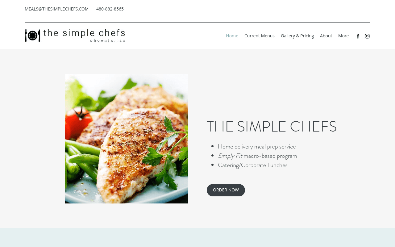
Screenshot of thesimplechefs.com
45of 100
D

The hero buries its strongest differentiators — no subscriptions, gluten-free, scratch-made, weekly delivery — inside a bullet list while the headline just repeats the brand name. With a 98 PageSpeed score and zero testimonials, this page is technically flawless and persuasively empty. The ORDER NOW button floats in a sea of white with nothing around it to justify the click.

Your action plan

Ordered by conversion impact. Click any fix to see the before → after.

1
Replace hero headline with a value-proposition statement
High ImpactQuick WinHero H1 'THE SIMPLE CHEFS'
Currently
THE SIMPLE CHEFS (brand name repeated, no value)
Recommended
Change H1 to 'Fresh, Scratch-Made Meals Delivered to Your Phoenix Door — No Subscription Required'
Repeating the brand name as the hero headline wastes prime real estate. A benefit-led headline increases conversion by communicating WIIFM within the 3-second attention window.

Copy rewrites

Ready to use

Drop-in replacements for your highest-leverage text. Each rewrite explains the conversion principle behind it.

Hero H1
THE SIMPLE CHEFS
Phoenix Meal Prep, Delivered Fresh Every Tuesday — No Subscription
Specificity and differentiation: names the city, the cadence, and the no-subscription hook in one scannable line
Hero bullet: Home delivery meal prep service
Home delivery meal prep service
Chef-made, gluten-free meals delivered fresh to your door — never frozen
Specificity: adds the never-frozen and gluten-free differentiators that currently hide in the meta description
WHO WE ARE subheading
Food as Medicine
Real Ingredients. Real Results. Meals That Actually Taste Like Home.
Emotional resonance and specificity: bridges the health mission with the taste promise, reducing the clinical tone that can repel non-dieters
ORDER NOW button
ORDER NOW
See This Week's Menu
Reduces commitment anxiety — visitors want to browse before buying; lower-friction CTA language increases top-of-funnel clicks
💡

The killer move

High Impact
Launch a weekly menu preview as the hero CTA

Replace or supplement ORDER NOW with 'See This Week's Menu' linking to a live menu page — visitors who browse the actual meals convert at dramatically higher rates, and a rotating weekly menu creates urgency and repeat visit behavior that a static order button never will.

How visitors experience your page

Second-by-second walkthrough.

1 strong2 mixed2 weak
0-3 secondsMixed
0-3s First Impression: Split hero: food photo left, brand name + 3 bullets + ORDER NOW button right. Email and phone in top bar.
Visitor identifies it as a food service but gets no immediate reason to care — the headline is the brand name, not a promise. Many will scan and scroll rather than click.
3-8 secondsWeak
3-8s Value Assessment: Three bullet points listing service types, ORDER NOW button, no price or proof
Visitor asks 'why you over competitors?' and finds no answer. No testimonials, no price signal, no differentiator beyond generic service categories. Scroll rate likely high, conversion rate low.
8-15 secondsMixed
8-15s Deeper Exploration: WHO WE ARE section with brand story, mindfulness philosophy, founder background
Story is warm and credible but long. Health-motivated visitors may connect; time-pressed visitors will skim. The 'Food as Medicine' angle is compelling but buried under dense paragraphs.
15-30 secondsStrong
15-30s Consideration: HOW IT WORKS section with delivery logistics, Simply Fit section, meal photos
Operational clarity (Tuesday delivery, Sunday cutoff, text alerts) builds confidence. This is the page's strongest conversion section but it appears too far down for most visitors to reach.
30+ secondsWeak
30s+ Decision: Catering section, contact form, footer with address and social links
No second CTA after the hero. Visitor who scrolled the full page and is ready to order must scroll all the way back up. A sticky CTA or bottom-of-page ORDER NOW is missing entirely.

Health check

8 dimensions, weighted by conversion impact.

First impression & hero
20%
4/10
Hero headline wastes space on brand name; no value prop, no proof, no price signal above the fold
Copy & messaging
20%
5/10
Brand story is authentic but long; strongest differentiators (never frozen, gluten-free, no subscription) are buried or absent from hero
Call-to-action
15%
4/10
Single ORDER NOW button with no surrounding context, no second CTA on page, no sticky element for scrollers
Trust & social proof
15%
2/10
Testimonials nav link exists but zero reviews, ratings, or customer counts appear anywhere on the page
Visual design & layout
10%
6/10
Clean, minimal aesthetic fits the brand; food photography is adequate but not appetite-driving at hero scale
Page structure & flow
8%
5/10
Logical section order but critical conversion info (pricing, delivery area) appears too late; no repeated CTA
Technical & SEO signals
7%
10/10
PageSpeed 98, FCP 0.7s, LCP 1.0s, accessibility 100, SEO 100 — technically exceptional
Differentiation & positioning
5%
4/10
No-subscription, never-frozen, scratch-made are genuine differentiators that never appear in the hero where they would do the most work

Page speed

Tested via Google Lighthouse
98/100
Overall score
Combined performance rating
1.0 s
Largest paint
Time until the main content is visible
0.044
Layout shift
How much the page moves while loading
0.7 s
First paint
Time until something first appears
2.0 s
Interactive
Time until the page is fully usable
Accessibility: 100SEO: 100Best Practices: 100

Want mobile analysis and fresh re-runs?

Buy roasts to unlock mobile analysis, re-analyze on demand, and more for thesimplechefs.com.

See roast packs →