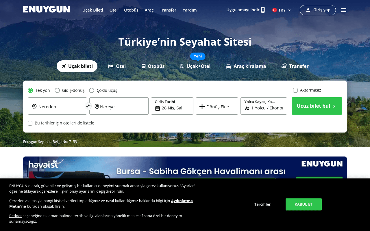
https://www.enuygun.com
Screenshot of enuygun.com
55of 100
C−

Enuygun has a clean, functional hero with a solid search widget, but 'Türkiye'nin Seyahat Sitesi' is a generic claim any competitor could make — there's zero differentiation above the fold. The page is content-rich below the fold but buries its value proposition under promotional banners and a fintech cross-sell before establishing why users should trust Enuygun over Skyscanner or Biletall.

Your action plan

Ordered by conversion impact. Click any fix to see the before → after.

1
Replace generic headline with a specific value claim
High ImpactQuick WinHero H1: 'Türkiye'nin Seyahat Sitesi'
Currently
Türkiye'nin Seyahat Sitesi
Recommended
'En Ucuz Uçak Bileti Garantisi — 500+ Havayolu, Anlık Fiyat Karşılaştırması'
Generic category labels ('Turkey's Travel Site') have near-zero conversion lift. Specificity — number of airlines, price guarantee — directly addresses the user's primary anxiety: am I getting the best price?

Copy rewrites

Ready to use

Drop-in replacements for your highest-leverage text. Each rewrite explains the conversion principle behind it.

Hero headline
Türkiye'nin Seyahat Sitesi
Türkiye'nin En Ucuz Bilet Sitesi — Anlık Karşılaştırma, Garantili Fiyat
Specificity and value proposition — replaces a category label with a concrete benefit and implicit price guarantee
CTA button
Ucuz bilet bul
En Ucuz Bileti Bul →
Adding the superlative 'En' reinforces price leadership positioning; arrow micro-cue signals interactivity
Why-choose-us section header (full page)
Neden ENUYGUN.com'u seçmelisiniz?
500.000+ Müşterinin Tercih Ettiği Seyahat Sitesi — İşte Nedeni
Social proof principle — leading with a user count transforms a generic question into a credibility statement
💡

The killer move

High Impact
Implement a Price Alert capture as a secondary CTA

Add a 'Fiyat Düşünce Haber Ver' (Notify me when price drops) secondary CTA in the search widget for users who search but don't book — this converts non-buyers into an email list and brings them back when prices match their threshold, a proven re-engagement loop used by Kayak and Google Flights that Enuygun's current page completely ignores.

How visitors experience your page

Second-by-second walkthrough.

1 strong3 mixed1 weak
0-3 secondsMixed
0-3s First Impression: Mountain/lake hero image, ENUYGUN logo, nav with 6 categories, headline 'Türkiye'nin Seyahat Sitesi', flight search widget with green CTA
User immediately understands this is a travel booking site and sees the search tool — good. But the headline communicates no differentiation, so price-sensitive users have no reason to stay vs. going to a competitor.
3-8 secondsStrong
3-8s Orientation: Tab navigation (Uçak bileti active, Otel, Otobüs, Uçak+Otel, Araç kiralama, Transfer), search fields for origin/destination/date/passengers
The multi-product tab system is clear and well-organized. Users quickly identify their booking category. The pre-filled date reduces friction. Most users will engage with the search widget here.
8-15 secondsMixed
8-15s Evaluation: Havaist partnership banner (Bursa-Sabiha route), Fırsat uçuşları deal cards with prices, Seyahatlerini yönet feature icons
Deal cards with specific prices (5,605 TL, 5,393 TL) are strong conversion triggers for price-motivated users. However, the Havaist banner feels like an ad, potentially eroding trust for users unfamiliar with the partnership.
15-30 secondsWeak
15-30s Consideration: Campaign banners (Amex, airline deals), ENUYGUN Finans cross-sell section, city exploration grid
The Finans section creates cognitive dissonance — user came to book travel, now sees a fintech product. This is a distraction that increases bounce risk before the user has committed to a search.
30+ secondsMixed
30s+ Decision: Why-choose-us icons, mobile app CTA banner, popular routes list, travel blog posts, massive footer
Popular routes list is genuinely useful for undecided users and captures long-tail intent. But by this point, unconverted users are likely gone. The page lacks a re-engagement hook (exit intent, price alert signup) for hesitant visitors.

Health check

8 dimensions, weighted by conversion impact.

First impression & hero
20%
6/10
Functional hero with clear search widget but generic headline wastes the most valuable real estate on the page
Copy & messaging
20%
5/10
Category-level language throughout — 'Türkiye'nin Seyahat Sitesi' and generic feature names never articulate a specific competitive advantage
Call-to-action
15%
7/10
Green 'Ucuz bilet bul' CTA is visually prominent and well-placed but lacks supporting micro-copy to reduce hesitation
Trust & social proof
15%
4/10
License number buried in gray text, no visible review count, no user testimonials, no booking volume indicators above fold
Visual design & layout
10%
7/10
Clean, professional design with good color contrast on CTA; hero image is attractive but slightly generic for a travel brand
Page structure & flow
8%
5/10
Finans cross-sell interrupts the conversion funnel before trust is established; why-choose-us section appears too late
Technical & SEO signals
7%
8/10
Excellent PageSpeed score of 92 with 983ms FCP and 1.0s LCP; however null meta title and meta description are critical SEO gaps
Differentiation & positioning
5%
4/10
No above-fold claim distinguishes Enuygun from Skyscanner, Biletall, or any other Turkish OTA — pure category play

Page speed

Based on real Chrome user data
92/100
Overall score
Combined performance rating
1.0 s
Largest paint
Time until the main content is visible
0.00
Layout shift
How much the page moves while loading
983 ms
First paint
Time until something first appears
149 ms
Responsiveness
How fast the page reacts to clicks

Want mobile analysis and fresh re-runs?

Buy roasts to unlock mobile analysis, re-analyze on demand, and more for enuygun.com.

See roast packs →