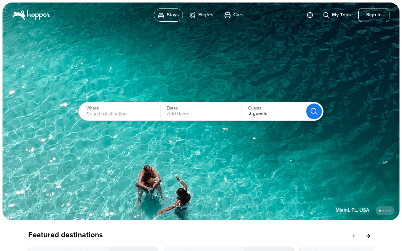
https://hopper.com
https://hopper.com
Screenshot of hopper.com
50of 100
D

Hopper's hero is a gorgeous aerial pool shot with zero headline — just a search bar floating in turquoise water.

With 120 million travelers as a credibility anchor buried in the app section and an 'AI Mode' badge nobody can miss in the nav, the page leads with aesthetics over argument. Kayak and Google Flights are one tab away; give visitors a reason to stay.

Your action plan

Ordered by conversion impact. Click any fix to see the before → after.

1
Add a value-proposition headline above the search bar
High ImpactQuick WinHero section — currently zero H1 text above or near the search widget
Currently
No headline exists; only the search bar sits over the hero image
Recommended
Add H1: 'Book smarter. Save more. 120M travelers trust Hopper.' in white text centered above the search bar
Nielsen research shows users decide relevance in under 5 seconds; without a headline, there is no value hook to differentiate from Google Flights or Booking.com

Copy rewrites

Ready to use

Drop-in replacements for your highest-leverage text. Each rewrite explains the conversion principle behind it.

Meta description / implied hero value prop
Join 120 million travelers in planning your next trip. Get the best price on hotels, homes, flights, and car rentals.
120M travelers use Hopper's AI to predict prices and book at the perfect moment. Hotels, flights, and cars — always at the best price.
Specificity + differentiation: leads with the AI price-prediction angle that separates Hopper from generic OTAs
App download section headline
Get deal alerts on the app
Never overpay again — get AI price alerts on the app
Loss aversion framing: 'never overpay' triggers stronger motivation than a passive benefit like 'get alerts'
Search bar placeholder text
Search destination
Where do you want to go? We'll find the best price.
Benefit-forward placeholder sets expectation of value delivery at the moment of engagement, reducing abandonment
Sign In prompt (mid-page banner)
Sign in, save money — Unlock our lowest prices when you sign in.
Members save up to 40% — Sign in to unlock Hopper's exclusive prices.
Specificity principle: a concrete discount claim ('up to 40%') outperforms vague 'save money' by giving users a tangible reason to act
💡

The killer move

High Impact
Make price prediction the hero, not the background

Replace the static hero with a live price-trend widget showing real-time 'Buy Now vs. Wait' signals for top destinations — this turns the homepage into a tool, not a brochure, and creates a reason to return that Expedia and Booking.com structurally cannot replicate.

How visitors experience your page

Second-by-second walkthrough.

1 strong2 mixed2 weak
0-3 secondsMixed
0-3s First Glance: Full-bleed aerial pool image, Hopper logo, nav with Stays/Flights/Cars, floating search bar, no headline
Visitor recognizes it as a travel booking site but gets no reason to prefer Hopper over Expedia or Google — beautiful but silent on value
3-8 secondsStrong
3-8s Orientation: Search bar with Where/Dates/Guests fields, blue search button, Miami FL USA location tag, rotating hero dots
Search intent is immediately actionable — low friction entry point is good, but without a headline the visitor has no emotional or rational hook to commit
8-15 secondsWeak
8-15s Evaluation: Featured destinations with Claim buttons, Deals for top destinations section, vague percentage discounts
Visitor sees deals but no prices — 'Claim' without a dollar amount feels like a bait-and-click pattern, eroding trust before they even search
15-30 secondsMixed
15-30s Consideration: App download section with QR code, 4.8 and 4.6 star ratings, 120M traveler claim, phone mockup
Strong social proof finally appears but it is asking visitors to leave the web experience for an app — creates friction for desktop users mid-funnel
30+ secondsWeak
30s+ Decision: Keep exploring popular destinations grid, footer with product links, no persistent CTA or retargeting hook
Visitor who scrolled this far without searching is lost — no email capture, no personalized recommendation prompt, no urgency mechanism to re-engage

Health check

8 dimensions, weighted by conversion impact.

First impression & hero
20%
5/10
Visually stunning hero image but zero headline means the page is beautiful and mute — no differentiation from any other OTA above the fold
Copy & messaging
20%
4/10
Hopper's genuine AI price-prediction differentiator is almost entirely absent from page copy; generic OTA language dominates throughout
Call-to-action
15%
6/10
Search bar CTA is clean and low-friction; deal section Claim buttons lack price context that would drive clicks
Trust & social proof
15%
5/10
120M travelers and 4.8-star ratings exist but are buried mid-page in the app section rather than anchoring the hero decision moment
Visual design & layout
10%
7/10
Clean, modern aesthetic with strong photography and consistent brand color; search bar placement is intuitive and well-executed
Page structure & flow
8%
5/10
Hero to featured deals to app download is logical but the page ends with a link dump footer and no conversion recovery mechanism for non-searchers
Technical & SEO signals
7%
5/10
PageSpeed 72 is acceptable but INP of 674ms is sluggish for an interaction-heavy search page; zero H1 tags is an SEO red flag for a homepage
Differentiation & positioning
5%
3/10
AI Mode badge in the nav is the only visible differentiator; Hopper's core price-prediction technology — its entire reason for existing — is invisible on the page

Page speed

Based on real Chrome user data
72/100
Overall score
Combined performance rating
1.5 s
Largest paint
Time until the main content is visible
0.00
Layout shift
How much the page moves while loading
922 ms
First paint
Time until something first appears
674 ms
Responsiveness
How fast the page reacts to clicks

Want mobile analysis and fresh re-runs?

Buy roasts to unlock mobile analysis, re-analyze on demand, and more for hopper.com.

See roast packs →