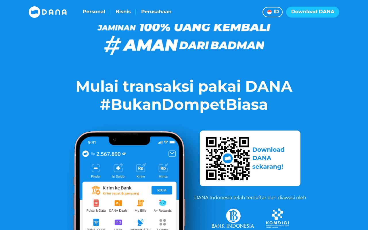
https://dana.id
https://dana.id
Screenshot of dana.id
40of 100
F

DANA's hero is a bold blue canvas with a hashtag headline and a QR code — brave on mobile, baffling on desktop where nobody scans their own screen. The full-page screenshot reveals massive blank grey sections below the fold that suggest broken content rendering, which is a conversion catastrophe hiding in plain sight.

Your action plan

Ordered by conversion impact. Click any fix to see the before → after.

1
Fix broken below-fold content sections immediately
High ImpactSome WorkLarge blank grey and blue sections visible in full-page screenshot
Currently
Multiple empty content blocks rendering as blank space below hero
Recommended
Audit and restore all below-fold sections — features, testimonials, user stats — that appear to have failed to render; this is likely a JS loading failure
Blank sections signal a broken page to visitors and crawlers alike; Nielsen Norman research shows users abandon pages that appear incomplete within seconds

Copy rewrites

Ready to use

Drop-in replacements for your highest-leverage text. Each rewrite explains the conversion principle behind it.

Hero headline
Mulai transaksi pakai DANA #BukanDompetBiasa
Mulai transaksi pakai DANA — Dompet Digital Terpercaya #1 Indonesia
Social proof and specificity: replacing a hashtag with a credibility claim anchors the brand and gives new visitors a reason to trust immediately
QR code CTA label
Download DANA sekarang!
Scan untuk download — atau klik App Store / Google Play
Friction reduction: acknowledges both scan and click paths so no desktop user is left without a conversion route
Trust badge caption
DANA Indonesia telah terdaftar dan diawasi oleh
Resmi terdaftar dan diawasi oleh Bank Indonesia dan Kominfo — transaksi Anda 100% terlindungi
Authority and reassurance: completing the sentence with a benefit statement converts a passive compliance notice into an active trust signal
💡

The killer move

High Impact
Replace QR-only CTA with a phone number SMS download flow

Add an input field where desktop visitors type their Indonesian mobile number and receive an SMS download link instantly — this captures a lead, removes the QR friction barrier, and gives DANA a retargeting asset, all in one interaction that competitors are not doing on their desktop landing pages.

How visitors experience your page

Second-by-second walkthrough.

2 mixed3 weak
0-3 secondsMixed
0-3s First Impression: Bold blue hero, DANA Protection badge, 100% money-back guarantee headline, app screenshot, QR code
Strong color and brand presence, but the hashtag headline communicates personality over utility — first-time visitors may not immediately understand what DANA does
3-8 secondsMixed
3-8s Value Assessment: BukanDompetBiasa headline, phone mockup showing app UI with balance and transfer features, Bank Indonesia and Kominfo logos
Regulatory logos build trust but there is no user count, transaction volume, or concrete benefit listed — visitor lacks a compelling reason to act now
8-15 secondsWeak
8-15s Conversion Attempt: QR code box with Download DANA sekarang CTA — no app store buttons visible
Desktop user hits a dead end: QR code requires a second device to scan, and no alternative download path exists — conversion friction is high and likely causes abandonment
15-30 secondsWeak
15-30s Exploration: Scrolls below fold and encounters large blank grey and blue sections with no visible content
Blank sections signal a broken or incomplete page — visitor confidence collapses and trust built in the hero is immediately undermined
30+ secondsWeak
30s+ Decision: No features section, no testimonials, no pricing, no social proof below fold — page appears to end after hero
Without supporting content to reinforce the decision, undecided visitors have no path to conversion and will likely exit to a competitor or app store search

Health check

8 dimensions, weighted by conversion impact.

First impression & hero
20%
6/10
Visually confident blue hero with trust badges, but hashtag headline and QR-only CTA limit immediate conversion clarity on desktop
Copy & messaging
20%
4/10
Brand-forward hashtag copy lacks specificity; no subheadline, no feature bullets, no quantified proof points to move undecided visitors
Call-to-action
15%
3/10
QR code as sole CTA is a desktop conversion dead end; no app store buttons, no alternative action path provided
Trust & social proof
15%
5/10
Bank Indonesia and Kominfo logos are present but no user numbers, ratings, or testimonials appear anywhere on the visible page
Visual design & layout
10%
6/10
Clean brand aesthetic and strong blue palette, but massive blank sections below fold severely damage perceived page quality
Page structure & flow
8%
2/10
Below-fold content appears entirely broken — blank sections replace what should be features, social proof, and supporting conversion content
Technical & SEO signals
7%
1/10
No meta title, no meta description, no H1 or H2 tags detected — the page is essentially invisible to search engines and social sharing
Differentiation & positioning
5%
4/10
BukanDompetBiasa and DANA Protection are brand differentiators but neither is explained with specifics that separate DANA from GoPay or OVO

Want mobile analysis and fresh re-runs?

Buy roasts to unlock mobile analysis, re-analyze on demand, and more for dana.id.

See roast packs →