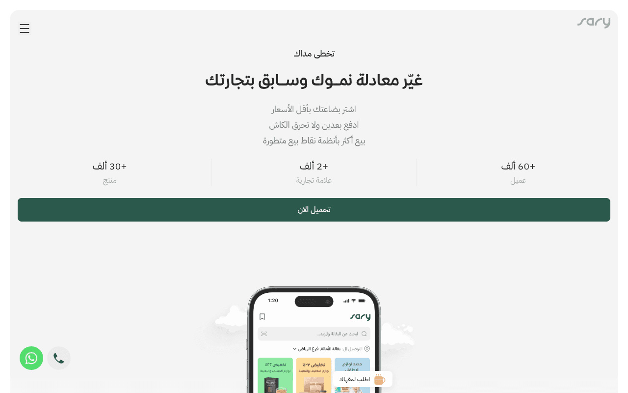
https://sary.com
https://sary.com
Screenshot of sary.com
55of 100
C−

The hero lands three solid proof points (60K+ clients, 2K+ brands, 30K+ products) but buries them in a layout that wastes 300px of dead whitespace before the app screenshot. The full-page view reveals three large gray placeholder sections — likely broken or unloaded content — that silently kill trust mid-scroll. A 4.3s LCP and zero accessibility score compound what is otherwise a competent but underperforming page.

Your action plan

Ordered by conversion impact. Click any fix to see the before → after.

1
Fix broken mid-page content sections
High ImpactSome WorkThree large gray empty blocks visible in full-page screenshot
Currently
Three large gray rectangles with no visible content — likely failed image/video loads or unrendered components
Recommended
Audit and fix rendering failures immediately; replace with feature benefit sections with icons, screenshots, or testimonials
Blank content blocks destroy trust and signal a broken product — Nielsen's error prevention principle; users interpret visual gaps as site failure and abandon

Copy rewrites

Ready to use

Drop-in replacements for your highest-leverage text. Each rewrite explains the conversion principle behind it.

Hero headline
غيّر معادلة نمـوك وسـابق بتجارتك
اشتري بالجملة، ادفع بعدين، وبع أكثر — كل شيء في تطبيق واحد
Specificity principle: the rewrite names the three core benefits explicitly rather than using abstract growth metaphor, reducing cognitive load and increasing relevance
Hero subheadline three-line block
اشتر بضاعتك بأقل الأسعار ادفع بعدين ولا تحرق الكاش بيع أكثر بأنظمة نقاط بيع متطورة
أسعار الجملة مباشرة لمنشأتك — ادفع بعد 30 يوم — نظام نقاط بيع مدمج لتنمية مبيعاتك
Concreteness and urgency: adding the 30-day payment term makes the BNPL benefit tangible and credible rather than vague
CTA button
تحميل الان
حمّل التطبيق مجاناً — ابدأ اليوم
Loss aversion and zero-risk framing: adding free and immediacy cues reduces hesitation at the conversion point
Meta title
Sary
ساري — منصة الجملة للمنشآت الصغيرة | أسعار تنافسية وادفع بعدين
SEO and relevance: a descriptive title with primary keywords improves click-through from search and sets accurate expectations before landing
💡

The killer move

High Impact
Surface the SILQ merger as a hero trust signal

The 412.5M SAR funding round and merger with ShopUp to form SILQ Group is buried in blog text at the bottom — adding a single trust badge or banner in the hero (backed by 412.5M SAR investment) would instantly elevate perceived legitimacy and reduce SMB owner hesitation at the download decision point.

How visitors experience your page

Second-by-second walkthrough.

1 strong3 mixed1 weak
0-3 secondsMixed
0-3s first impression: Clean logo, hamburger menu, Arabic headline, three benefit lines, three stat counters, large green download CTA
Brand reads as professional and the CTA is impossible to miss, but the abstract headline requires cognitive effort to decode the product category — some visitors may not immediately understand this is a wholesale B2B app
3-8 secondsMixed
3-8s value assessment: Stats (60K+ clients, 2K+ brands, 30K+ products), then large empty whitespace, then partial phone mockup entering from bottom
Stats build credibility but the dead whitespace creates a false bottom — visitors may think the page ended and not scroll, missing the product demonstration entirely
8-15 secondsStrong
8-15s product exploration: Phone mockup with app UI, brand logos (Pepsi, Coca-Cola, Unilever, Vimto, Almarai, Nutella), feature icons with Arabic descriptions
Recognizable FMCG brand logos are powerful trust anchors for the target SMB audience — seeing Coca-Cola and Nutella confirms product legitimacy and breadth
15-30 secondsWeak
15-30s mid-page evaluation: Three large gray empty content blocks — no visible text, images, or features
Broken content sections create serious trust damage; visitors interpret this as a buggy or abandoned product and are likely to exit rather than continue scrolling
30+ secondsMixed
30s+ decision point: Why choose Sary section, enable all businesses section, blog content about merger with ShopUp forming SILQ Group
The merger announcement (SILQ Group, 412.5M SAR funding) is actually a powerful credibility signal buried at the bottom — surfacing this in the hero would dramatically increase trust and conversion

Health check

8 dimensions, weighted by conversion impact.

First impression & hero
20%
6/10
Strong CTA and readable stats, but abstract headline and 300px dead whitespace below the fold waste the desktop canvas
Copy & messaging
20%
5/10
Benefit bullets are clear but the headline is metaphorical rather than specific; the 412.5M SAR merger news — a massive credibility signal — is buried in blog content
Call-to-action
15%
6/10
The green CTA button is prominent and full-width, but lacks supporting micro-copy like app store ratings or zero-risk framing
Trust & social proof
15%
6/10
Brand logos (Coca-Cola, Nutella, Unilever) and stat counters are solid trust elements, but no testimonials, ratings, or case studies are present
Visual design & layout
10%
5/10
Clean aesthetic and good typography, but three broken gray sections in the full page view are a critical visual failure
Page structure & flow
8%
4/10
Logical top-level structure collapses mid-page with empty sections that break narrative momentum and user trust
Technical & SEO signals
7%
4/10
LCP at 4.3s is poor; meta title is just the brand name with no keywords; 73 images missing alt text hurts accessibility and SEO
Differentiation & positioning
5%
5/10
BNPL for B2B and POS integration are genuine differentiators but are listed as bullet points rather than positioned as the core competitive advantage

Page speed

Based on real Chrome user data
68/100
Overall score
Combined performance rating
4.3 s
Largest paint
Time until the main content is visible
0.07
Layout shift
How much the page moves while loading
802 ms
First paint
Time until something first appears
51 ms
Responsiveness
How fast the page reacts to clicks

Want mobile analysis and fresh re-runs?

Buy roasts to unlock mobile analysis, re-analyze on demand, and more for sary.com.

See roast packs →