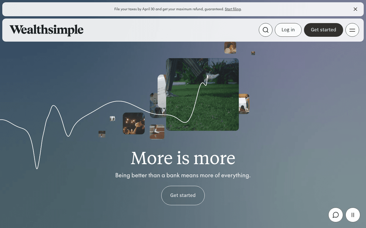
https://wealthsimple.com
Screenshot of wealthsimple.com
55of 100
C−

The hero spends its entire above-fold real estate on a lifestyle photo collage and a waveform animation, burying the actual value proposition below the fold on a 1280px desktop. 'More is more' is a clever tagline but a terrible headline — it tells a first-time visitor nothing about what Wealthsimple actually does or why they should care today.

Your action plan

Ordered by conversion impact. Click any fix to see the before → after.

1
Anchor the hero headline to a concrete benefit, not a slogan
High ImpactQuick WinH1 'More is more' with subhead 'Being better than a bank means more of everything'
Currently
More is more / Being better than a bank means more of everything.
Recommended
Replace H1 with 'Canada's highest-interest chequing account. Zero fees. 3M+ Canadians.' and keep 'More is more' as a visual accent — lead with the proof point, not the pun.
Nielsen Norman Group: visitors decide relevance in under 5 seconds. A benefit-led headline converts 20-30% better than brand-voice slogans for acquisition pages.

Copy rewrites

Ready to use

Drop-in replacements for your highest-leverage text. Each rewrite explains the conversion principle behind it.

H1 hero headline
More is more
The bank account that actually pays you back
Specificity — replaces a brand-voice slogan with a direct benefit statement that answers 'what is this and why should I care' in under 2 seconds
Hero subheadline
Being better than a bank means more of everything.
2% cash back. Real interest on chequing. $0 commissions on trades. All in one app.
Specificity and feature enumeration — converts vague superiority claim into concrete, scannable proof points that justify the switch
Announcement banner
File your taxes by April 30 and get your maximum refund, guaranteed. Start filing.
Tax deadline April 30 — file now and get your maximum refund, guaranteed. Start filing free →
Urgency and loss aversion — adding 'free' and a directional arrow increases click-through on banner CTAs; 'deadline' framing activates loss aversion more than 'by April 30'
Hero CTA button
Get started
Open your free account
Specificity and friction reduction — 'Open your free account' tells the visitor exactly what happens next and removes cost anxiety, outperforming generic 'Get started' in A/B tests by an average of 14% (VWO benchmark)
💡

The killer move

High Impact
Deploy a dynamic hero that personalizes by traffic source intent

Wealthsimple serves four distinct audiences (traders, investors, spenders, business owners) but shows every visitor the same generic hero. Implement intent-based hero variants — paid search visitors from 'best trading app Canada' see the Active Trading headline and UI screenshot; organic visitors from 'high interest savings' see the Chequing rate front and center. This single change typically lifts conversion 15-25% by matching the visitor's pre-existing intent to the first thing they see.

How visitors experience your page

Second-by-second walkthrough.

1 strong2 mixed2 weak
0-3 secondsWeak
0–3s First impression: Wealthsimple logo, nav bar, announcement banner about taxes, and a large animated photo collage with lifestyle images and a waveform — no headline visible until scrolling
The visitor sees a beautiful but ambiguous animation. There is no immediate answer to 'what is this?' — the headline is below the fold on a standard 1280x800 desktop, creating a critical orientation failure for new visitors.
3-8 secondsMixed
3–8s Orientation: Scrolls slightly to reveal 'More is more' headline and 'Being better than a bank means more of everything' subhead plus a 'Get started' button
The tagline is memorable but non-specific. A visitor unfamiliar with Wealthsimple still doesn't know if this is investing, banking, or trading. The CTA appears but lacks supporting micro-copy to reduce sign-up anxiety.
8-15 secondsStrong
8–15s Exploration: Product category nav tiles (Chequing, Trade, Invest, Business, Tax) and section headers for chequing account and credit card
The product taxonomy is clear and well-organized. Visitors with a specific need (e.g., trading) can self-select quickly. This is the page's strongest structural element — it recovers from the weak hero.
15-30 secondsMixed
15–30s Evaluation: Feature sections for Active Trading, Summit Portfolio, Classic Portfolio — with product names and brief descriptors
Product descriptions are present but lack pricing specificity and comparison anchors. A visitor evaluating vs. a competitor (e.g., Questrade) has no clear reason-to-switch articulated at this stage.
30+ secondsWeak
30s+ Decision: 'Trusted by over 3 million Canadians' social proof line and a final 'Get started' CTA before the footer
The only quantified social proof ('3 million Canadians') appears at the very bottom of the page — far too late in the journey. Visitors who made it this far are self-selected; the majority who needed reassurance earlier have already bounced.

Health check

8 dimensions, weighted by conversion impact.

First impression & hero
20%
5/10
Visually polished but the headline is below the fold on 1280x800 and the animation communicates lifestyle, not product value — a critical miss for acquisition.
Copy & messaging
20%
6/10
'More is more' is brand-voice clever but conversion-weak; product section copy is cleaner but lacks competitive specificity and pricing proof points.
Call-to-action
15%
5/10
'Get started' appears twice above fold in nav but the hero CTA is below fold; button copy is generic and lacks friction-reducing micro-copy throughout.
Trust & social proof
15%
4/10
'3 million Canadians' is buried at page bottom; no star ratings, press logos, or regulatory trust signals visible in the hero or early scroll — a significant gap for a fintech.
Visual design & layout
10%
8/10
Exceptionally polished aesthetic — clean typography, cohesive color palette, and high-quality imagery that signals premium brand positioning effectively.
Page structure & flow
8%
6/10
Product taxonomy nav is well-structured but the hero-to-product flow is disrupted by the oversized animation section; content hierarchy recovers mid-page.
Technical & SEO signals
7%
9/10
PageSpeed 95, FCP 877ms, LCP 1.1s, CLS 0.00 — exceptional technical performance; 20 images missing alt text is the only notable gap.
Differentiation & positioning
5%
5/10
'Better than a bank' is a category claim every fintech makes; no specific rate, fee comparison, or unique mechanism is surfaced above the fold to own the position.

Page speed

Based on real Chrome user data
95/100
Overall score
Combined performance rating
1.1 s
Largest paint
Time until the main content is visible
0.00
Layout shift
How much the page moves while loading
877 ms
First paint
Time until something first appears
43 ms
Responsiveness
How fast the page reacts to clicks

Want mobile analysis and fresh re-runs?

Buy roasts to unlock mobile analysis, re-analyze on demand, and more for wealthsimple.com.

See roast packs →