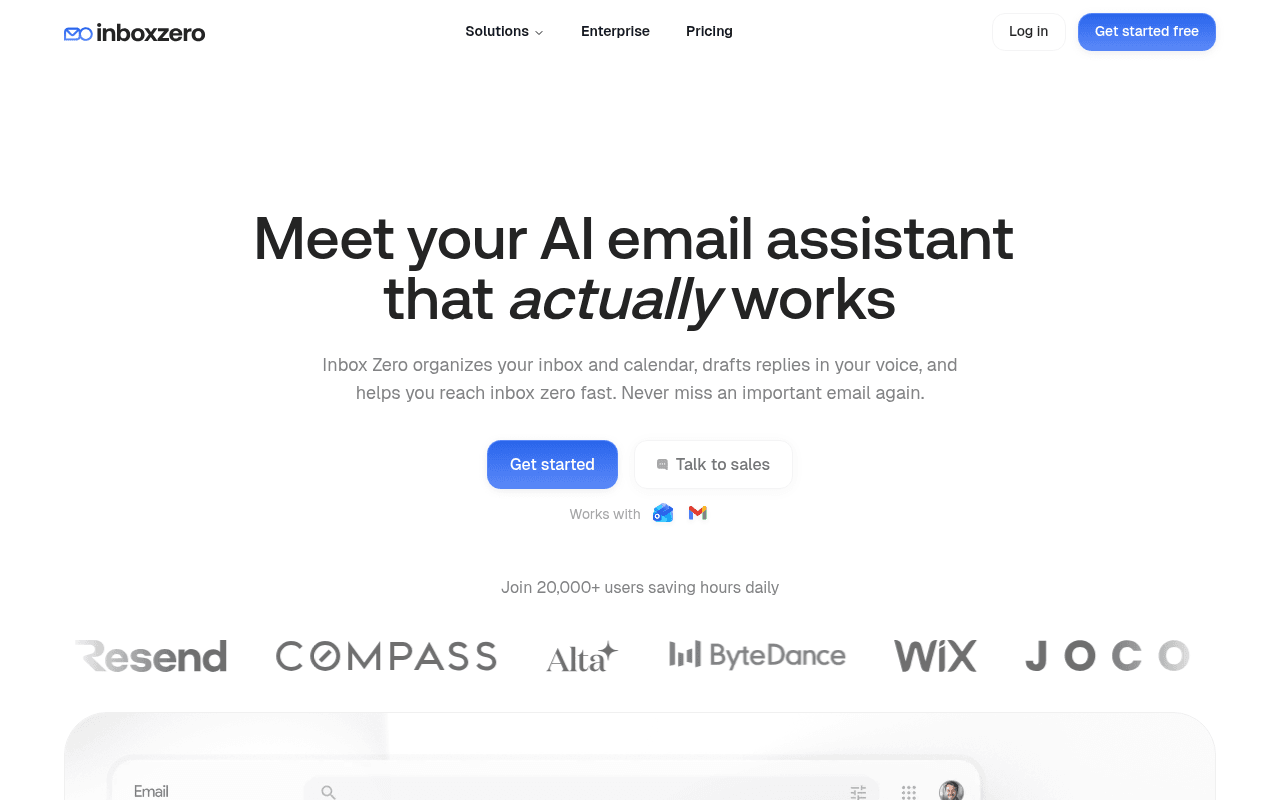
https://www.getinboxzero.com/
Screenshot of getinboxzero.com
60of 100
C

The headline 'actually works' is doing heavy lifting against a sea of AI email tools, but 20,000 users and recognizable logos like ByteDance and Wix are buried below the fold where most visitors never reach them. No testimonials anywhere on the page means the social proof is all logos and numbers — credible but cold, and the 'Talk to sales' button next to a free CTA creates unnecessary friction for a self-serve product.

Your action plan

Ordered by conversion impact. Click any fix to see the before → after.

1
Add a real testimonial above the fold
High ImpactQuick WinHero section below the CTA buttons
Currently
Join 20,000+ users saving hours daily (text only)
Recommended
Replace or supplement with a 1-2 sentence quote from a named user with title/company, e.g. 'I went from 300 unread emails to zero in one afternoon.' — Jane D., Founder
Nielsen Norman research shows testimonials near CTAs increase conversion by 34%. The page has zero testimonials despite metadata confirming hasTestimonials:false — this is the single biggest trust gap.

Copy rewrites

Ready to use

Drop-in replacements for your highest-leverage text. Each rewrite explains the conversion principle behind it.

Hero H1
Meet your AI email assistant that actually works
The AI email assistant that clears your inbox — automatically
Specificity and outcome-focus. 'Actually works' implies competitors fail but doesn't state the benefit. 'Clears your inbox automatically' is concrete and desirable.
Get started CTA button
Get started
Try free for 7 days
Urgency and risk-reversal. The pricing section already uses this phrasing — consistency reduces cognitive load and the free trial framing lowers commitment anxiety.
Hero subheadline
Inbox Zero organizes your inbox and calendar, drafts replies in your voice, and helps you reach inbox zero fast. Never miss an important email again.
Stop spending hours on email. Inbox Zero auto-organizes, drafts replies in your voice, and gets you to inbox zero — in minutes, not hours.
Pain-first framing. Opens with the problem the visitor is experiencing, then delivers the solution. More emotionally resonant than a feature list.
Social proof line below CTAs
Join 20,000+ users saving hours daily
Join 20,000+ professionals who reclaimed their inbox — and their time
Identity-based social proof. 'Professionals' speaks to the target audience's self-image; 'reclaimed' is more emotionally charged than 'saving hours.'
💡

The killer move

High Impact
Add a live social proof ticker or real-time counter near the hero CTA

Display a dynamic element like 'Sarah from Stripe reached inbox zero 12 minutes ago' or a live counter of emails organized today — this converts passive number claims into visceral, real-time proof that the product is actively working for real people, which is the exact anxiety the 'actually works' headline creates but never resolves.

How visitors experience your page

Second-by-second walkthrough.

2 strong3 mixed
0-3 secondsStrong
0-3s First Impression: Clean nav, bold headline 'Meet your AI email assistant that actually works', two CTAs, Gmail/Outlook compatibility icons
Visitor immediately understands the category (AI email tool) and sees a free entry point. The italic 'actually' creates intrigue. No confusion about what the product does.
3-8 secondsMixed
3-8s Value Scan: Subheadline listing features, 'Join 20,000+ users' text, partially visible logo bar
Visitor wants proof this is real and trusted. The 20k number is good but unverified by faces or quotes. Logos are barely visible. Skepticism builds without a testimonial anchor.
8-15 secondsStrong
8-15s Feature Evaluation: Auto-organization section with before/after UI, pre-written drafts section, multi-platform support
Before/after UI comparison is highly effective — shows tangible transformation. Visitor who scrolls this far is engaged and evaluating fit. Product screenshots build credibility.
15-30 secondsMixed
15-30s Trust Verification: 3-step onboarding flow, bulk unsubscribe feature, attachment filing, feature grid
Lots of features shown but still no customer quotes or case studies. Visitor may wonder if this is too good to be true. SOC2 and GitHub stars appear late — should be higher.
30+ secondsMixed
30s+ Decision Point: Pricing section with annual/monthly toggle, Starter plan at $18/user/month, 7-day free trial CTA
Pricing is clear and fair but arriving here without social proof reinforcement means conversion intent may have already dropped. No testimonials at the decision moment is a missed opportunity.

Health check

8 dimensions, weighted by conversion impact.

First impression & hero
20%
7/10
Clean, confident hero with clear category and dual CTAs, but no above-fold testimonials and logos are cut off — trust signals arrive too late.
Copy & messaging
20%
6/10
Headline is punchy but subheadline lists features instead of leading with pain; body copy throughout is competent but rarely emotionally compelling.
Call-to-action
15%
6/10
Primary CTA 'Get started' is vague — the pricing page uses 'Try free for 7 days' which is stronger; inconsistency dilutes conversion intent.
Trust & social proof
15%
4/10
Zero testimonials on a page with 20,000+ users is a critical gap; logos and GitHub stars are present but cold — no human voices anywhere.
Visual design & layout
10%
7/10
Clean, modern aesthetic with good whitespace; before/after UI comparison is a standout element; product screenshots are clear and professional.
Page structure & flow
8%
6/10
Feature sections are logically ordered but the page is feature-heavy without interspersed social proof to maintain trust momentum through the scroll.
Technical & SEO signals
7%
5/10
Performance score 70 with LCP at 3.4s is below Google's 2.5s threshold; INP at 219ms is borderline; accessibility and SEO scores unavailable.
Differentiation & positioning
5%
6/10
Open-source and SOC2 are genuine differentiators but appear late; 'actually works' implies competitor failure without naming what makes Inbox Zero uniquely better.

Page speed

Based on real Chrome user data
70/100
Overall score
Combined performance rating
3.4 s
Largest paint
Time until the main content is visible
0.00
Layout shift
How much the page moves while loading
1.1 s
First paint
Time until something first appears
219 ms
Responsiveness
How fast the page reacts to clicks

Want mobile analysis and fresh re-runs?

Buy roasts to unlock mobile analysis, re-analyze on demand, and more for getinboxzero.com.

See roast packs →