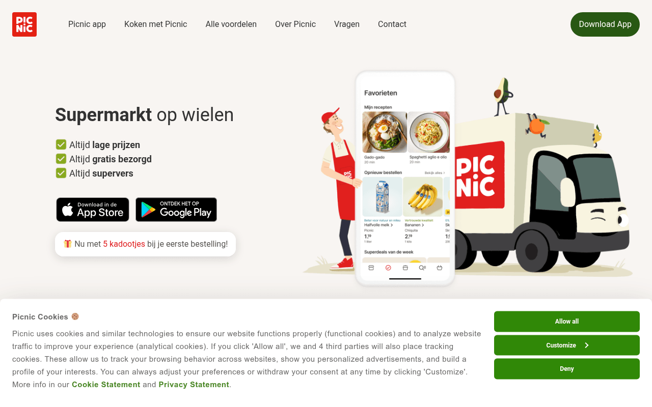
https://picnic.app
https://picnic.app
Screenshot of picnic.app
65of 100
C+

Picnic's hero nails the value trifecta — low prices, free delivery, fresh — but buries the gift incentive ('5 kadootjes') in a small box below the app store badges instead of making it the headline hook. The page scrolls beautifully but never asks for a postcode or email, missing the single highest-converting action for a delivery service: confirming availability before the download ask.

Your action plan

Ordered by conversion impact. Click any fix to see the before → after.

1
Elevate the gift incentive into the hero headline
High ImpactQuick WinSmall gift box below app store badges reading 'Nu met 5 kadootjes bij je eerste bestelling!'
Currently
Tertiary text element below CTAs, easy to miss
Recommended
Move '5 gratis kadootjes bij je eerste bestelling' directly under the H1 as a bold subheadline or badge, before the bullet points
Loss aversion and incentive salience: leading with a concrete gift offer increases click-through on app download CTAs by surfacing the reward before the ask

Copy rewrites

Ready to use

Drop-in replacements for your highest-leverage text. Each rewrite explains the conversion principle behind it.

H1 hero headline
Supermarkt op wielen
De supermarkt die gratis bij jou thuisbezorgt
Specificity and benefit-first framing — the current tagline is clever but abstract; the rewrite leads with the primary differentiator (free delivery) for first-time visitors who don't know Picnic
Gift incentive callout below app badges
Nu met 5 kadootjes bij je eerste bestelling!
Gratis: 5 verrassingen bij je eerste bestelling — download nu
Urgency and specificity: adding 'Gratis' and a direct action verb converts a passive notice into an active incentive with a clear next step
Three hero bullet points
Altijd lage prijzen / Altijd gratis bezorgd / Altijd supervers
Lage prijzen — geen lidmaatschap nodig / Gratis bezorgd — 100% elektrisch / Supervers — direct van de boer
Specificity principle: adding the proof point or qualifier to each claim makes them more credible and differentiating rather than generic marketing assertions
Nav CTA button
Download App
Download gratis — met 5 kadootjes
Incentive salience at the CTA: surfacing the gift offer on the primary button increases click-through by making the reward visible at the decision point
💡

The killer move

High Impact
Add a postcode-first availability gate as the hero micro-conversion

Replace the passive app badge layout with a postcode input as the primary hero CTA — 'Bezorgen we bij jou? Vul je postcode in' — then redirect to the app store only after confirming coverage. This single change qualifies traffic, reduces non-serviceable-area churn, creates a micro-commitment that dramatically increases download follow-through, and gives Picnic first-party location data for retargeting.

How visitors experience your page

Second-by-second walkthrough.

2 strong2 mixed1 weak
0-3 secondsStrong
0-3s first impression: Clean nav, bold H1 'Supermarkt op wielen', three checkmark bullets, app store badges, colorful delivery van illustration
Brand is immediately clear — grocery delivery app — and the illustration is distinctive. Visitor understands the concept but hasn't yet seen a reason to act over competitors.
3-8 secondsMixed
3-8s value scan: Three 'Altijd' bullet points, app store badges, small gift incentive box, hero product app screenshot
Value props are readable but generic. The gift incentive is noticed late if at all. Visitor likely thinks 'sounds good' but hasn't been given a compelling reason to download right now.
8-15 secondsWeak
8-15s scroll exploration: Van de beste makers section, recipe sections, family meal content — all blocked by cookie consent for video
Two video sections are gated behind cookie acceptance, creating dead zones in the content flow. Visitors who declined cookies see blank boxes, breaking narrative momentum at a critical engagement window.
15-30 secondsMixed
15-30s mid-page evaluation: Awards section '3 keer in de prijzen', BundelBonus savings feature, cross-border pricing section
Awards are credible trust signals but appear too far down the page. BundelBonus is a genuine differentiator but lacks a concrete savings example — visitors need a number to feel the benefit.
30+ secondsStrong
30s+ decision and FAQ: Simple ordering UI illustration, 20-minute delivery promise, FAQ section with three questions, footer download CTA
FAQ addresses real objections (refunds, minimum order, no subscription) effectively. The repeat download CTA at the bottom catches scrollers. Visitors who reach here are well-qualified and likely to convert.

Health check

8 dimensions, weighted by conversion impact.

First impression & hero
20%
7/10
Clear concept, attractive illustration, but the gift incentive and social proof are undersized relative to their conversion value
Copy & messaging
20%
6/10
Friendly Dutch tone works well but bullet points are generic assertions without proof; recipe and family sections are engaging but mid-funnel
Call-to-action
15%
6/10
App store badges are visible but passive; no urgency, no postcode qualifier, and the gift offer is not attached to the primary CTA button
Trust & social proof
15%
5/10
Awards section exists but is buried mid-page; no customer count, no ratings, no testimonials anywhere on the page
Visual design & layout
10%
8/10
Warm, consistent brand palette, clean whitespace, strong illustration style — one of the page's genuine strengths
Page structure & flow
8%
6/10
Logical content progression but two cookie-gated video blocks create dead zones that interrupt the narrative at key scroll depths
Technical & SEO signals
7%
7/10
PageSpeed 92 with 1.1s FCP and 1.8s LCP is excellent; 11 images missing alt text is the main technical gap to address
Differentiation & positioning
5%
7/10
Cross-border pricing, artisan sourcing, and BundelBonus are genuinely distinctive but each needs a sharper proof point to land with skeptical visitors

Page speed

Based on real Chrome user data
92/100
Overall score
Combined performance rating
1.8 s
Largest paint
Time until the main content is visible
0.00
Layout shift
How much the page moves while loading
1.1 s
First paint
Time until something first appears
66 ms
Responsiveness
How fast the page reacts to clicks

Want mobile analysis and fresh re-runs?

Buy roasts to unlock mobile analysis, re-analyze on demand, and more for picnic.app.

See roast packs →