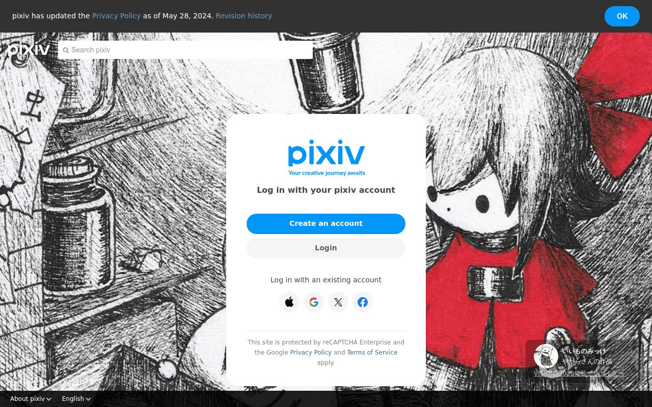
https://www.pixiv.net
Screenshot of pixiv.net
45of 100
D

Pixiv's login page is doing the bare minimum: a floating modal over rotating fan art with zero value proposition beyond 'Your creative journey awaits.' The page has a CLS score of 0.68 — catastrophically bad — and offers no reason for a new visitor to create an account versus just bouncing. The background art is the most compelling content on the page, yet it's doing zero conversion work.

Your action plan

Ordered by conversion impact. Click any fix to see the before → after.

1
Add social proof stat beneath the headline
High ImpactQuick Win'Log in with your pixiv account' heading inside modal
Currently
Log in with your pixiv account
Recommended
Add '120M+ artists and fans worldwide' as a subline directly under the headline to anchor value before the CTA
Social proof at the decision point reduces hesitation; Nielsen Norman research shows quantified community size increases signup intent on platform pages

Copy rewrites

Ready to use

Drop-in replacements for your highest-leverage text. Each rewrite explains the conversion principle behind it.

Modal headline
Log in with your pixiv account
Welcome to pixiv — 120M+ creators and counting
Social proof + scale signals credibility and community size at the highest-attention moment
Tagline under logo
Your creative journey awaits
Browse millions of illustrations, manga, and novels — free
Specificity and benefit clarity outperform aspirational vagueness for cold traffic conversion
Create an account button
Create an account
Join Free — Start Exploring
Urgency + zero-cost framing removes the biggest objection (cost/commitment) at the primary CTA
💡

The killer move

High Impact
Implement a split-screen registration page with live art feed

Replace the static background with a live mosaic of trending pixiv art on the left half and the registration modal on the right — letting the content itself sell membership, exactly as Pinterest did when they increased signups 40% by showing content before requiring login.

How visitors experience your page

Second-by-second walkthrough.

3 mixed2 weak
0-3 secondsMixed
0-3s first impression: Rotating fan art background, floating modal with pixiv logo, two buttons and social login icons, privacy policy banner at top
Visually striking art creates curiosity but the modal offers no reason to act — visitor knows it's an art platform but not why they should join over alternatives
3-8 secondsWeak
3-8s value scan: 'Your creative journey awaits' tagline, 'Log in with your pixiv account' headline, Create an account and Login buttons
Tagline is generic and headline assumes the visitor already wants to log in — new visitors get zero value proposition and may bounce without scrolling
8-15 secondsMixed
8-15s decision point: Social login options (Apple, Google, X, Facebook), reCAPTCHA notice, background art attribution credit bottom-right
Social login options reduce friction for returning users but new visitors still lack a compelling reason to commit — the reCAPTCHA legal text adds visual noise at a critical moment
15-30 secondsWeak
15-30s scroll exploration: Full-page background art (palm tree illustration in second screenshot), footer with About pixiv description and service links
The footer finally explains what pixiv is — 'one of the world's largest art communities' — but this critical positioning is buried below a massive decorative image, invisible to most visitors
30+ secondsMixed
30s+ consideration: Footer service ecosystem: pixiv COMIC, FANBOX, BOOTH, VRoid Studio, etc. — extensive product suite
The breadth of services signals a mature platform but is presented as a link dump with no hierarchy — a visitor who reaches here is likely already motivated or completely lost

Health check

8 dimensions, weighted by conversion impact.

First impression & hero
20%
5/10
Visually arresting background art but the modal delivers no value proposition — beauty without persuasion
Copy & messaging
20%
3/10
'Your creative journey awaits' is the only brand message and it says nothing specific or compelling
Call-to-action
15%
6/10
Create an account CTA is prominent and blue, social logins reduce friction, but zero benefit framing around either
Trust & social proof
15%
3/10
No user counts, no testimonials, no community stats — reCAPTCHA notice is the only trust signal visible
Visual design & layout
10%
7/10
Clean modal design, strong brand color, but CLS of 0.68 indicates severe layout instability undermining the polished aesthetic
Page structure & flow
8%
4/10
Value proposition is in the footer, login modal is at top — information architecture is inverted for new visitors
Technical & SEO signals
7%
2/10
Performance score 60, CLS 0.68 is catastrophic, accessibility and SEO scores unavailable — significant technical debt
Differentiation & positioning
5%
3/10
Nothing on the visible page distinguishes pixiv from DeviantArt, ArtStation, or any other art community

Page speed

Based on real Chrome user data
60/100
Overall score
Combined performance rating
2.0 s
Largest paint
Time until the main content is visible
0.68
Layout shift
How much the page moves while loading
1.2 s
First paint
Time until something first appears
126 ms
Responsiveness
How fast the page reacts to clicks

Want mobile analysis and fresh re-runs?

Buy roasts to unlock mobile analysis, re-analyze on demand, and more for pixiv.net.

See roast packs →