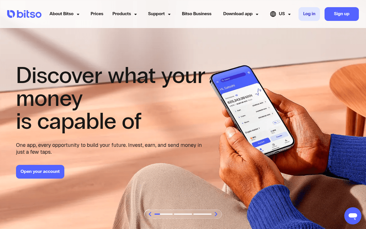
https://bitso.com
https://bitso.com
Screenshot of bitso.com
55of 100
C−

Bitso has a polished brand but the hero is doing the bare minimum — 'Discover what your money is capable of' is aspirational fluff that tells a first-time visitor nothing about what Bitso actually is. The full-page screenshot reveals a critically broken layout: below the fold is almost entirely a giant beige background with no content visible, suggesting severe rendering or scroll-depth issues that would kill conversion for anyone who doesn't immediately click.

Your action plan

Ordered by conversion impact. Click any fix to see the before → after.

1
Add quantified social proof to hero section
High ImpactQuick WinHero subheadline: 'One app, every opportunity to build your future'
Currently
One app, every opportunity to build your future. Invest, earn, and send money in just a few taps.
Recommended
Add a trust line directly below: 'Trusted by 9M+ users across Latin America — regulated, licensed, and secure.' Pair with a user count badge near the CTA.
First-time fintech visitors need trust signals before they act. Nielsen Norman research shows social proof near the CTA increases conversion by 15-30% in financial services.

Copy rewrites

Ready to use

Drop-in replacements for your highest-leverage text. Each rewrite explains the conversion principle behind it.

H1 hero headline
Discover what your money is capable of
Crypto, stocks, and global transfers — one powerful app
Specificity: names the three core products so visitors immediately understand the offering without scrolling
Hero subheadline
One app, every opportunity to build your future. Invest, earn, and send money in just a few taps.
Buy 100+ cryptos, invest in 5,000 stocks, and send money globally — all from one regulated app.
Specificity and feature enumeration: replaces abstract promise with concrete numbers that signal depth and credibility
CTA button
Open your account
Start investing free — open your account
Reduces friction by addressing cost concern and adding action momentum; 'free' is a proven conversion trigger in fintech onboarding
Trust section headline
Bitso: where LATAM invests
9M+ investors trust Bitso — licensed and regulated for over a decade
Social proof with specificity: replaces a geographic claim with a user-count and longevity signal that directly addresses fintech trust barriers
💡

The killer move

High Impact
Launch a geo-personalized hero with a live yield rate display

Show the current USDC yield rate (e.g. 4% APY) dynamically in the hero for US-region visitors — a live number creates immediate tangible value and separates Bitso from exchanges that only offer trading, converting passive savers who would otherwise ignore a crypto-first pitch.

How visitors experience your page

Second-by-second walkthrough.

1 strong3 mixed1 weak
0-3 secondsMixed
0-3s first impression: Large hero with warm beige background, phone mockup showing app UI, headline 'Discover what your money is capable of', single blue CTA button, full nav with Log in and Sign up
Brand looks premium and trustworthy but the headline communicates no clear product category. A first-time visitor cannot tell if this is a bank, crypto exchange, or investment app — ambiguity increases bounce risk.
3-8 secondsMixed
3-8s orientation: Subheadline mentioning invest, earn, send money; slider dots suggesting multiple hero slides; Sign up button in nav
Visitor begins to understand it is a financial app but still lacks specifics on geography, fees, or trust signals. The slider dots suggest more content but there is no incentive to wait for rotation.
8-15 secondsStrong
8-15s consideration: Scrolls to see stocks section mentioning 5,000 stocks, crypto ticker with recognizable assets like BTC ETH SOL, earn yields section
The product depth becomes clear here — crypto plus stocks plus yield is a compelling combination. Visitors with investment intent will engage strongly with the asset ticker and yield percentages.
15-30 secondsMixed
15-30s evaluation: Cross-border transfer section, trust section with decade-long track record, three App Store testimonial snippets
Testimonials exist but are short and lack names, photos, or verified reviewer details — they read as generic. The trust section copy is strong but the social proof execution is weak for a fintech audience.
30+ secondsWeak
30s+ decision: Educational content section, Bitso Business CTA, footer
No sticky CTA, no urgency mechanism, no email capture fallback for visitors not ready to open an account. Users who reach this depth without converting have no re-engagement path offered on the page.

Health check

8 dimensions, weighted by conversion impact.

First impression & hero
20%
6/10
Visually polished but the headline is aspirational fluff — no product category, no geography, no differentiator visible in 3 seconds
Copy & messaging
20%
5/10
Subheadline and section copy improve with scroll but the hero copy fails the specificity test that fintech audiences require
Call-to-action
15%
5/10
Single CTA with decent label but no secondary app-download path, no urgency, and no sticky CTA for scroll depth
Trust & social proof
15%
5/10
App Store quotes exist but lack reviewer names and photos; no user count, regulatory badges, or security certifications visible above fold
Visual design & layout
10%
7/10
Clean, modern brand system with good typography hierarchy and a warm color palette that differentiates from typical cold fintech blue
Page structure & flow
8%
4/10
Full-page screenshot shows a near-empty below-fold experience suggesting a serious rendering or lazy-load issue that breaks the conversion funnel
Technical & SEO signals
7%
7/10
PageSpeed 86 with 1.2s FCP and 2.9s LCP is solid; CLS 0.00 is excellent; meta title and description are well-optimized for crypto investing keywords
Differentiation & positioning
5%
6/10
Crypto plus stocks plus transfers in one app is genuinely differentiated for LATAM but this combination is never stated as a single punchy positioning line

Page speed

Based on real Chrome user data
86/100
Overall score
Combined performance rating
2.9 s
Largest paint
Time until the main content is visible
0.00
Layout shift
How much the page moves while loading
1.2 s
First paint
Time until something first appears
86 ms
Responsiveness
How fast the page reacts to clicks

Want mobile analysis and fresh re-runs?

Buy roasts to unlock mobile analysis, re-analyze on demand, and more for bitso.com.

See roast packs →