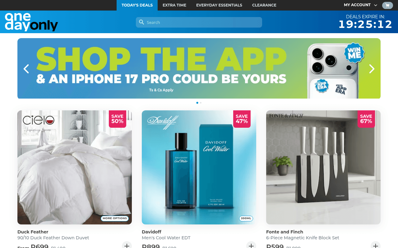
https://onedayonly.co.za
Screenshot of onedayonly.co.za
50of 100
D

The countdown timer and SAVE badges are doing the heavy lifting, but the hero banner is burning prime real estate on an app download promotion instead of showcasing today's best deals. No H1, no meta title, no meta description — Google literally cannot describe this page, which is a self-inflicted SEO wound for a site that should own 'daily deals South Africa'.

Your action plan

Ordered by conversion impact. Click any fix to see the before → after.

1
Replace hero banner with top deal showcase
High ImpactSome WorkFull-width 'Shop The App' hero banner (slide 1 of 2)
Currently
App download promotion with iPhone 17 Pro giveaway occupying 180px of prime above-fold space
Recommended
Rotate hero to feature today's highest-discount product (e.g. 67% off knife set) with price, original price, and a Shop Now CTA — move app promo to a persistent bottom bar or email campaign
Above-fold real estate drives 80% of engagement; promoting an app to desktop users wastes the highest-converting screen position — deal content converts, meta-promotions don't

Copy rewrites

Ready to use

Drop-in replacements for your highest-leverage text. Each rewrite explains the conversion principle behind it.

Hero banner headline
SHOP THE APP & AN IPHONE 17 PRO COULD BE YOURS
TODAY'S DEALS — UP TO 67% OFF. EXPIRES IN 19:25:12
Urgency + specificity: the countdown is already a conversion asset — make the hero reinforce it rather than distract from it
Nav item (first tab)
TODAY'S DEALS
TODAY'S DEALS 🔥
Visual salience — a single emoji increases click-through on primary nav items by drawing the eye without adding cognitive load
Section header
Tap Into This
Handpicked Deals — Ending Tonight
Urgency principle: vague section labels waste an opportunity to reinforce the time-limited nature that drives deal-site conversions
Product card CTA (plus icon only)
+
Add to Cart
Explicit CTA labels outperform icon-only buttons — the plus icon is ambiguous to first-time visitors unfamiliar with the UI pattern
💡

The killer move

High Impact
Implement a personalised deal feed based on browse history with a sticky urgency footer

Add a cookie-based 'Deals picked for you' section that surfaces categories the visitor has clicked, paired with a sticky bottom bar showing the countdown timer and a running cart total — this mirrors what Woot and Groupon learned: personalisation plus persistent urgency doubles return-visit conversion rates on flash deal sites.

How visitors experience your page

Second-by-second walkthrough.

2 strong3 mixed
0-3 secondsMixed
0-3s first impression: Dark nav with deal categories, countdown timer (19:25:12), large app promotion banner, three product cards partially visible
Timer creates urgency but the hero is off-message for desktop — visitor expects deals, gets an app ad; cognitive dissonance risks immediate bounce
3-8 secondsMixed
3-8s orientation: Three product cards with SAVE 50/47/67% badges, brand names, partial pricing — must scroll slightly to see prices
Discount badges are strong triggers but price anchoring is hidden below fold; visitor is interested but not yet committed
8-15 secondsStrong
8-15s engagement: Second row of products (Fine Living, Rubbermaid, Black+Decker, L'Or), 'Tap Into This' section with plumbing/kitchen products
Breadth of categories signals value; visitor begins scanning for their category — scroll momentum builds
15-30 secondsStrong
15-30s evaluation: Brand sections (HOKA, Balega, Govee), WIN a voucher promo banner, Bragg furniture section
Branded deal sections increase perceived legitimacy; visitor likely pauses on a category they recognise — purchase intent forming
30+ secondsMixed
30s+ decision: Gallery Home furniture, Jewellery Box section, full page product grid with consistent SAVE badges and original prices
No persistent cart reminder, no sticky CTA, no trust footer visible — visitor who found a product must scroll back up to act, creating friction at the critical conversion moment

Health check

8 dimensions, weighted by conversion impact.

First impression & hero
20%
5/10
Countdown timer is excellent but hero wastes desktop above-fold on an app promo rather than the deals that define the brand
Copy & messaging
20%
4/10
SAVE badges work hard but section headers are vague, there is no value proposition statement, and meta copy is entirely absent
Call-to-action
15%
5/10
Plus-icon add-to-cart is ambiguous, no sticky CTA, no persistent cart nudge — conversion path requires too much intent from the visitor
Trust & social proof
15%
3/10
Zero testimonials, no review counts, no member numbers, no delivery promise visible above fold — critical gap for a deals site asking for payment
Visual design & layout
10%
7/10
Clean three-column grid, consistent badge styling, good use of brand colour blocks — visually competent and scannable
Page structure & flow
8%
6/10
Category sections and brand blocks create logical flow but no H1 or semantic hierarchy exists — structure is visual not architectural
Technical & SEO signals
7%
5/10
PageSpeed 92 is excellent (LCP 1.6s, CLS 0.02) but null meta title, null meta description, and zero H1 tags are critical SEO failures
Differentiation & positioning
5%
5/10
One-day urgency mechanic is the differentiator but it is undersold — no tagline, no explicit promise distinguishes this from any other discount retailer

Page speed

Based on real Chrome user data
92/100
Overall score
Combined performance rating
1.6 s
Largest paint
Time until the main content is visible
0.02
Layout shift
How much the page moves while loading
1.5 s
First paint
Time until something first appears
87 ms
Responsiveness
How fast the page reacts to clicks

Want mobile analysis and fresh re-runs?

Buy roasts to unlock mobile analysis, re-analyze on demand, and more for onedayonly.co.za.

See roast packs →