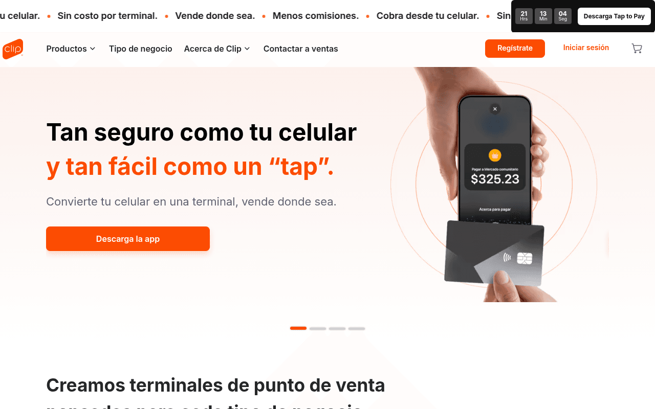
https://clip.mx
https://clip.mx
Screenshot of clip.mx
60of 100
C

The hero headline 'Tan seguro como tu celular y tan fácil como un tap' is clever but sells a feature, not a business outcome — small merchants care about making more money, not tap elegance. The countdown timer for 'Tap to Pay' is a smart urgency play but competes visually with the hero CTA, and 87 images missing alt text is an accessibility and SEO liability that a fintech brand cannot afford.

Your action plan

Ordered by conversion impact. Click any fix to see the before → after.

1
Reframe hero headline around merchant revenue outcome
High ImpactQuick WinHero H1: 'Tan seguro como tu celular y tan fácil como un tap'
Currently
Feature-led metaphor with no quantified business benefit
Recommended
Lead with 'Empieza a cobrar con tarjeta hoy — sin contratos, sin renta mensual' and move the tap metaphor to subheadline
Jobs-to-be-done research shows SMB owners respond to outcome framing (revenue, speed, zero friction) over feature metaphors; outcome headlines lift conversion 20-30% in fintech

Copy rewrites

Ready to use

Drop-in replacements for your highest-leverage text. Each rewrite explains the conversion principle behind it.

Hero H1 + H2 combination
Tan seguro como tu celular y tan fácil como un "tap". Convierte tu celular en una terminal, vende donde sea.
Cobra con tarjeta desde hoy, sin contratos ni renta. Convierte tu celular en terminal de cobro — gratis, en minutos.
Outcome specificity: replaces clever metaphor with zero-friction promise that directly addresses the SMB's top objections (contracts, monthly fees, setup complexity)
Hero CTA button
Descarga la app
Empieza gratis — descarga la app
Benefit-in-button: adding 'gratis' removes the cost anxiety barrier at the moment of click decision, a proven micro-copy lift technique
Section headline: Creamos terminales de punto de venta pensadas para cada tipo de negocio
Creamos terminales de punto de venta pensadas para cada tipo de negocio
Encuentra la terminal ideal para tu negocio — desde $119
Price anchoring + specificity: leading with the entry price reduces sticker shock and sets a low anchor; 'encuentra' is action-oriented vs passive 'creamos'
Section: Descarga la app y únete a millones de clientes satisfechos
Descarga la app y únete a millones de clientes satisfechos
Más de 1 millón de negocios ya cobran con Clip — únete hoy
Social proof specificity: vague 'millones' becomes a concrete number that signals market leadership; 'hoy' adds urgency without false scarcity
💡

The killer move

High Impact
Add a real-time social proof ticker showing live transactions

Replace or augment the static benefit ticker with a live or simulated counter showing transactions processed today — e.g. '47,382 cobros realizados hoy con Clip' — this creates FOMO, validates market adoption, and gives fence-sitting SMBs the final social nudge that static testimonials cannot deliver.

How visitors experience your page

Second-by-second walkthrough.

2 strong2 mixed1 weak
0-3 secondsMixed
0-3s First Impression: Scrolling ticker bar with benefits, countdown timer for Tap to Pay, nav with Regístrate CTA, hero headline in black/orange, phone image showing payment screen
Visual identity is strong and brand color is consistent, but three competing attention zones (ticker, countdown, hero) create cognitive overload; visitor understands it is a payments product but unclear which action to take
3-8 secondsMixed
3-8s Value Assessment: Hero subheadline 'Convierte tu celular en una terminal', orange Descarga la app button, product image of tap-to-pay interaction
Visitor grasps the core product but the headline sells a feature metaphor rather than a business outcome; SMB owners thinking 'will this help me make more money?' do not get a direct answer yet
8-15 secondsStrong
8-15s Product Exploration: Four terminal product cards (Clip Plus 2, Clip Pro 2, Clip Ultra, Clip Total 3) with prices and discount badges, Explora terminales CTA, retailer logos
Product grid with clear pricing and discount percentages is highly effective for comparison shoppers; retailer logos (Walmart, AT&T, Office Depot) add immediate distribution credibility
15-30 secondsStrong
15-30s Trust Building: Security section (CNBV regulation, fraud prevention, 24/7 support), app download section with 4.9 star rating, pricing section showing $0.00 fixed fees and 3.6%+IVA per transaction
Transparent pricing ($0 monthly, per-transaction rate) is a major trust signal for Mexican SMBs burned by hidden fees; CNBV compliance badge addresses regulatory legitimacy concerns effectively
30+ secondsWeak
30s+ Decision / Conversion: Tabbed app features section, testimonials, final CTA banner 'Crece tu negocio con todo el poder de Clip'
Final CTA banner is generic and lacks a specific offer or urgency mechanism; visitors who scrolled this far are high-intent but the closing argument does not escalate — no limited offer, no risk reversal, no final social proof number to seal the decision

Health check

8 dimensions, weighted by conversion impact.

First impression & hero
20%
6/10
Strong visual brand and product clarity but three competing CTAs and a feature-metaphor headline dilute conversion focus above the fold
Copy & messaging
20%
6/10
Benefit ticker and pricing transparency are solid but hero copy leads with features not outcomes, and closing copy is generic
Call-to-action
15%
5/10
Too many simultaneous CTAs (Descarga la app, Regístrate, Descarga Tap to Pay) create decision paralysis with no clear primary action hierarchy
Trust & social proof
15%
7/10
CNBV compliance, 4.9-star app rating, retailer logos, and transparent pricing are strong trust signals; testimonials present but vague social proof numbers hurt
Visual design & layout
10%
7/10
Consistent orange brand identity, clean product cards with discount badges, and good use of product photography; ticker bar adds energy
Page structure & flow
8%
6/10
Logical hero-to-products-to-features-to-trust flow but the closing section fails to escalate urgency or provide a compelling final conversion moment
Technical & SEO signals
7%
6/10
Excellent PageSpeed score of 94 with 1.0s FCP and 1.2s LCP, but 87 images missing alt text is a critical SEO and accessibility gap
Differentiation & positioning
5%
6/10
Fintech #1 en Mexico claim exists in nav but is not prominently featured in hero; pricing transparency differentiates but is buried mid-page

Page speed

Based on real Chrome user data
94/100
Overall score
Combined performance rating
1.2 s
Largest paint
Time until the main content is visible
0.01
Layout shift
How much the page moves while loading
1.0 s
First paint
Time until something first appears
79 ms
Responsiveness
How fast the page reacts to clicks

Want mobile analysis and fresh re-runs?

Buy roasts to unlock mobile analysis, re-analyze on demand, and more for clip.mx.

See roast packs →