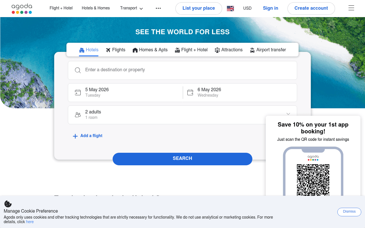
https://agoda.com
https://agoda.com
Screenshot of agoda.com
50of 100
D

Agoda's hero does the basics right — clean search widget, clear tabs — but 'See the World for Less' is a generic promise every OTA has made since 2005. The app QR code popup competes directly with the primary search action, and the below-fold content is a link farm masquerading as inspiration.

Your action plan

Ordered by conversion impact. Click any fix to see the before → after.

1
Replace generic headline with a specific value proposition
High ImpactQuick WinHero headline: SEE THE WORLD FOR LESS
Currently
SEE THE WORLD FOR LESS — no quantification, no differentiation
Recommended
Add a specific claim: 'Hotels up to 40% cheaper — 2M+ properties worldwide' as a subheadline directly below the main headline
Specificity outperforms vague claims by 2-3x in A/B tests (Nielsen Norman). Every OTA says 'less' — a number makes it credible and scannable in under 3 seconds.

Copy rewrites

Ready to use

Drop-in replacements for your highest-leverage text. Each rewrite explains the conversion principle behind it.

Hero headline
SEE THE WORLD FOR LESS
Book Smarter. Save More. 2M+ Hotels at Guaranteed Low Prices.
Specificity and social proof — quantified claims outperform vague superlatives in travel category testing
App popup headline
Save 10% on your 1st app booking!
First App Booking? Save 10% Instantly — Scan to Download
Action-oriented framing with immediacy cue; moves benefit before the ask
Search CTA button
SEARCH
SEARCH BEST PRICES
Benefit-reinforcing CTA copy reduces hesitation by reminding users what they get, not just what they do
Top destinations section header
Top destinations in the United States
Best Deals in the United States — Prices from $49/night
Price anchoring at the section level converts browsing intent to booking intent faster
💡

The killer move

High Impact
Add a real-time price comparison strip above the search widget

Show a live ticker or static callout like 'Agoda vs. competitors: avg. 23% lower on Asia-Pacific hotels' with a link to methodology — this turns an abstract promise into a verifiable claim and gives price-sensitive comparison shoppers a reason to stop their tab-switching and book here.

How visitors experience your page

Second-by-second walkthrough.

1 strong2 mixed2 weak
0-3 secondsMixed
0-3s First Impression: Agoda logo, aerial beach hero image, SEE THE WORLD FOR LESS headline, search widget with tabs
Brand is recognizable, layout is clean, but headline fails to differentiate. Visitor knows what the site does but has no reason to prefer it over Booking.com or Expedia.
3-8 secondsStrong
3-8s Orientation: Search tabs (Hotels, Flights, Homes, Flight+Hotel, Attractions, Airport transfer), destination input, date fields, guest selector, SEARCH button
Tab navigation is comprehensive and familiar. Pre-filled dates reduce friction. Visitor likely begins entering a destination — primary funnel engagement begins.
8-15 secondsWeak
8-15s Engagement: App QR code popup appears bottom-right, Add a flight link, SEARCH button
QR popup interrupts search completion. Visitor on desktop cannot scan a QR code without a second device — this creates friction and cognitive load at the worst moment.
15-30 secondsMixed
15-30s Exploration: Top US destinations grid (Las Vegas, LA, Dallas, NY), Accommodation Promotions banners, Flights & Activities Promotions
Destination tiles are visually appealing but lack prices. Promotion banners are generic. Visitor who did not search yet may click a tile but has no price signal to motivate urgency.
30+ secondsWeak
30s+ Decision: Properties we think you like, Popular destinations outside US, massive SEO footer with hundreds of links
Page devolves into an SEO link farm. No personalization signal, no reviews, no urgency mechanisms. Undecided visitors have no compelling reason to convert here vs. a competitor.

Health check

8 dimensions, weighted by conversion impact.

First impression & hero
20%
6/10
Clean layout and recognizable brand, but headline is generic and the app popup immediately competes with the primary search action.
Copy & messaging
20%
4/10
SEE THE WORLD FOR LESS is the weakest possible OTA headline — no specificity, no proof, no differentiation from a dozen competitors.
Call-to-action
15%
6/10
SEARCH button is prominent and blue, but lacks benefit reinforcement; app popup CTA actively cannibalizes primary conversion.
Trust & social proof
15%
3/10
Zero trust signals visible above the fold — no review count, no guarantee badge, no partner logos near the search widget where they matter most.
Visual design & layout
10%
7/10
Aerial hero image is aspirational, widget is clean and well-structured, tab iconography is clear — solid execution on visual fundamentals.
Page structure & flow
8%
5/10
Hero to search is logical, but below-fold devolves into undifferentiated tiles and an SEO footer that serves crawlers more than customers.
Technical & SEO signals
7%
6/10
PageSpeed 75 with 929ms LCP is acceptable; CLS of 0.11 is borderline — likely caused by the app popup loading after initial render.
Differentiation & positioning
5%
3/10
Nothing on this page explains why Agoda beats Booking.com or Expedia — no unique angle, no proprietary data point, no memorable brand promise.

Page speed

Based on real Chrome user data
75/100
Overall score
Combined performance rating
929 ms
Largest paint
Time until the main content is visible
0.11
Layout shift
How much the page moves while loading
816 ms
First paint
Time until something first appears
354 ms
Responsiveness
How fast the page reacts to clicks

Want mobile analysis and fresh re-runs?

Buy roasts to unlock mobile analysis, re-analyze on demand, and more for agoda.com.

See roast packs →