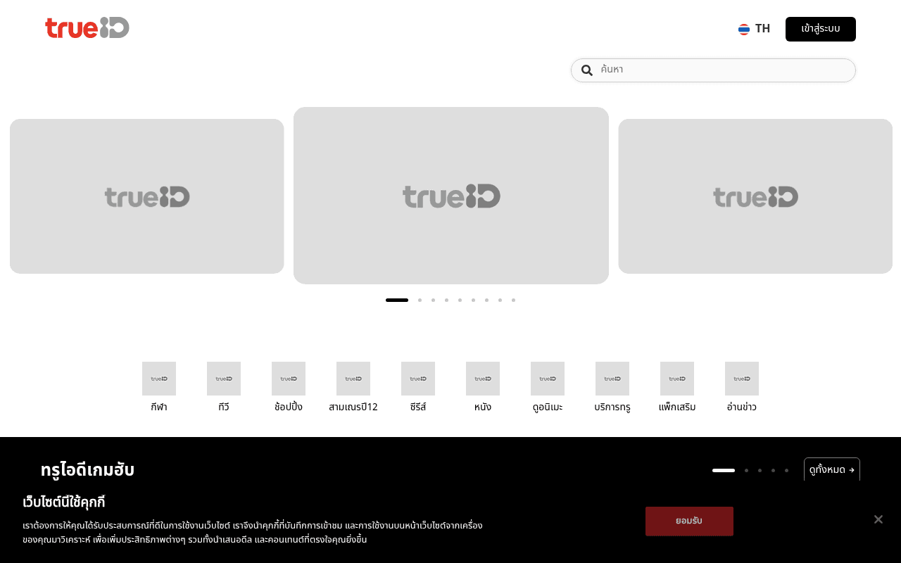
https://trueid.net
https://trueid.net
Screenshot of trueid.net
30of 100
F

The hero carousel is three identical grey placeholder boxes with TrueID logos — zero content, zero value proposition, zero reason to stay. The only conversion CTA above the fold is a login button, meaning new visitors get nothing to convert on. A streaming platform that can't show its content in the hero is like a restaurant with a blank menu.

Your action plan

Ordered by conversion impact. Click any fix to see the before → after.

1
Replace broken hero carousel with actual content thumbnails and a value proposition
High ImpactSome WorkThree grey placeholder carousel cards above the fold
Currently
Three identical grey boxes showing only the TrueID logo — no content, no headline, no CTA
Recommended
Load real featured content (show/movie art) with an overlay headline like 'ดูหนัง ซีรีส์ กีฬา ฟรี — สมัครวันนี้' and a prominent 'สมัครฟรี' CTA button on the hero
Above-fold content is the single highest-leverage conversion zone; blank placeholders signal a broken page and cause immediate bounce — Nielsen Norman Group data shows users decide to stay or leave within 10-20 seconds

Copy rewrites

Ready to use

Drop-in replacements for your highest-leverage text. Each rewrite explains the conversion principle behind it.

Top navigation CTA button
เข้าสู่ระบบ
สมัครฟรี / เข้าสู่ระบบ
Acquisition priority — new visitors need a registration path before a login path; splitting the CTA doubles conversion surface area
Hero section (currently no headline exists)
(no headline — blank carousel only)
หนัง ซีรีส์ กีฬาสด และอีกมากมาย — ดูฟรีได้เลย
Value proposition clarity — visitors need an immediate answer to 'what is this and why should I care' within 3 seconds of landing
Section header visible in full-page view
ทรูไอดีเกมฮับ
เกมฮับ — เล่นเกมพรีเมียมฟรีสำหรับสมาชิก TrueID
Specificity and benefit-led copy — naming the membership benefit converts browsers into registrants by making the value exchange explicit
💡

The killer move

High Impact
Implement a personalized content preview wall for logged-out users

Show 6-8 pieces of premium locked content (popular Thai series, live sports) with a blurred or truncated preview and a single inline 'สมัครฟรีเพื่อดูต่อ' CTA — this converts the entire content grid into a registration funnel rather than a passive browse experience, a tactic proven by Disney+ and HBO Max to lift free-to-paid conversion by 20-35%.

How visitors experience your page

Second-by-second walkthrough.

1 strong2 mixed2 weak
0-3 secondsWeak
0-3s First Impression: TrueID logo, language toggle, login button, search bar, and three large grey placeholder boxes with no content
Visitor cannot determine what TrueID offers — grey boxes signal a broken or slow page, triggering immediate distrust and high bounce probability
3-8 secondsMixed
3-8s Value Scan: Category icons (กีฬา, ทีวี, ช้อปปิ้ง, ซีรีส์, หนัง, etc.) below the broken carousel
Category icons provide the first real signal that this is a content platform, but without a headline or value prop, visitors are still piecing together what TrueID is
8-15 secondsStrong
8-15s Content Discovery: Game Hub section with actual game thumbnails (Rayman, Watch Dogs, Patrick Star) and TV schedule section with real content
Real content thumbnails finally appear and create engagement pull — visitors who scroll this far begin to understand the platform's breadth and may continue
15-30 secondsMixed
15-30s Deeper Evaluation: Movie and series sections, some with grey placeholder cards still loading; free content labels visible
Persistent placeholder cards undermine confidence; free content labels are a conversion trigger but are small and easy to miss — no paywall explanation or membership benefit summary exists
30+ secondsWeak
30s+ Decision Point: Footer with app download badges (App Store, Google Play, AppGallery) and social follow links
No registration CTA appears at the bottom of the page — users who have scrolled the full page and are ready to convert find only app download links, creating a dead end for desktop sign-ups

Health check

8 dimensions, weighted by conversion impact.

First impression & hero
20%
2/10
Three grey placeholder boxes dominate the hero with zero content, headline, or value proposition — functionally broken above the fold
Copy & messaging
20%
3/10
No headline, no value proposition, no meta tags — the page communicates almost nothing about what TrueID offers or why to register
Call-to-action
15%
3/10
Only a login button exists above the fold; no sign-up CTA anywhere on the page for new user acquisition
Trust & social proof
15%
3/10
No testimonials, subscriber counts, partner logos, or trust signals visible; broken placeholder images actively erode credibility
Visual design & layout
10%
5/10
When content loads, the card-grid layout is clean and familiar for streaming platforms, but CLS of 0.27 and grey placeholders damage execution
Page structure & flow
8%
5/10
Content categories are logically organized below the fold but the page lacks a conversion funnel — no registration prompt at any scroll depth
Technical & SEO signals
7%
3/10
Performance score 70, CLS 0.27 (Poor), zero meta title or description, zero H1/H2 headings — SEO foundation is essentially absent
Differentiation & positioning
5%
3/10
Nothing on the page explains why TrueID over Netflix, YouTube, or local competitors — no unique value proposition is stated anywhere

Page speed

Based on real Chrome user data
70/100
Overall score
Combined performance rating
1.4 s
Largest paint
Time until the main content is visible
0.27
Layout shift
How much the page moves while loading
802 ms
First paint
Time until something first appears
80 ms
Responsiveness
How fast the page reacts to clicks

Want mobile analysis and fresh re-runs?

Buy roasts to unlock mobile analysis, re-analyze on demand, and more for trueid.net.

See roast packs →