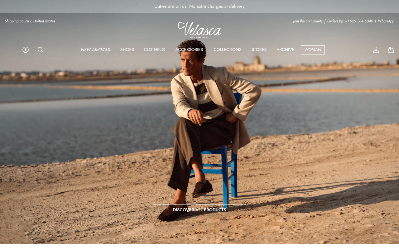
https://velasca.com
https://velasca.com
Screenshot of velasca.com
45of 100
D

Velasca's hero is a gorgeous Mediterranean mood board with zero copy — the model's shoes are barely visible yet shoes are the core product. The only above-fold text is a generic 'Duties are on us' banner, leaving visitors to guess what they're buying. A $300 loafer deserves more than a ghost CTA floating at the bottom of a full-bleed image.

Your action plan

Ordered by conversion impact. Click any fix to see the before → after.

1
Add hero headline and subhead over the image
High ImpactQuick WinFull-bleed hero image — currently zero copy overlay
Currently
No headline, no product context, no value proposition visible above fold
Recommended
Overlay headline 'Italian Craftsmanship. Worn for Life.' with subhead 'Handmade shoes and clothing from Milan's finest artisans — duty-free to the US'
Nielsen Norman research shows users decide within 10 seconds whether to stay; zero copy forces 100% of the persuasion burden onto a single ambiguous image

Copy rewrites

Ready to use

Drop-in replacements for your highest-leverage text. Each rewrite explains the conversion principle behind it.

Hero CTA button
DISCOVER ALL PRODUCTS
Shop New Arrivals
Specificity — 'New Arrivals' signals freshness and creates mild urgency vs. the generic 'all products' which implies no editorial curation
Meta title
Velasca | Italian style, made to last
Velasca | Handcrafted Italian Shoes & Clothing — Duty-Free to the US
SEO specificity + conversion: includes the duty-free USP that US visitors care about and targets transactional search intent
Newsletter signup headline
Take the first step
Get 10% Off Your First Order
Lead with the benefit, not a metaphor — direct incentive framing increases email capture rates by making the value exchange explicit immediately
Meta description
Men's shoes and clothing, artisanal quality and timeless style. Online and in store.
Handcrafted Italian shoes and clothing for men. Artisanal quality, timeless style — duty-free delivery to the US. Discover Velasca.
Specificity and urgency: adds the duty-free differentiator that converts US searchers and ends with a clear action verb
💡

The killer move

High Impact
Launch a split hero with a product-first right panel

Replace the full-bleed single image with a 60/40 split: lifestyle photography left, curated 2x2 product grid right showing bestselling shoes with prices and a single category CTA — this preserves brand aesthetics while immediately surfacing purchasable inventory, directly addressing the zero-product-visibility problem that is almost certainly the primary bounce driver for new US visitors.

How visitors experience your page

Second-by-second walkthrough.

1 strong2 mixed2 weak
0-3 secondsMixed
0-3s First Impression: Full-bleed Mediterranean lifestyle image, man in linen blazer and loafers, Velasca logo, nav bar, duty-free announcement strip
Aesthetic is premium and on-brand but visitor cannot confirm what is being sold — shoes? clothing? a lifestyle magazine? Ambiguity risks immediate bounce from intent-driven visitors
3-8 secondsMixed
3-8s Orientation: Navigation items: NEW ARRIVALS, SHOES, CLOTHING, ACCESSORIES, COLLECTIONS, STORES, ARCHIVE, WOMAN — ghost CTA button at bottom
Nav provides category clarity but requires active reading; no visual hierarchy guides the eye. Visitor must self-direct rather than being led — friction for cold traffic
8-15 secondsWeak
8-15s Engagement: Ghost CTA button DISCOVER ALL PRODUCTS at bottom of hero — no product imagery, no price anchoring, no social proof
Visitor has seen zero products after 15 seconds. Without price or product context, high-intent shoppers feel unanchored and may exit to a competitor with visible inventory
15-30 secondsWeak
15-30s Consideration: Must scroll past full-height hero to reach any product content — page structure below fold not visible in screenshots
Scroll depth required to reach product is a conversion killer on desktop; users who don't scroll never reach the purchase funnel. Bounce probability peaks here
30+ secondsStrong
30s+ Decision: Newsletter popup or below-fold content including newsletter signup with 10% offer
The 10% newsletter incentive is a solid retention mechanism for visitors who stayed, but it arrives too late for cold traffic who bounced before seeing it — needs earlier exposure

Health check

8 dimensions, weighted by conversion impact.

First impression & hero
20%
5/10
Stunning photography undermined by zero copy, invisible product, and a ghost CTA that blends into the sand
Copy & messaging
20%
4/10
No headline, no value proposition, no product context above fold — the brand story exists only in the newsletter flow
Call-to-action
15%
4/10
Single ghost-style CTA buried at bottom of hero with generic label; no secondary CTA, no urgency, no directional hierarchy
Trust & social proof
15%
3/10
No reviews, ratings, press mentions, or customer counts visible anywhere on the homepage — a significant gap for a premium DTC brand
Visual design & layout
10%
7/10
Photography quality is excellent and brand aesthetic is cohesive; layout execution sacrifices conversion for pure aesthetics
Page structure & flow
8%
4/10
Entire above-fold viewport is one image with no content hierarchy; product discovery requires scrolling past a full-height lifestyle shot
Technical & SEO signals
7%
5/10
Performance score 65 with CLS of 0.20 (above 0.1 threshold) and no H1 tags — both hurt SEO and user experience measurably
Differentiation & positioning
5%
6/10
Made in Italy and duty-free messaging are genuine differentiators but are buried in the announcement bar rather than hero copy

Page speed

Based on real Chrome user data
65/100
Overall score
Combined performance rating
2.5 s
Largest paint
Time until the main content is visible
0.20
Layout shift
How much the page moves while loading
1.2 s
First paint
Time until something first appears
61 ms
Responsiveness
How fast the page reacts to clicks

Want mobile analysis and fresh re-runs?

Buy roasts to unlock mobile analysis, re-analyze on demand, and more for velasca.com.

See roast packs →