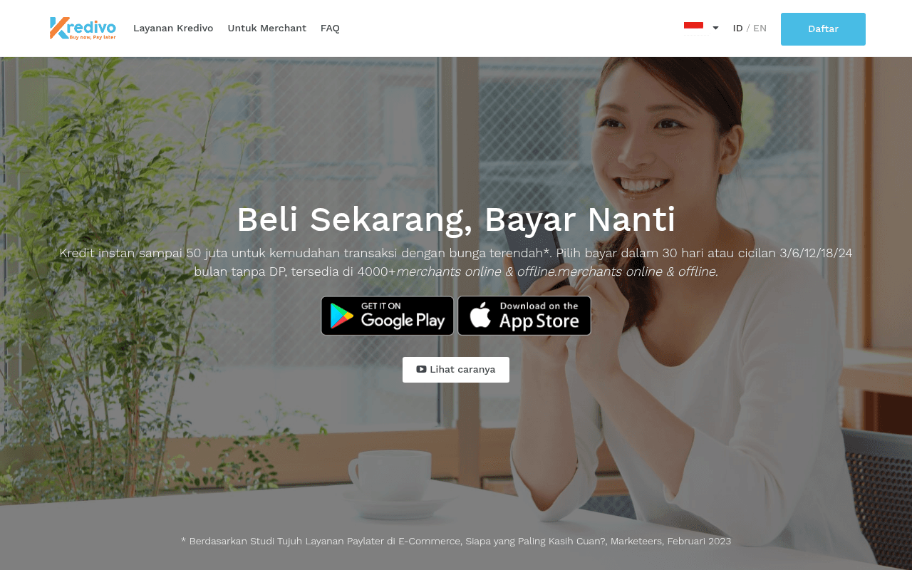
https://kredivo.com
https://kredivo.com
Screenshot of kredivo.com
60of 100
C

The hero is a full-viewport background image with centered text that buries the primary CTA (Daftar) in the nav while pushing app store buttons mid-page — a classic conversion hierarchy failure. The subheadline has a visible text duplication bug ('merchants online & offline.merchants online & offline') that screams quality control issues to first-time visitors considering trusting you with their financial data.

Your action plan

Ordered by conversion impact. Click any fix to see the before → after.

1
Fix critical text duplication bug in hero subheadline
High ImpactQuick WinHero subheadline: 'tersedia di 4000+merchants online & offline.merchants online & offline'
Currently
merchants online & offline.merchants online & offline
Recommended
tersedia di 4000+ merchant online & offline
Trust is the #1 conversion factor in fintech. A visible rendering bug in the hero signals poor quality control — exactly the wrong signal when asking users to share KTP and bank account data.

Copy rewrites

Ready to use

Drop-in replacements for your highest-leverage text. Each rewrite explains the conversion principle behind it.

Hero headline
Beli Sekarang, Bayar Nanti
Beli Sekarang, Bayar Nanti — Cicilan 0% Tanpa Kartu Kredit
Specificity: the tagline is memorable but generic. Adding the 0% and no-credit-card differentiator in the headline captures the key objection and benefit in one line.
Hero subheadline
Kredit instan sampai 50 juta untuk kemudahan transaksi dengan bunga terendah*. Pilih bayar dalam 30 hari atau cicilan 3/6/12/18/24 bulan tanpa DP, tersedia di 4000+merchants online & offline.merchants online & offline.
Kredit instan hingga Rp50 juta, bunga terendah*, tanpa DP. Bayar dalam 30 hari atau cicil 3–24 bulan di 4.000+ merchant online & offline.
Clarity and scannability: removes the duplication bug, adds currency symbol for specificity, uses em-dash for cleaner list formatting, reduces cognitive load.
Ghost CTA button
Lihat caranya
Lihat Cara Kerjanya (2 menit)
Specificity and low-commitment framing: adding a time estimate reduces perceived effort and increases click-through on secondary CTAs by signaling minimal investment required.
💡

The killer move

High Impact
Launch a desktop-optimized split-screen hero with an inline eligibility check

Replace the full-bleed centered hero with a two-column layout: left side has headline, subheadline, and a 2-field inline form (phone number + income range) with a 'Cek Kelayakan Saya' CTA; right side keeps the lifestyle image. This converts passive browsers into micro-committed leads and captures intent data — fintech brands using inline eligibility widgets report 30-40% higher qualified lead rates than app-store-only CTAs.

How visitors experience your page

Second-by-second walkthrough.

2 strong3 mixed
0-3 secondsMixed
0-3s First Impression: Full-viewport hero with smiling woman, large headline 'Beli Sekarang, Bayar Nanti', Kredivo logo, nav with Daftar button top-right
Brand and category are immediately clear — BNPL fintech. But the hero CTA is only in the nav corner; the eye lands on the headline then searches for what to do next and finds only app store badges, creating a micro-hesitation.
3-8 secondsMixed
3-8s Value Scan: Subheadline with 50 juta credit limit, installment options, 4000+ merchants, app store download buttons, ghost 'Lihat caranya' button
The value proposition is substantive but the text duplication bug ('merchants online & offline' repeated) triggers a credibility concern. Desktop users see app store badges and may assume this is mobile-only, reducing registration intent.
8-15 secondsStrong
8-15s Consideration: Bottom of hero with footnote citation from Marketeers Feb 2023, beginning of testimonial section
The Marketeers citation adds third-party credibility. Visitors who scroll this far are engaged — but the gap between hero CTA and testimonials means motivated users must work to find social proof.
15-30 secondsStrong
15-30s Evaluation: Testimonial carousel with multiple authentic user reviews (Ella S., Maurice L., etc.), 4000+ merchant logos mentioned
Testimonials are specific, authentic, and varied — covering approval speed, ease of use, and limit size. This section does heavy lifting for trust but arrives too late in the scroll journey for most desktop users.
30+ secondsMixed
30s+ Decision: How-to steps section, merchant section, final registration CTA
Users who reach this point are highly qualified but the page lacks urgency triggers or a final compelling offer to push registration. No limited-time incentive or risk-reversal (e.g., no annual fee, instant approval guarantee) at the bottom CTA.

Health check

8 dimensions, weighted by conversion impact.

First impression & hero
20%
6/10
Clear BNPL category signal but CTA hierarchy is broken — Daftar buried in nav, no hero-body action button, text duplication bug undermines trust.
Copy & messaging
20%
6/10
Core value props are present (50 juta, 0%, 4000+ merchants) but subheadline has a rendering bug and the headline misses the no-credit-card differentiator.
Call-to-action
15%
4/10
Primary CTA exists only in the nav; hero body offers only app store badges and a ghost secondary button — a significant conversion gap on desktop.
Trust & social proof
15%
7/10
Testimonials are authentic and specific, Marketeers citation adds credibility, but all social proof is below the fold with no user count or rating in the hero.
Visual design & layout
10%
6/10
Clean aesthetic with good typography scale, but full-viewport hero wastes desktop real estate and the centered layout underutilizes the wide canvas.
Page structure & flow
8%
5/10
Logical section order (hero, testimonials, how-to, merchant, CTA) but social proof is too far from the primary conversion action to be effective.
Technical & SEO signals
7%
7/10
Performance score 86, LCP 2.9s is acceptable, CLS 0.07 is clean; meta title and description are present but misaligned (title says 0% cicilan 3 bulan, page says 24 bulan options).
Differentiation & positioning
5%
5/10
'Bunga terendah' claim is asterisked and vague; no explicit comparison to credit cards or competitors to anchor the differentiation for undecided visitors.

Page speed

Based on real Chrome user data
86/100
Overall score
Combined performance rating
2.9 s
Largest paint
Time until the main content is visible
0.07
Layout shift
How much the page moves while loading
1.8 s
First paint
Time until something first appears
41 ms
Responsiveness
How fast the page reacts to clicks

Want mobile analysis and fresh re-runs?

Buy roasts to unlock mobile analysis, re-analyze on demand, and more for kredivo.com.

See roast packs →