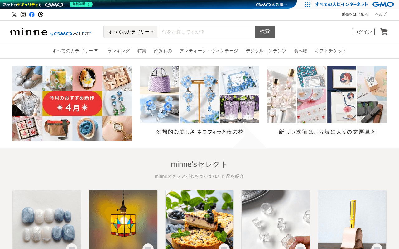
https://minne.com
https://minne.com
Screenshot of minne.com
50of 100
D

Japan's largest handmade marketplace buries its biggest asset — 18 million products from 960,000 creators — below the fold while the hero shows a generic April collage with no headline, no value proposition, and no CTA. The search bar is the de facto hero, which works for returning users but leaves first-timers with zero reason to stay.

Your action plan

Ordered by conversion impact. Click any fix to see the before → after.

1
Add a hero headline and CTA above the fold
High ImpactSome WorkHero banner area (今月のおすすめ新作 4月 collage)
Currently
Three image collages with Japanese category labels, no headline, no CTA button
Recommended
Overlay a headline on the left panel: '960万人の作家から、あなただけの一点物を' with a primary CTA button '今すぐ探す' in brand color
Nielsen Norman Group: users decide to stay or leave in under 10 seconds. No headline means no value proposition is communicated — first-time visitors have no anchor to convert.

Copy rewrites

Ready to use

Drop-in replacements for your highest-leverage text. Each rewrite explains the conversion principle behind it.

Page H1 / brand tagline (implied from meta)
ハンドメイドマーケット minne(ミンネ)
960万人の作家が作る、世界にひとつの作品と出会う場所
Specificity and emotional benefit — replaces a category label with a value proposition that triggers curiosity and desire
minne's Select section subtitle
minneスタッフが心をつかまれた作品を紹介
スタッフが実際に惚れ込んだ、今週の厳選10作品
Urgency and specificity — 'today' and a count create scarcity framing; 'inaho' (inaho) language adds authenticity
Brand manifesto / bottom section
家具も、服も、食べものも。ぜんぶ、だれかがつくったものだ。Handmade is Good.
家具も、服も、食べものも。ぜんぶ、だれかがつくったものだ。だから、選ぶことが応援になる。
Emotional resonance and purpose-driven buying — adds a reason to choose minne over mass retail, tapping into the conscious consumer mindset
App download section headline
いつでもどこでも楽しめる。
1,700万人がアプリで探している。あなたもはじめよう。
Social proof and FOMO — replaces a generic benefit with a specific number that validates the download decision
💡

The killer move

High Impact
Launch a personalized first-visit overlay with a first-purchase coupon

Detect first-time visitors (no cookie) and show a lightweight modal after 8 seconds: '初めてのご購入に使える500円クーポン' with email capture. This simultaneously builds the CRM list, reduces first-purchase friction, and gives the page a conversion mechanism it currently lacks entirely — Etsy's equivalent program drives 15-20% of new user first purchases.

How visitors experience your page

Second-by-second walkthrough.

1 strong3 mixed1 weak
0-3 secondsMixed
0-3s First Impression: minne logo, search bar, category nav, three image collages with no headline or CTA
Returning users recognize the marketplace and go straight to search. New visitors see beautiful product photos but no value proposition — they understand it is a shopping site but not why minne over alternatives.
3-8 secondsMixed
3-8s Orientation: Category navigation bar, three editorial banners (April new arrivals, Nemophila flowers, stationery), no prices visible yet
Visitor scans for relevance. The editorial banners are visually appealing but lack CTAs — they function as decoration rather than conversion drivers. Category nav is comprehensive but overwhelming without a starting point.
8-15 secondsStrong
8-15s Engagement: minne's Select grid with 10 curated products and prices (3,300-12,000 yen range), heart/favorite icons
Product grid with prices is the first concrete conversion opportunity. Curated selection reduces choice paralysis. Visitors with purchase intent will engage here — this section is doing the hero's job.
15-30 secondsMixed
15-30s Evaluation: 注目トピックス (featured topics), 人気のショップ (popular shops), 人気のカテゴリー (popular categories), weekly ranking
Heavy content density creates discovery but also cognitive load. No persistent CTA or urgency mechanism. Visitors interested in selling have still seen only one tiny text link — a significant missed opportunity.
30+ secondsWeak
30s+ Decision: Handmade is Good brand section, news/announcements, app download CTA, footer with full site map
By this point, engaged visitors have self-selected into search or browsing. The brand manifesto and app CTA arrive too late to influence undecided visitors. No email capture, no first-purchase incentive, no urgency — the page lets fence-sitters leave without a conversion attempt.

Health check

8 dimensions, weighted by conversion impact.

First impression & hero
20%
4/10
Beautiful product imagery but zero headline, zero value proposition, zero CTA — the hero is a mood board, not a conversion tool
Copy & messaging
20%
5/10
Tagline is poetic but vague; 96万件 and 1800万点 stats that could anchor trust are invisible above the fold
Call-to-action
15%
3/10
Only one button visible above the fold (ログイン) — no primary purchase CTA, no seller CTA, no email capture anywhere on the page
Trust & social proof
15%
5/10
Strong stats exist in metadata but not on the page; no testimonials, no review counts, no creator stories above the fold
Visual design & layout
10%
7/10
Clean, editorial aesthetic with high-quality product photography; grid layouts are well-executed and consistent with marketplace conventions
Page structure & flow
8%
6/10
Logical content hierarchy from curated to popular to ranked, but the page is extremely long with no sticky CTA or re-engagement hooks mid-scroll
Technical & SEO signals
7%
5/10
Performance score 71 is acceptable; CLS of 0.27 is a critical failure above Google's 0.1 threshold; 4 images missing alt text
Differentiation & positioning
5%
5/10
Japan's largest handmade marketplace claim exists only in footer footnote — the page does not visually or verbally differentiate from any generic e-commerce site

Page speed

Based on real Chrome user data
71/100
Overall score
Combined performance rating
1.2 s
Largest paint
Time until the main content is visible
0.27
Layout shift
How much the page moves while loading
896 ms
First paint
Time until something first appears
66 ms
Responsiveness
How fast the page reacts to clicks

Want mobile analysis and fresh re-runs?

Buy roasts to unlock mobile analysis, re-analyze on demand, and more for minne.com.

See roast packs →