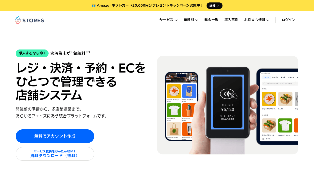
https://www.stores.jp
Screenshot of stores.jp
65of 100
C+

STORES has a clean, competent hero with a clear value prop — register, pay, reserve, EC in one system — but the above-fold CTA button is visually undersized relative to the hero image, and the page is missing any quantified social proof (number of stores, GMV, years in market) that would close skeptical SMB owners who need reassurance before committing.

Your action plan

Ordered by conversion impact. Click any fix to see the before → after.

1
Add quantified trust metrics directly below the hero headline
High ImpactQuick WinSubheadline area between hero copy and CTA buttons
Currently
開業前の準備から、多店舗運営まで。あらゆるフェイズにあう統合プラットフォームです。
Recommended
Insert a stat bar: e.g. '導入店舗数 XX万店以上 | 決済手数料業界最安水準 | サポート満足度 98%' immediately below the subheadline
Nielsen Norman research shows quantified proof near the primary CTA increases conversion 15-30%; the page currently has zero numbers above the fold despite having a pricing section below

Copy rewrites

Ready to use

Drop-in replacements for your highest-leverage text. Each rewrite explains the conversion principle behind it.

Hero headline
レジ・決済・予約・ECをひとつで管理できる店舗システム
レジ・決済・予約・ECを、ひとつで。開業から多店舗展開まで対応する店舗プラットフォーム。
Specificity and outcome framing — adds the growth journey endpoint (多店舗展開) which signals scalability and reduces churn anxiety for growing merchants
Hero subheadline
開業前の準備から、多店舗運営まで。あらゆるフェイズにあう統合プラットフォームです。
月額3,300円から。決済手数料1.98%。導入当日から使えるシンプル設計。
Specificity principle — replaces vague platform language with the three most decision-driving facts already on the page but buried in the pricing section
Secondary CTA label
サービス概要をかんたん理解!資料ダウンロード(無料)
3分でわかるSTORES資料を無料ダウンロード
Specificity and time-to-value framing — '3分で' reduces perceived effort; removes redundant 無料 repetition from label into a single clean phrase
Pricing section header
ご利用料金
シンプルな料金体系 — 無料プランから始められます
Loss aversion and anchoring — leading with free plan availability reduces price anxiety before visitors see the Standard plan numbers
💡

The killer move

High Impact
Launch an interactive ROI calculator in the hero section

Replace the static subheadline with a 3-field calculator (current monthly sales, current payment fee %, number of locations) that instantly shows yen savings with STORES Standard plan — this transforms a passive browsing experience into a personalized business case, which is the single highest-converting tactic for SMB SaaS in Japan where cost sensitivity is the primary objection.

How visitors experience your page

Second-by-second walkthrough.

2 strong3 mixed
0-3 secondsStrong
0-3s First impression: STORES logo, nav with 5 items, yellow campaign bar, hero headline in large bold Japanese, product UI screenshot on right, two CTA buttons
Category and value prop are immediately clear — POS/EC/reservation platform. The product screenshot grounds the abstract claim. Visitor likely thinks 'this looks legitimate and relevant.'
3-8 secondsMixed
3-8s Orientation: Hero subheadline, 無料でアカウント作成 button, 資料ダウンロード secondary CTA, campaign badge 導入するなら今!
Visitor wants to know cost and who else uses it before clicking. Neither is answered here. The free account CTA is present but lacks friction-reducing micro-copy. Risk of scroll-past without clicking.
8-15 secondsStrong
8-15s Evaluation: ワンストップ service grid (cashless, netshop, reservation, mobile order, POS), pricing section with Standard 3,300 yen and Free plan
Service breadth and pricing are well-structured. The two-tier pricing (Standard vs Free) is clear. Visitor likely compares against current solution. Good section but could use a comparison table vs competitors.
15-30 secondsMixed
15-30s Validation: STORESが選ばれています logos (SHIPS, JIN, Alpen Group, Marras Web), testimonial cards with photos and quotes, resource download section
Social proof exists but testimonials are text-heavy and small at full-page zoom. Logo recognition (SHIPS, JIN) is strong for credibility but no aggregate number of stores is shown — a missed trust signal.
30+ secondsMixed
30s+ Decision: FAQ accordion, illustrated support section (form, help center, brochure download), final CTA section お店作りをはじめましょう
FAQ addresses real objections but the final CTA section uses illustrated 3D characters rather than reinforcing the strongest conversion argument. Visitor who scrolled this far needs a final push with a testimonial or stat, not cartoon figures.

Health check

8 dimensions, weighted by conversion impact.

First impression & hero
20%
7/10
Clear value prop and product visual, but zero quantified proof above fold weakens conversion confidence for skeptical SMB owners
Copy & messaging
20%
6/10
Headline is functional but subheadline wastes prime real estate on vague platform language instead of the specific pricing and proof already on the page
Call-to-action
15%
6/10
Primary CTA exists and is visible but lacks micro-copy, urgency, and is visually undersized relative to the hero image column
Trust & social proof
15%
6/10
Named logos (SHIPS, JIN) and testimonials are present but buried below fold with no aggregate store count or GMV figure anywhere on the page
Visual design & layout
10%
8/10
Clean, modern two-column hero, consistent teal brand color, good use of product UI screenshot — professional execution throughout
Page structure & flow
8%
7/10
Logical progression from features to pricing to social proof to FAQ, though the final CTA section uses illustration over conversion-driving content
Technical & SEO signals
7%
8/10
PageSpeed 92 performance score, FCP 862ms, LCP 1.1s — excellent technical foundation; missing meta title and description is a notable SEO gap
Differentiation & positioning
5%
5/10
All-in-one positioning is clear but not defended — no explicit comparison to Square, Airレジ, or other Japanese POS competitors visible on the page

Page speed

Based on real Chrome user data
92/100
Overall score
Combined performance rating
1.1 s
Largest paint
Time until the main content is visible
0.00
Layout shift
How much the page moves while loading
862 ms
First paint
Time until something first appears
46 ms
Responsiveness
How fast the page reacts to clicks

Want mobile analysis and fresh re-runs?

Buy roasts to unlock mobile analysis, re-analyze on demand, and more for stores.jp.

See roast packs →