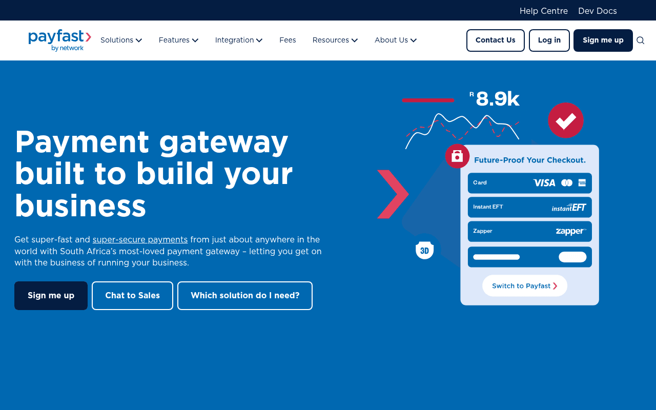
https://payfast.co.za
Screenshot of payfast.co.za
55of 100
C−

The hero headline 'Payment gateway built to build your business' is a forgettable word-salad that wastes prime real estate — 'built to build' is circular and says nothing. The checkout UI visual is compelling but the massive empty blue void below the CTA row screams unfinished, and 75 PageSpeed with a 0.19 CLS score means the page is literally shifting under visitors' feet.

Your action plan

Ordered by conversion impact. Click any fix to see the before → after.

1
Rewrite the hero headline to lead with a concrete outcome
High ImpactQuick WinH1: 'Payment gateway built to build your business'
Currently
Payment gateway built to build your business
Recommended
Accept payments from anywhere. Get paid faster. South Africa's most trusted gateway.
Circular phrasing ('built to build') scores low on clarity tests. Nielsen Norman research shows users decide relevance in under 5 seconds — outcome-led headlines convert 20-30% better than feature-led ones.

Copy rewrites

Ready to use

Drop-in replacements for your highest-leverage text. Each rewrite explains the conversion principle behind it.

Hero H1
Payment gateway built to build your business
Get paid faster. South Africa's payment gateway trusted by 80,000+ businesses.
Specificity and social proof — replaces circular phrasing with a concrete outcome and a credibility anchor
Hero subheadline
Get super-fast and super-secure payments from just about anywhere in the world with South Africa's most-loved payment gateway – letting you get on with the business of running your business.
Accept 18+ payment methods — cards, Instant EFT, Zapper and more — with zero monthly fees. Start in minutes, get paid the same day.
Specificity and urgency — replaces vague superlatives with concrete features (18+ methods, zero monthly fees) and a time-based benefit that reduces perceived friction
Section headline below hero
Your Payfast by Network account. The smartest way to get you paid.
One account. Every payment method. Zero monthly fees.
Clarity and benefit compression — the original is self-congratulatory; the rewrite leads with the three most compelling differentiators in scannable format
No monthly fees callout
No monthly fees on the Payfast Aggregation solution. Zero. Zip. Nada.
No monthly fees, ever. Pay only when you make a sale — no setup costs, no hidden charges.
Loss aversion and specificity — 'Zero. Zip. Nada.' is playful but vague; spelling out the exact model (pay-per-transaction) removes the mental friction that kills sign-ups
💡

The killer move

High Impact
Deploy a fee calculator in the hero section

A simple interactive widget — 'Enter your monthly sales volume, see your exact Payfast cost vs competitors' — would convert the zero-fee claim from a passive statement into a personalized proof moment, dramatically increasing sign-up intent for the SMB segment that is most price-sensitive and most likely to comparison-shop.

How visitors experience your page

Second-by-second walkthrough.

2 strong2 mixed1 weak
0-3 secondsMixed
0-3s First Impression: Blue hero with large headline, checkout UI mockup showing Visa/EFT/Zapper, three CTA buttons, Payfast by Network logo
Brand and category are clear (payment gateway, South Africa) but the headline fails to differentiate. Visitor knows what it is but not why to choose it over competitors like Peach Payments or PayGate.
3-8 secondsWeak
3-8s Value Scan: Subheadline mentioning 'most-loved', three CTAs, the checkout UI with payment method logos, large empty blue space below
The empty whitespace below CTAs signals the page isn't loaded or is broken — visitor may scroll prematurely or lose confidence. No pricing signal or key differentiator is visible yet.
8-15 secondsStrong
8-15s Trust Check: Logo carousel (Takealot, iTickets, Yuma, Dis-Chem), section headline about smartest way to get paid, Chat to Sales and Integration Support CTAs
Recognizable South African brand logos (Dis-Chem, Takealot) provide strong local credibility. Visitor who scrolls this far is likely reassured they are dealing with a legitimate, established platform.
15-30 secondsStrong
15-30s Feature Evaluation: No monthly fees callout, payment methods UI, Paygate gateway section, card machine section, plugin logos (WooCommerce, Shopify, Magento)
The zero-fee model and plugin ecosystem are compelling for SMB merchants. However, the page structure feels like a product catalogue rather than a conversion funnel — no repeated CTA anchors the scroll.
30+ secondsMixed
30s+ Decision Point: Developer documentation section, integration plugins, custom integrations, footer trust claim '80,000 South African businesses'
The most powerful trust signal (80,000 businesses) is at the very bottom. Developers are well-served but SMB merchants may have dropped off. No testimonials or case study quotes appear in the scroll path to close hesitant visitors.

Health check

8 dimensions, weighted by conversion impact.

First impression & hero
20%
6/10
Category and geography are immediately clear but the headline is circular, the empty hero whitespace undermines polish, and no quantified proof appears above the fold.
Copy & messaging
20%
5/10
Relies on superlatives like 'most-loved' and 'smartest' without substantiation; the zero-fee differentiator is buried mid-page rather than leading the narrative.
Call-to-action
15%
5/10
Three equal-weight hero CTAs create Hick's Law paralysis; no repeated sign-up CTA appears during the scroll journey to recapture intent.
Trust & social proof
15%
6/10
Strong logo bar (Dis-Chem, Takealot) and the 80,000 businesses claim exist but are poorly positioned — logos below the fold, the headline claim in the footer.
Visual design & layout
10%
6/10
Clean brand system and the checkout UI mockup is effective, but the large empty hero void and CLS of 0.19 undermine the professional impression.
Page structure & flow
8%
5/10
Page reads as a feature catalogue rather than a conversion funnel — no progressive disclosure of value, no mid-page CTA anchors, and the strongest proof point is at the bottom.
Technical & SEO signals
7%
5/10
PageSpeed 75 is acceptable but CLS 0.19 and FCP/LCP both at 2.8s are borderline; 36 images missing alt text is an accessibility and SEO liability.
Differentiation & positioning
5%
6/10
Zero monthly fees and 18+ payment methods are genuine differentiators but are not foregrounded in the hero — competitors could copy the headline without changing a word.

Page speed

Based on real Chrome user data
75/100
Overall score
Combined performance rating
2.8 s
Largest paint
Time until the main content is visible
0.19
Layout shift
How much the page moves while loading
2.8 s
First paint
Time until something first appears
65 ms
Responsiveness
How fast the page reacts to clicks

Want mobile analysis and fresh re-runs?

Buy roasts to unlock mobile analysis, re-analyze on demand, and more for payfast.co.za.

See roast packs →