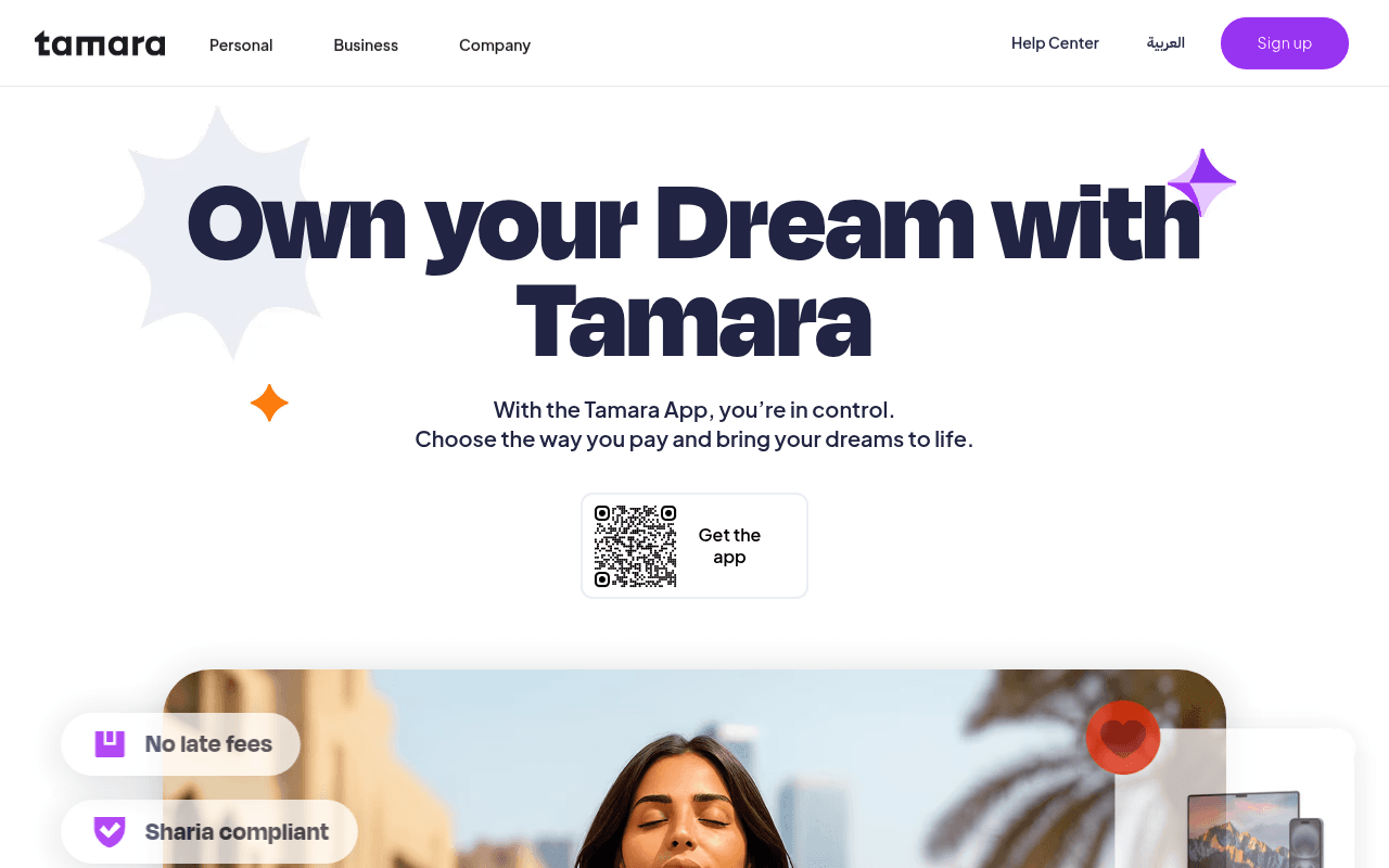
https://tamara.co
https://tamara.co
Screenshot of tamara.co
50of 100
D

The hero headline 'Own your Dream with Tamara' is aspirational fluff when the meta title already nails the value prop — 'Buy now pay over 24 months, no late fees.' A QR code as the sole CTA on desktop is a mobile-first mistake that leaves desktop users with nowhere to go. The page looks polished but converts like a brochure.

Your action plan

Ordered by conversion impact. Click any fix to see the before → after.

1
Replace QR-only CTA with dual desktop/mobile buttons
High ImpactQuick Win'Get the app' QR code block in hero
Currently
Single QR code widget with 'Get the app' label — unusable on desktop without a phone in hand
Recommended
Add App Store and Google Play buttons alongside the QR code, plus a secondary 'Sign up' text CTA for web-based onboarding
Desktop users cannot scan a QR code from their own screen. Fitts's Law: the primary action must be directly clickable. This single fix likely recovers significant desktop conversion leakage.

Copy rewrites

Ready to use

Drop-in replacements for your highest-leverage text. Each rewrite explains the conversion principle behind it.

H1 hero headline
Own your Dream with Tamara
Buy Now, Pay Over 24 Months — No Late Fees, Sharia Compliant
Specificity: replaces vague aspiration with the exact value proposition that differentiates Tamara in the Saudi BNPL market
Hero subheadline
With the Tamara App, you're in control. Choose the way you pay and bring your dreams to life.
Split any purchase into up to 24 easy payments at thousands of stores — with zero late fees and full Sharia compliance.
Specificity and benefit-stacking: answers 'what do I get?' immediately, reinforcing the two key trust signals for this audience
Section headline
Tamara makes payments effortless. Built on trust, designed for simplicity, and available wherever your dreams take you.
Shop at 30,000+ stores today. Pay in flexible installments — your way, your pace, no hidden fees.
Social proof + specificity: replaces abstract brand values with a concrete store count and reiterates the no-fees promise that drives conversion
Smart section CTA area
Free for the first month, then only á 19 monthly.
Free for 30 days, then SAR 19/month. Cancel anytime.
Clarity and loss aversion reduction: the garbled currency symbol and vague 'á' undermines trust; explicit currency and cancellation terms reduce friction
💡

The killer move

High Impact
Move the two differentiators into the headline and test a web sign-up flow

Tamara's 'no late fees + Sharia compliant' combination is rare in BNPL globally — make it the H1, not a badge. Simultaneously, add a web-based sign-up or waitlist flow for desktop users who cannot or will not scan a QR code; this single change could recover the entire desktop conversion gap.

How visitors experience your page

Second-by-second walkthrough.

1 strong3 mixed1 weak
0-3 secondsMixed
0-3s first impression: Large decorative headline 'Own your Dream with Tamara', minimal subtext, a QR code, and decorative star shapes on white background
Brand looks modern and clean but the headline communicates nothing specific. Desktop visitor immediately faces a dead-end CTA (QR code). Likely reaction: 'What exactly does this do?' — curiosity without direction.
3-8 secondsMixed
3-8s value scan: Subheadline about the app, QR code widget, and partially visible 'No late fees' and 'Sharia compliant' badges at bottom of viewport
The two most compelling differentiators (no late fees, Sharia compliance) are buried below the fold. Visitors who don't scroll miss the strongest trust signals entirely.
8-15 secondsStrong
8-15s feature exploration: Hero lifestyle image, four feature cards (Sharia compliant, Pay over 24 months, School tuition, Deals and cashbacks), brand logos section
Feature cards are visually clear and well-organized. The 24-month installment message lands here. Engaged visitors start understanding the product — but this should have happened in the first 3 seconds.
15-30 secondsMixed
15-30s consideration: Browse Brands section, Discounts/Deals section, Smart subscription upsell, Business section
Page tries to serve consumers, deal-seekers, Smart subscribers, and merchants simultaneously. No clear conversion funnel emerges. Visitor may feel overwhelmed or unsure which path is for them.
30+ secondsWeak
30s+ decision: Business CTA, privacy/safety section, FAQ accordion at bottom
No persistent CTA, no urgency mechanism, no testimonials or reviews anywhere on the page. A motivated visitor reaches the bottom with no compelling reason to act now — classic brochure-site drop-off pattern.

Health check

8 dimensions, weighted by conversion impact.

First impression & hero
20%
5/10
Visually polished but headline is vague, sole CTA is a QR code unusable on desktop, and key differentiators are below the fold
Copy & messaging
20%
5/10
Meta title nails the value prop but hero copy retreats into aspiration; feature cards are clear but the Smart pricing has a broken currency symbol
Call-to-action
15%
3/10
QR code as primary desktop CTA is a critical conversion blocker; no sticky CTA, no urgency, no secondary web sign-up path visible
Trust & social proof
15%
4/10
No testimonials, no user counts, no app store ratings visible on page; Sharia compliance badge is strong but appears too late in the scroll
Visual design & layout
10%
7/10
Clean, modern design system with consistent purple palette; feature cards and lifestyle imagery are well-executed
Page structure & flow
8%
5/10
Page tries to serve four audiences (consumers, deal-seekers, Smart users, merchants) without a clear primary funnel or conversion hierarchy
Technical & SEO signals
7%
5/10
LCP 4.7s is in poor territory; 52 of 54 images missing alt text; performance score 76 is acceptable but image accessibility is a significant gap
Differentiation & positioning
5%
6/10
No late fees plus Sharia compliance is a genuinely strong dual differentiator for Saudi market but it is underplayed in the hero where it matters most

Page speed

Based on real Chrome user data
76/100
Overall score
Combined performance rating
4.7 s
Largest paint
Time until the main content is visible
0.06
Layout shift
How much the page moves while loading
1.2 s
First paint
Time until something first appears
53 ms
Responsiveness
How fast the page reacts to clicks

Want mobile analysis and fresh re-runs?

Buy roasts to unlock mobile analysis, re-analyze on demand, and more for tamara.co.

See roast packs →