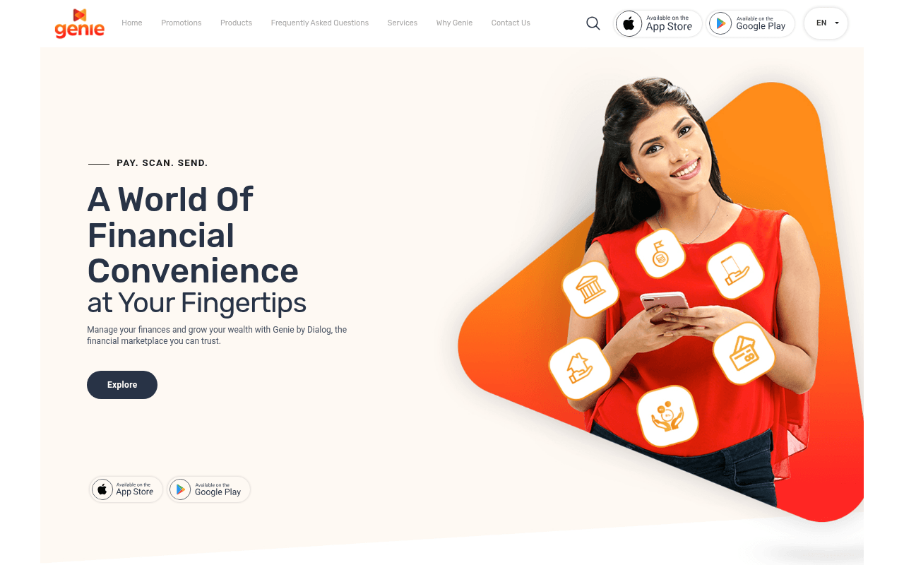
https://www.genie.lk
Screenshot of genie.lk
40of 100
F

The hero looks polished but the full-page screenshot reveals a catastrophic content void — the page is 90% empty cream-colored space with content crammed into one tiny zone. With zero H1 tags, 22 of 23 images missing alt text, and a CTA that says 'Explore' instead of 'Download Now,' this app landing page is leaving downloads on the table.

Your action plan

Ordered by conversion impact. Click any fix to see the before → after.

1
Replace 'Explore' CTA with a direct download trigger
High ImpactQuick WinPrimary dark CTA button in hero reading 'Explore'
Currently
Explore
Recommended
Download Genie Free — App Store & Google Play
The goal is app downloads, yet the primary CTA sends users to explore content. Friction-free CTAs that name the action increase click-through by 14-30% per CXL research. The app store badges below the fold are the real CTA — promote them above.

Copy rewrites

Ready to use

Drop-in replacements for your highest-leverage text. Each rewrite explains the conversion principle behind it.

Hero eyebrow text
PAY. SCAN. SEND.
Sri Lanka's First Financial Super App
Specificity and positioning — names the category and geography, establishing market leadership rather than listing generic features
Hero headline
A World Of Financial Convenience at Your Fingertips
Manage Money, Save Smarter, Pay Instantly — All in One App
Specificity over abstraction — replaces vague 'convenience' with concrete benefits users actually want, improving relevance and scan-ability
Hero subtext
Manage your finances and grow your wealth with Genie by Dialog, the financial marketplace you can trust.
Genie by Dialog lets you pay bills, scan QR codes, send money, and grow savings — trusted by millions across Sri Lanka.
Social proof plus feature specificity — 'trusted by millions' adds credibility while naming actual features reduces ambiguity about what the app does
Primary CTA button
Explore
Download Free — App Store & Google Play
Action clarity and value framing — 'Free' removes cost friction, naming both stores removes platform ambiguity, imperative verb drives action
💡

The killer move

High Impact
Surface the Dialog brand authority as the primary trust anchor

Dialog Axiata is Sri Lanka's largest telecom — yet 'by Dialog' appears only in small subtext. Reframe the hero as 'The Official Financial App of Dialog Axiata' with Dialog's user base and regulatory backing front and center; this single change converts the biggest fintech objection (is this safe?) into a conversion asset.

How visitors experience your page

Second-by-second walkthrough.

3 mixed2 weak
0-3 secondsMixed
0-3s First Impression: Clean hero with orange brand shape, smiling woman holding phone, headline 'A World Of Financial Convenience', App Store and Google Play badges in nav and below fold
Visual is professional and on-brand. But the headline is abstract and the primary CTA says 'Explore' — visitor doesn't immediately know this is an app download page. Mild confusion about what action to take.
3-8 secondsMixed
3-8s Value Assessment: Subtext about managing finances, 'Explore' button, floating financial service icons on the hero image, app store badges at bottom of hero
Visitor understands it's a financial app but can't quickly identify what makes Genie different from competitors. No user count, no rating, no unique hook. Trust is not established — risky for fintech.
8-15 secondsWeak
8-15s Scroll Intent: Based on full-page screenshot, visitor scrolls into a near-blank cream void — sections appear to not render properly on desktop
This is a conversion killer. Visitor interprets blank space as broken page or end of content and likely bounces. The Smart Solutions and GenieServices sections exist in text but are invisible on desktop.
15-30 secondsMixed
15-30s Feature Discovery: If sections render: Smart Solutions, Savings, Device Loans, Quick Loan, Mutual Funds, Cards — GenieServices pay/scan/send breakdown
Feature breadth is good for consideration-stage visitors, but there's no pricing, no comparison, no testimonials to push toward decision. Visitor remains in exploration mode with no urgency trigger.
30+ secondsWeak
30s+ Decision Point: Footer with navigation links, Terms and Conditions, copyright 2026, 'Concept and design by Antyra Solutions'
No sticky CTA, no final conversion push, no testimonials, no app store rating callout at page end. Visitor who scrolled this far is interested but gets no closing argument — high exit probability without a download.

Health check

8 dimensions, weighted by conversion impact.

First impression & hero
20%
6/10
Visually appealing hero with strong brand colors but abstract headline and weak CTA undermine conversion intent for an app download page
Copy & messaging
20%
4/10
Generic financial app language with no differentiation, no specifics on user base, and no urgency — 'convenience' and 'trust' are table stakes, not selling points
Call-to-action
15%
3/10
'Explore' as the primary CTA on an app download page is a fundamental mismatch — app store badges are buried and duplicated without hierarchy
Trust & social proof
15%
2/10
Zero testimonials, no user count, no app store rating displayed, no security badges — critical omissions for a fintech product asking users to trust it with their money
Visual design & layout
10%
6/10
Hero design is clean and on-brand but the full-page rendering failure creates a massive dead zone that destroys below-fold user experience
Page structure & flow
8%
3/10
No H1 tags, 22 images missing alt text, and apparent CSS rendering failure on desktop make the page structure fundamentally broken below the hero
Technical & SEO signals
7%
4/10
Performance score 87 is decent but LCP at 3.1s is borderline, zero H1 tags, 22 missing alt texts, and no accessibility/SEO scores reported are serious gaps
Differentiation & positioning
5%
4/10
Being 'Sri Lanka's first financial super app' is a strong differentiator that's buried in meta description but never stated on the page itself

Page speed

Based on real Chrome user data
87/100
Overall score
Combined performance rating
3.1 s
Largest paint
Time until the main content is visible
0.02
Layout shift
How much the page moves while loading
2.3 s
First paint
Time until something first appears
29 ms
Responsiveness
How fast the page reacts to clicks

Want mobile analysis and fresh re-runs?

Buy roasts to unlock mobile analysis, re-analyze on demand, and more for genie.lk.

See roast packs →