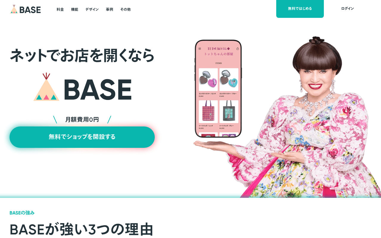
https://thebase.com
https://thebase.com
Screenshot of thebase.com
65of 100
C+

BASE has strong bones — zero monthly fee is a killer value prop and the teal CTA is impossible to miss — but the hero wastes half its real estate on a celebrity endorser whose name recognition may not translate to trust for the target audience. The duplicate H1 tags and 119 images missing alt text signal that technical SEO is being left on the table despite a near-perfect PageSpeed score.

Your action plan

Ordered by conversion impact. Click any fix to see the before → after.

1
Add a quantified social proof stat to the hero
High ImpactQuick WinHero section below the BASE logo, above the CTA button
Currently
月額費用0円 (only value prop shown)
Recommended
Add '180万ショップ突破' or equivalent verified user count directly beneath the logo, before the CTA button
Zero-cost claims are common; a large user number provides herd-effect social proof that reduces perceived risk and increases signup intent — proven by Shopify and similar SaaS hero patterns

Copy rewrites

Ready to use

Drop-in replacements for your highest-leverage text. Each rewrite explains the conversion principle behind it.

Hero headline
ネットでお店を開くなら
はじめてでも、今日からお店が開ける。
Specificity and empathy — speaks directly to the beginner anxiety of the target audience rather than a generic conditional phrase
Hero sub-value prop
月額費用0円
月額0円・初期費用0円・知識不要
Stacking three zero-barrier claims triples the reassurance signal without adding length — addresses the three most common objections in one line
Bottom CTA section headline
まずはお試し開設を
30秒で開設。気に入らなければ、やめるだけ。
Reversibility framing reduces commitment anxiety — one of the highest-impact copy techniques for free trial signups per CXL research
Features section tagline
あらたな可能性が、あなたらしさと広がる拠点・BASE
売上もファンも、BASEひとつで育てられる。
Outcome specificity — replaces abstract brand poetry with a concrete benefit statement that maps to the audience's actual goal
💡

The killer move

High Impact
Add a real-time or recent social proof ticker above the hero CTA

Display a live or recently-updated counter showing shops opened today or this week (e.g. '今日だけで247店舗が開設されました') — this creates urgency through social momentum without manufactured scarcity, and directly addresses the beginner's fear of being alone in a new venture. Shopify's equivalent implementation drove measurable lift in their free trial funnel.

How visitors experience your page

Second-by-second walkthrough.

3 strong2 mixed
0-3 secondsMixed
0-3s first impression: BASE logo, nav with 料金/機能/デザイン/事例, large headline, teal CTA button, celebrity with phone mockup
Brand and zero-cost message land immediately, but the celebrity visual creates a moment of confusion — visitors may not recognize her and wonder if this is a celebrity shop rather than a platform for them
3-8 secondsStrong
3-8s value scan: 月額費用0円 badge, 無料でショップを開設する CTA button, phone mockup showing a real shop interface
The free-forever signal is prominent and the CTA is high-contrast teal — motivated visitors will click here without scrolling; this is the page's strongest conversion moment
8-15 secondsStrong
8-15s credibility check: BASEが強い3つの理由 section with 3 feature columns: かんたんにつくれる, 売れる, 続けられる
Three-pillar structure maps well to the beginner's mental checklist (can I start, can I sell, can I sustain) — logical and reassuring for the target audience
15-30 secondsMixed
15-30s trust validation: ショップオーナーの声 testimonials with real seller photos and shop names, 料金・プラン pricing table
Testimonials are real and specific (shop names, hashtag context) which is good, but the pricing table introduces complexity with two plans and multiple footnote asterisks that may create hesitation
30+ secondsStrong
30s+ decision or exit: FAQ accordion, bottom CTA section, resource download offer, footer
FAQ directly addresses the top objections (hidden fees, no knowledge needed) in the right order — visitors who reach here are likely to convert or at minimum bookmark; the second CTA reinforces the 30-second setup claim

Health check

8 dimensions, weighted by conversion impact.

First impression & hero
20%
6/10
Zero-cost message is clear but celebrity imagery creates identification gap for the core aspiring-seller audience
Copy & messaging
20%
7/10
Feature benefits are well-structured across three pillars but hero copy is generic and the bottom tagline is abstract brand poetry
Call-to-action
15%
7/10
Teal CTA is visually dominant and repeated appropriately but lacks time-to-value language at the primary placement
Trust & social proof
15%
6/10
Real seller testimonials with names and context are solid but no aggregate user count or revenue milestone is shown above the fold
Visual design & layout
10%
7/10
Clean teal brand system, good whitespace, but hero right-column celebrity image competes with the product mockup for visual hierarchy
Page structure & flow
8%
8/10
Logical progression from value prop to features to social proof to pricing to FAQ to CTA follows a textbook conversion architecture
Technical & SEO signals
7%
5/10
PageSpeed 96 is excellent but duplicate H1s and 119 missing alt attributes are significant SEO and accessibility liabilities
Differentiation & positioning
5%
6/10
Zero monthly fee is clearly stated but competitive differentiation vs Stores.jp or Shopify is not articulated anywhere on the page

Page speed

Based on real Chrome user data
96/100
Overall score
Combined performance rating
754 ms
Largest paint
Time until the main content is visible
0.04
Layout shift
How much the page moves while loading
575 ms
First paint
Time until something first appears
90 ms
Responsiveness
How fast the page reacts to clicks

Want mobile analysis and fresh re-runs?

Buy roasts to unlock mobile analysis, re-analyze on demand, and more for thebase.com.

See roast packs →