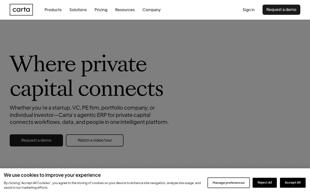
https://carta.com
https://carta.com
Screenshot of carta.com
60of 100
C

Carta has the brand authority to command attention but squanders it with a gray-on-gray hero that buries the product visually and a subhead that name-drops 'agentic ERP' — jargon that will lose half the audience before they scroll. The hero right column is completely empty at 1280px, wasting 40% of prime real estate that could show the actual platform.

Your action plan

Ordered by conversion impact. Click any fix to see the before → after.

1
Fill the empty hero right column with a product screenshot or dashboard preview
High ImpactSome WorkHero section — right half of viewport is blank gray at 1280px
Currently
Empty gray background occupying ~40% of above-fold width
Recommended
Place an in-context product UI screenshot or animated dashboard preview showing cap table or fund overview
F-pattern and Z-pattern eye tracking research shows right-column hero visuals increase time-on-page and demo intent by reducing abstraction — visitors need to see what they are buying

Copy rewrites

Ready to use

Drop-in replacements for your highest-leverage text. Each rewrite explains the conversion principle behind it.

H1 headline
Where private capital connects
The platform where private capital manages, moves, and models money — together.
Specificity and benefit-stacking: the original is atmospheric but non-functional; naming the three core jobs (manage, move, model) mirrors the page's own value prop section
Hero subheadline
Whether you're a startup, VC, PE firm, portfolio company, or individual investor—Carta's agentic ERP for private capital connects workflows, data, and people in one intelligent platform.
Whether you're a startup, VC, PE firm, or LP — Carta connects your cap table, fund admin, and reporting in one platform your whole team actually uses.
Specificity and jargon removal: replaces 'agentic ERP' with concrete product nouns; adds 'actually uses' to address adoption anxiety common in enterprise SaaS
Primary CTA button
Request a demo
See Carta in action
Curiosity and low-friction framing: 'See' is lower commitment than 'Request' and aligns with the secondary CTA's video tour energy, reducing decision paralysis
The Carta difference section intro (implied)
The Carta difference
Why 40,000+ companies chose Carta over point solutions
Social proof + competitive framing: transforms a generic section header into a proof-backed claim that pre-empts the 'why not a competitor' objection
💡

The killer move

High Impact
Launch segment-specific hero variants with dynamic social proof

Carta's audience segmentation tabs (PE, VC, Corp, LP) are already built — extend this logic to create four distinct hero experiences with segment-specific headlines, product screenshots, and testimonials from that exact buyer type, reducing the current one-size-fits-all hero that must serve four very different decision-makers simultaneously.

How visitors experience your page

Second-by-second walkthrough.

2 strong2 mixed1 weak
0-3 secondsMixed
0-3s first impression: Large serif headline on gray background, nav with 5 items, two CTAs, empty right column
Brand feels premium but the gray hero with no product visual creates ambiguity — visitor cannot immediately confirm this is software vs. a financial services firm
3-8 secondsStrong
3-8s value scan: Subheadline with audience list, Request a demo and Watch a video tour buttons, segment tabs (Private Equity, VC, Corporations, LPs)
Audience segmentation tabs are excellent — sophisticated visitors self-select and feel immediately addressed, increasing relevance and scroll intent
8-15 secondsMixed
8-15s feature evaluation: All together now section with connectivity diagram, The Carta difference 6-feature grid
Feature grid is comprehensive but abstract — icons and one-line descriptions without screenshots or micro-demos leave technical buyers unconfirmed on actual UX quality
15-30 secondsStrong
15-30s trust validation: Trusted by testimonials (3 visible), logo strip with Base10, QED, Accel, Kayne Anderson
Named executives with titles and company logos are high-credibility signals; however hasTestimonials metadata flags false — structured markup may be missing, hurting SEO-driven trust
30+ secondsWeak
30s+ decision: Explore our solutions tabs, Carta by the Numbers 1.7M+ stat, Let's connect section
The most powerful quantitative proof point (1.7M+) appears too late to rescue visitors who bounced earlier; the final CTA section likely converts only the already-convinced

Health check

8 dimensions, weighted by conversion impact.

First impression & hero
20%
6/10
Premium typography and clear audience segmentation, but empty right column and gray void waste 40% of above-fold real estate
Copy & messaging
20%
5/10
'Agentic ERP' jargon in the hero subhead undermines clarity for a broad audience that includes non-technical founders and LPs
Call-to-action
15%
7/10
Dual CTA strategy (demo + video tour) is smart for high and low intent visitors, but primary button label 'Request a demo' is passive
Trust & social proof
15%
7/10
Named executive testimonials and recognizable VC logos are strong, but the 1.7M+ stat is buried at page bottom where few visitors reach
Visual design & layout
10%
6/10
Clean serif typography and restrained palette feel premium, but the blank hero right column and gray background create an unfinished impression
Page structure & flow
8%
6/10
Logical segment-to-features-to-proof flow, but the most persuasive quantitative proof arrives too late in the scroll sequence
Technical & SEO signals
7%
8/10
PageSpeed 97 with 902ms FCP is exceptional; 32 images missing alt text is a meaningful accessibility and SEO gap given 59 total images
Differentiation & positioning
5%
6/10
'Agentic ERP' is a bold positioning bet but risks alienating buyers who do not recognize the category; competitive contrast is absent above the fold

Page speed

Based on real Chrome user data
97/100
Overall score
Combined performance rating
907 ms
Largest paint
Time until the main content is visible
0.00
Layout shift
How much the page moves while loading
902 ms
First paint
Time until something first appears
67 ms
Responsiveness
How fast the page reacts to clicks

Want mobile analysis and fresh re-runs?

Buy roasts to unlock mobile analysis, re-analyze on demand, and more for carta.com.

See roast packs →