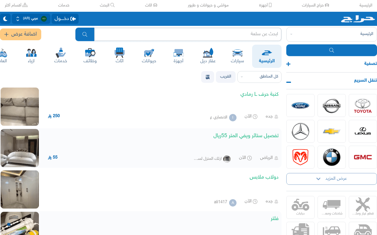
https://haraj.com.sa
Screenshot of haraj.com.sa
40of 100
F

Haraj is a functional classifieds marketplace that looks like it was designed in 2012 and never told.

The hero is a search bar with no value proposition — zero reason for a new visitor to trust or register. The right-column car brand grid competes visually with listings instead of supporting them, creating a cluttered two-column race to nowhere.

Your action plan

Ordered by conversion impact. Click any fix to see the before → after.

1
Add a value proposition headline above the search bar
High ImpactQuick WinSearch bar area — currently just a placeholder 'ابحث عن سلعة' with no surrounding context
Currently
Bare search input with no headline, subtext, or trust signal
Recommended
Add H1: 'أكبر سوق إلكتروني في السعودية — ملايين العروض يومياً' directly above the search bar
First-time visitors need a reason to engage; a clear value prop above the search bar increases search initiation by reducing cognitive uncertainty (Nielsen Norman Group: orientation copy lifts engagement)

Copy rewrites

Ready to use

Drop-in replacements for your highest-leverage text. Each rewrite explains the conversion principle behind it.

Meta description
حراج , حراج سعودي يحتوي على حراج لكل السلع وحراج السيارات وحراج عقار وحراج الأجهزة.
حراج — أكبر موقع بيع وشراء في السعودية. سيارات، عقارات، أجهزة، وأكثر. أضف عرضك مجاناً اليوم.
Specificity and action-oriented language; current version repeats the word 'حراج' four times with zero benefit statement
Search bar placeholder
ابحث عن سلعة
ابحث في ملايين العروض — سيارات، أجهزة، عقارات...
Social proof via scale signal; communicates inventory depth and reduces search hesitation
Add listing button
اضافة عرض
أضف عرضك مجاناً
Removes friction by addressing the implicit cost objection; 'مجاناً' is a proven conversion trigger in Arabic marketplace contexts
💡

The killer move

High Impact
Launch a seller social proof counter in the hero

Display a live or daily-updated counter — 'تم نشر 12,450 عرض اليوم' — directly below the search bar. Marketplace liquidity is the core value proposition; making it visible converts fence-sitters into both buyers and sellers by proving the market is active.

How visitors experience your page

Second-by-second walkthrough.

1 strong2 mixed2 weak
0-3 secondsMixed
0-3s first impression: Blue navigation bar, search input, category icons, listing cards, car brand grid on right
Visitor recognizes a classifieds site immediately but sees no brand promise or differentiation — they proceed on habit, not conviction. New users have no anchor.
3-8 secondsStrong
3-8s orientation: Category icons (سيارات، أجهزة، اثاث etc.), recent listings with prices and locations, region filter
Category icons are clear and well-iconified; experienced users quickly orient to their category. The RTL layout is consistent and scannable.
8-15 secondsMixed
8-15s evaluation: Individual listing cards with titles, prices in SAR, city names, timestamps, seller usernames
Listings lack photos on some cards and seller trust signals are minimal (username only). Visitor questions listing quality and seller legitimacy before clicking.
15-30 secondsWeak
15-30s decision: More listings below fold, car brand shortcuts, 'عرض المزيد' button, vehicle subcategory icons
No personalization, no featured or verified listings differentiation, no login prompt with benefit. Casual browsers have no hook to convert to registered users.
30+ secondsWeak
30s+ engagement: Full page listings, footer with legal links, subscription and store options
Footer reveals monetization options (annual subscription, promoted listings) but these are buried. Sellers who could monetize the platform never see the upsell opportunity.

Health check

8 dimensions, weighted by conversion impact.

First impression & hero
20%
4/10
Search bar with no headline or value prop; new visitors get zero orientation above the fold
Copy & messaging
20%
3/10
No brand voice, no benefit statements anywhere on page; all text is functional labels with zero persuasion
Call-to-action
15%
4/10
Add listing CTA is visually buried; login button is prominent but offers no benefit reason to click
Trust & social proof
15%
4/10
No testimonials, no listing counts, no verified seller badges, no transaction volume signals visible
Visual design & layout
10%
5/10
Functional but dated; two-column layout creates visual competition between listings and car brand grid
Page structure & flow
8%
6/10
Category navigation is logical and RTL-consistent; search-first structure is appropriate for classifieds
Technical & SEO signals
7%
7/10
Performance score 86, LCP 2.3s is acceptable; SearchAction schema implemented correctly; no H1 tag is a missed SEO opportunity
Differentiation & positioning
5%
3/10
Nothing on the page communicates why Haraj beats OpenSooq or Facebook Marketplace — pure commodity positioning

Page speed

Based on real Chrome user data
86/100
Overall score
Combined performance rating
2.3 s
Largest paint
Time until the main content is visible
0.02
Layout shift
How much the page moves while loading
1.2 s
First paint
Time until something first appears
101 ms
Responsiveness
How fast the page reacts to clicks

Want mobile analysis and fresh re-runs?

Buy roasts to unlock mobile analysis, re-analyze on demand, and more for haraj.com.sa.

See roast packs →